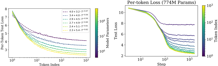
## Chart: Per-Token Test Loss vs. Token Index and Step
### Overview
The image presents two line charts comparing per-token test loss against token index (left) and step (right). Both charts display multiple lines, each representing a different model parameter configuration. A color gradient is used to represent the model parameters and token index.
### Components/Axes
**Left Chart:**
* **Title:** Per-Token Test Loss
* **X-axis:** Token Index (Logarithmic scale from 10^0 to 10^3)
* **Y-axis:** Per-Token Test Loss (Linear scale from 2 to 8)
* **Legend:** Located at the top-right of the left chart. The legend entries are color-coded and represent different model parameter configurations. The color gradient ranges from dark purple to yellow, corresponding to the following values:
* Dark Purple: 4.0 + 3.2 * T^-0.47
* Purple: 3.4 + 4.0 * T^-0.56
* Green-Blue: 2.9 + 4.5 * T^-0.56
* Green: 2.7 + 4.9 * T^-0.60
* Yellow-Green: 2.4 + 5.1 * T^-0.61
* Yellow: 2.3 + 5.4 * T^-0.62
**Right Chart:**
* **Title:** Per-token Loss (774M Params)
* **X-axis:** Step (Logarithmic scale from 10^1 to 10^5)
* **Y-axis:** Test Loss (Linear scale from 2 to 10)
* **Color Bar (Right Side):** Token Index (Logarithmic scale from 10^0 to 10^3)
### Detailed Analysis
**Left Chart (Per-Token Test Loss vs. Token Index):**
* **Trend:** All lines show a decreasing trend as the token index increases. The rate of decrease diminishes as the token index grows larger.
* **Data Points:**
* The dark purple line (4.0 + 3.2 * T^-0.47) starts at approximately 7.5 at Token Index 1 and decreases to approximately 4.5 at Token Index 1000.
* The purple line (3.4 + 4.0 * T^-0.56) starts at approximately 7.5 at Token Index 1 and decreases to approximately 4.2 at Token Index 1000.
* The green-blue line (2.9 + 4.5 * T^-0.56) starts at approximately 7.5 at Token Index 1 and decreases to approximately 3.8 at Token Index 1000.
* The green line (2.7 + 4.9 * T^-0.60) starts at approximately 7.5 at Token Index 1 and decreases to approximately 3.5 at Token Index 1000.
* The yellow-green line (2.4 + 5.1 * T^-0.61) starts at approximately 7.5 at Token Index 1 and decreases to approximately 3.2 at Token Index 1000.
* The yellow line (2.3 + 5.4 * T^-0.62) starts at approximately 7.5 at Token Index 1 and decreases to approximately 3.0 at Token Index 1000.
**Right Chart (Per-token Loss vs. Step):**
* **Trend:** All lines show a decreasing trend as the step increases. The rate of decrease diminishes as the step grows larger.
* **Data Points:**
* The lines start at approximately 10 at Step 10^1 and decrease to between 6 and 2 at Step 10^5.
* The lines are clustered together, making it difficult to distinguish individual values.
### Key Observations
* In both charts, the loss decreases as the token index or step increases, indicating that the model is learning.
* The left chart shows a clear separation between the lines, indicating that different model parameter configurations result in different loss values.
* The right chart shows that the loss values converge as the step increases, suggesting that the model is reaching a point of diminishing returns.
### Interpretation
The charts illustrate the training process of a language model, showing how the per-token test loss decreases as the model is exposed to more tokens (left chart) and as the training progresses through more steps (right chart). The different lines in the left chart represent different model parameter configurations, and the fact that they converge in the right chart suggests that the model is learning to generalize well regardless of the initial parameter settings. The color gradient in the left chart represents the model parameters, while the color gradient in the right chart represents the token index. The convergence of the lines in the right chart suggests that the model is reaching a point of diminishing returns, where further training does not significantly improve the loss.