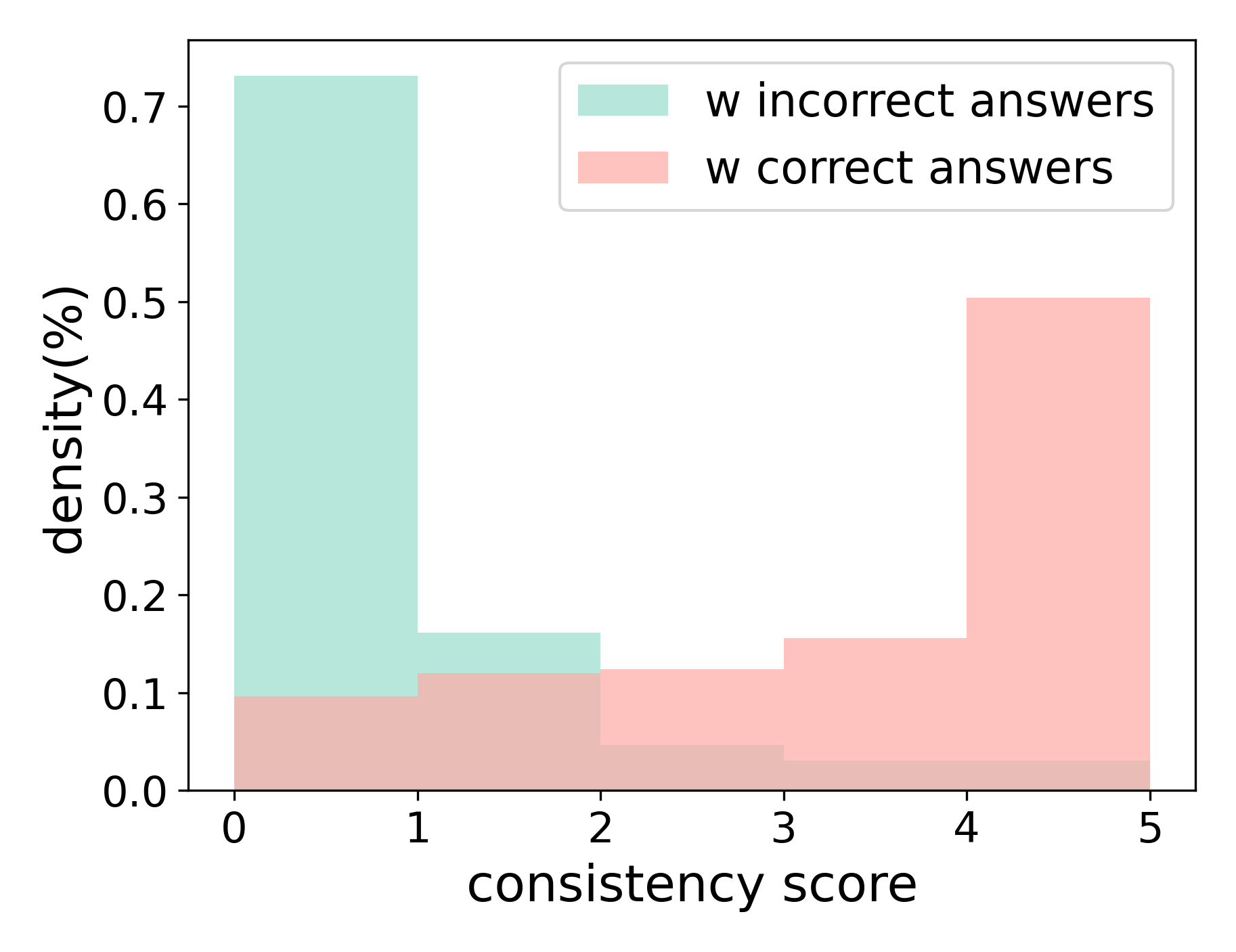
## Histogram: Consistency Score Density by Answer Correctness
### Overview
The image displays a histogram comparing the density distribution of "consistency scores" for two groups: one with incorrect answers and one with correct answers. The chart uses overlapping, semi-transparent bars to show the frequency (density) of scores across a range from 0 to 5.
### Components/Axes
* **Chart Type:** Histogram (overlapping bar chart).
* **X-Axis:**
* **Label:** `consistency score`
* **Scale:** Linear, ranging from 0 to 5.
* **Markers:** Major ticks at integer values: 0, 1, 2, 3, 4, 5.
* **Y-Axis:**
* **Label:** `density(%)`
* **Scale:** Linear, ranging from 0.0 to 0.7 (representing 0% to 70%).
* **Markers:** Major ticks at 0.0, 0.1, 0.2, 0.3, 0.4, 0.5, 0.6, 0.7.
* **Legend:**
* **Position:** Top-right corner, inside the plot area.
* **Entries:**
1. `w incorrect answers` (Light teal/cyan color)
2. `w correct answers` (Light pink/salmon color)
### Detailed Analysis
The histogram presents two distinct distributions:
**1. Distribution for "w incorrect answers" (Teal Bars):**
* **Trend:** Shows a steep, monotonic decline from left to right.
* **Data Points (Approximate Density):**
* Consistency Score 0: ~0.73 (73%)
* Consistency Score 1: ~0.16 (16%)
* Consistency Score 2: ~0.05 (5%)
* Consistency Score 3: ~0.03 (3%)
* Consistency Score 4: ~0.02 (2%)
* Consistency Score 5: ~0.02 (2%)
* **Observation:** The vast majority of instances with incorrect answers have a very low consistency score (0), with density dropping off sharply as the score increases.
**2. Distribution for "w correct answers" (Pink Bars):**
* **Trend:** Shows a steady, monotonic increase from left to right.
* **Data Points (Approximate Density):**
* Consistency Score 0: ~0.10 (10%)
* Consistency Score 1: ~0.12 (12%)
* Consistency Score 2: ~0.13 (13%)
* Consistency Score 3: ~0.15 (15%)
* Consistency Score 4: ~0.50 (50%)
* Consistency Score 5: ~0.50 (50%)
* **Observation:** Instances with correct answers are concentrated at higher consistency scores, with the highest density at scores 4 and 5.
**Overlap Region:**
* The bars overlap significantly at lower scores (0-2), where both distributions have non-zero density. The combined color in these regions is a muted brownish-pink.
### Key Observations
1. **Inverse Relationship:** The two distributions are nearly mirror images. High density for incorrect answers corresponds to low consistency scores, while high density for correct answers corresponds to high consistency scores.
2. **Polarization:** The data is highly polarized. The "incorrect" group is overwhelmingly clustered at score 0, and the "correct" group is heavily clustered at scores 4 and 5.
3. **Minimal Middle Ground:** There is relatively low density for both groups in the middle range of consistency scores (2 and 3).
### Interpretation
This histogram demonstrates a strong, positive correlation between a higher "consistency score" and the likelihood of providing a correct answer. The data suggests that the "consistency score" is a highly effective metric for distinguishing between correct and incorrect responses in this context.
* **What it means:** A low consistency score (especially 0) is a very strong indicator of an incorrect answer. Conversely, a high consistency score (4 or 5) is a strong indicator of a correct answer.
* **Why it matters:** This relationship validates the "consistency score" as a meaningful measure. It could be used as a proxy for confidence, understanding, or reliability in the system being measured. The stark separation between the groups implies the scoring mechanism is well-calibrated for this task.
* **Underlying Pattern:** The pattern suggests a binary-like outcome: responses tend to be either highly consistent (and correct) or highly inconsistent (and incorrect), with few ambiguous cases in the middle. This could indicate a task where understanding is clear-cut, or where the consistency metric captures a fundamental aspect of the correct solution process.