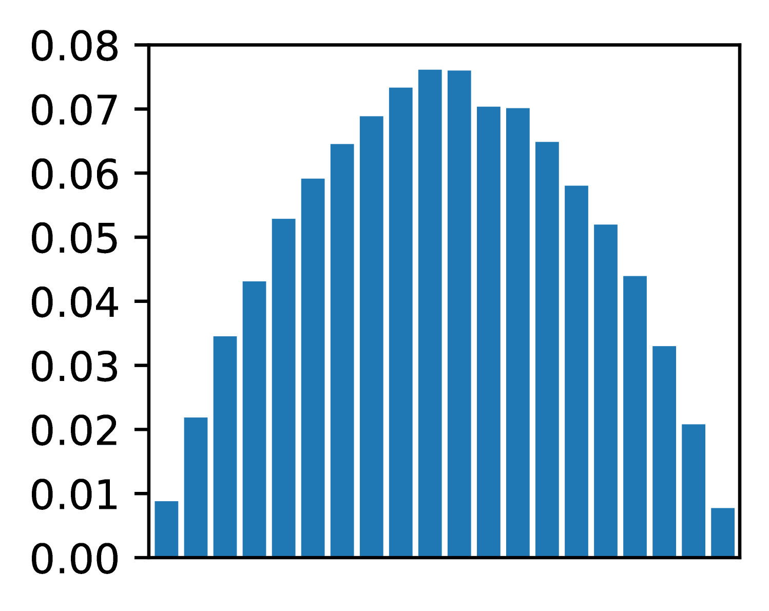
## Bar Chart: Distribution Plot
### Overview
The image is a bar chart depicting a distribution. The bars are blue and arranged symmetrically, forming a bell-like shape. The y-axis represents a value, and the x-axis represents categories.
### Components/Axes
* **Y-axis:** Ranges from 0.00 to 0.08, with increments of 0.01.
* **X-axis:** No explicit labels, but the bars represent different categories or values along the x-axis.
* **Bars:** All bars are blue.
### Detailed Analysis
The bar chart shows a distribution that increases to a peak and then decreases symmetrically.
* **Left Side (Ascending):**
* The first bar is approximately 0.01.
* The second bar is approximately 0.02.
* The third bar is approximately 0.035.
* The fourth bar is approximately 0.043.
* The fifth bar is approximately 0.053.
* The sixth bar is approximately 0.06.
* The seventh bar is approximately 0.065.
* The eighth bar is approximately 0.07.
* The ninth bar is approximately 0.073.
* **Center (Peak):**
* The tenth bar is approximately 0.076.
* **Right Side (Descending):**
* The eleventh bar is approximately 0.076.
* The twelfth bar is approximately 0.07.
* The thirteenth bar is approximately 0.065.
* The fourteenth bar is approximately 0.07.
* The fifteenth bar is approximately 0.053.
* The sixteenth bar is approximately 0.043.
* The seventeenth bar is approximately 0.035.
* The eighteenth bar is approximately 0.02.
* The nineteenth bar is approximately 0.008.
### Key Observations
* The distribution is symmetrical.
* The peak of the distribution is around the tenth and eleventh bars.
* The values increase gradually to the peak and then decrease gradually.
### Interpretation
The bar chart represents a distribution, likely a probability distribution or a frequency distribution. The symmetrical bell shape suggests a normal distribution or a similar symmetric distribution. The x-axis represents different categories or values, and the y-axis represents the frequency or probability of each category. The peak indicates the most frequent or probable category. The data suggests that values near the center of the distribution are more common than values at the extremes.