## Histogram: Frequency Distribution of Data Points
### Overview
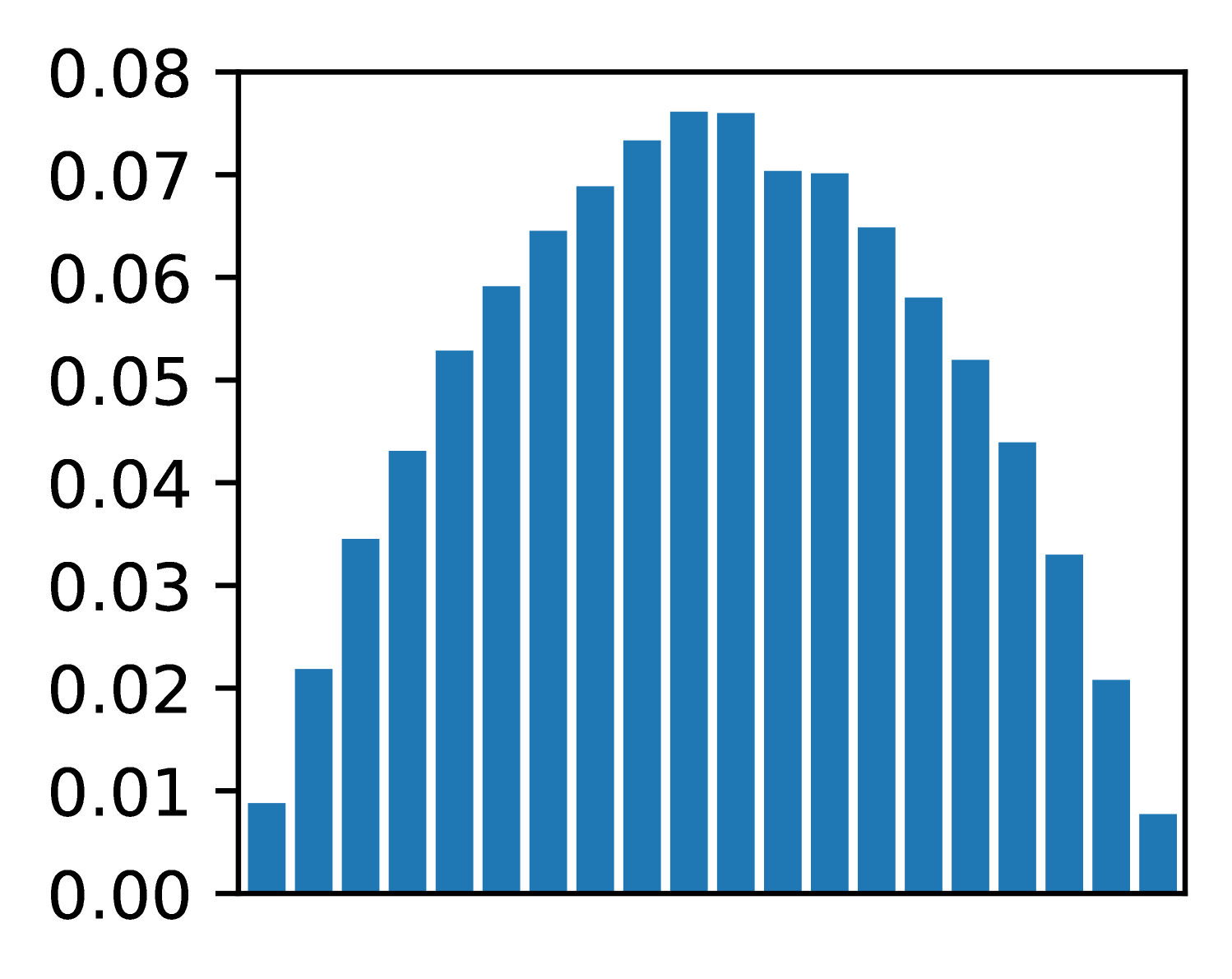
The image displays a histogram with a bell-shaped distribution, indicating a normal distribution of data points. The x-axis represents data values ranging from 0.00 to 0.08, while the y-axis represents frequency or probability density, also ranging from 0.00 to 0.08. The bars are uniformly colored in blue, with no explicit legend or title provided.
### Components/Axes
- **X-axis**: Labeled with increments of 0.01 (0.00, 0.01, ..., 0.08). Represents the range of data values.
- **Y-axis**: Labeled with increments of 0.01 (0.00, 0.01, ..., 0.08). Represents frequency or probability density.
- **Bars**: Blue vertical bars with approximate heights corresponding to the frequency of data points at each x-axis interval.
### Detailed Analysis
- **Leftmost bar**: ~0.01 (x=0.00), height ~0.01.
- **Increasing trend**: Bars rise steadily from x=0.00 to x=0.04, with heights increasing from ~0.01 to ~0.075.
- **Peak**: Tallest bars centered at x=0.04, reaching ~0.075 on the y-axis.
- **Decreasing trend**: Bars decline symmetrically from x=0.04 to x=0.08, with heights decreasing from ~0.075 to ~0.01.
- **Rightmost bar**: ~0.01 (x=0.08), height ~0.01.
### Key Observations
1. **Symmetry**: The distribution is symmetric around x=0.04, consistent with a normal distribution.
2. **Peak frequency**: The highest frequency (~0.075) occurs at x=0.04, suggesting this is the mode of the data.
3. **Tapered tails**: Frequencies decrease gradually toward both ends of the x-axis, indicating diminishing probabilities for extreme values.
4. **No outliers**: No bars deviate significantly from the bell curve, suggesting no anomalous data points.
### Interpretation
The histogram likely represents a dataset with a mean and median centered at ~0.04, with values clustering tightly around this point. The symmetry and bell shape imply the data follows a Gaussian distribution, common in natural phenomena or measurement errors. The absence of a legend or title limits contextual interpretation, but the structure suggests this could model phenomena like:
- Measurement errors in scientific experiments
- Biological trait distributions (e.g., heights, weights)
- Financial returns adjusted for risk
The uniform bin width (0.01) ensures consistent resolution across the dataset. The y-axis scaling (up to 0.08) indicates the maximum frequency density, which could correspond to a probability density function if normalized. The lack of explicit units or context necessitates caution in applying this data to real-world scenarios without additional metadata.