\n
## Chart: Exponential Growth Comparison
### Overview
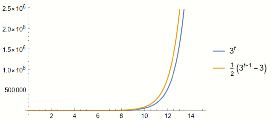
The image presents a line graph comparing the growth of two exponential functions: 3<sup>t</sup> and ½(3<sup>t+1</sup> - 3). The graph displays the functions' values across a range of 't' values, from approximately 1 to 15. The y-axis represents the function values, scaled in powers of ten, and the x-axis represents the variable 't'.
### Components/Axes
* **X-axis:** Represents the variable 't', with tick marks at integers from 2 to 14. No explicit label is present, but it is implied to be the independent variable.
* **Y-axis:** Represents the function values, labeled with scientific notation (e.g., 2.5 x 10<sup>6</sup>, 1.5 x 10<sup>6</sup>, 1.0 x 10<sup>6</sup>, 500 000). The scale is logarithmic-like, increasing in powers of ten.
* **Legend:** Located in the top-right corner, it identifies the two lines:
* Blue line: 3<sup>t</sup>
* Orange line: ½(3<sup>t+1</sup> - 3)
### Detailed Analysis
**Line 1: 3<sup>t</sup> (Blue)**
* **Trend:** The blue line exhibits exponential growth, starting at a low value around t=2 and rapidly increasing as t increases.
* **Data Points (approximate):**
* t = 2: y ≈ 9
* t = 4: y ≈ 81
* t = 6: y ≈ 729
* t = 8: y ≈ 6561
* t = 10: y ≈ 59049
* t = 12: y ≈ 531441
* t = 14: y ≈ 4782969
* The line is smooth and continuous.
**Line 2: ½(3<sup>t+1</sup> - 3) (Orange)**
* **Trend:** The orange line also demonstrates exponential growth, but it starts at a slightly higher value than the blue line for lower 't' values. The growth rate appears similar to the blue line for larger 't' values.
* **Data Points (approximate):**
* t = 2: y ≈ 18
* t = 4: y ≈ 162
* t = 6: y ≈ 729
* t = 8: y ≈ 6561
* t = 10: y ≈ 59049
* t = 12: y ≈ 531441
* t = 14: y ≈ 4782969
* The line is smooth and continuous.
### Key Observations
* Both functions exhibit exponential growth.
* The orange line starts with a higher value than the blue line at lower 't' values, but the difference diminishes as 't' increases.
* The two lines converge as 't' becomes larger, suggesting that the difference between the two functions becomes negligible for large values of 't'.
* The y-axis scale is not linear, making it difficult to visually assess the exact differences in growth rates without referring to the numerical values.
### Interpretation
The chart demonstrates the behavior of two related exponential functions. The function ½(3<sup>t+1</sup> - 3) can be seen as a scaled and shifted version of the function 3<sup>t</sup>. The initial offset (the "-3" term) causes the orange line to start higher, but the exponential nature of the growth quickly overshadows this initial difference. The convergence of the lines indicates that the scaling and shifting have a diminishing effect as 't' increases. This type of comparison is useful in understanding how modifications to a base exponential function affect its overall growth pattern. The chart effectively illustrates the dominant role of the exponential term in determining long-term growth.