## Line Chart: Cumulative Citations Over Time
### Overview
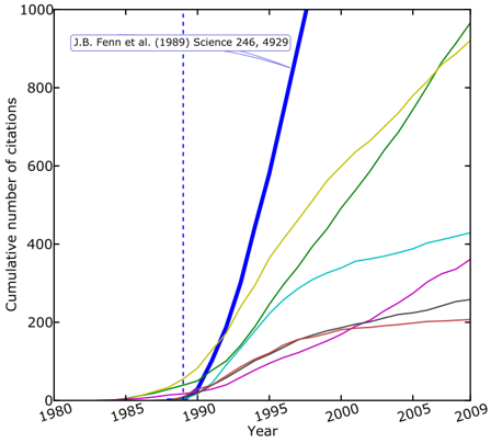
This image presents a line chart illustrating the cumulative number of citations over time, spanning from 1980 to 2009. The chart displays multiple lines, each representing a different research area or publication series, showing how their citations have accumulated over the years. A vertical dashed line highlights the year 1990, and a text annotation points to a specific publication.
### Components/Axes
* **X-axis:** Year, ranging from 1980 to 2009, with tick marks every 5 years.
* **Y-axis:** Cumulative number of citations, ranging from 0 to 1000, with tick marks every 200.
* **Lines:** Seven distinct colored lines representing different citation trends. No explicit legend is provided, so line identification relies on visual differentiation.
* **Annotation:** "J.B. Fenn et al. (1989) Science 246, 4929" positioned near the top-left of the chart.
* **Vertical Dashed Line:** Located at the year 1990.
### Detailed Analysis
Let's analyze each line's trend and approximate data points.
* **Dark Blue Line:** This line exhibits the steepest upward slope, indicating rapid citation growth. It starts at approximately 0 citations in 1980 and reaches nearly 1000 citations by 2009.
* (1985): ~20 citations
* (1990): ~200 citations
* (1995): ~600 citations
* (2000): ~850 citations
* (2005): ~950 citations
* (2009): ~990 citations
* **Yellow Line:** This line shows a steady, but slower, increase in citations compared to the dark blue line.
* (1985): ~0 citations
* (1990): ~50 citations
* (1995): ~250 citations
* (2000): ~500 citations
* (2005): ~700 citations
* (2009): ~850 citations
* **Light Green Line:** This line has a moderate growth rate, starting later than the dark blue and yellow lines.
* (1985): ~0 citations
* (1990): ~0 citations
* (1995): ~100 citations
* (2000): ~300 citations
* (2005): ~500 citations
* (2009): ~650 citations
* **Cyan Line:** This line shows a slower growth rate, with a plateau around 400-500 citations.
* (1985): ~0 citations
* (1990): ~50 citations
* (1995): ~200 citations
* (2000): ~350 citations
* (2005): ~450 citations
* (2009): ~450 citations
* **Black Line:** This line exhibits a relatively slow and steady growth, remaining below 300 citations throughout the period.
* (1985): ~0 citations
* (1990): ~20 citations
* (1995): ~80 citations
* (2000): ~150 citations
* (2005): ~200 citations
* (2009): ~250 citations
* **Magenta Line:** This line shows the slowest growth, remaining below 200 citations.
* (1985): ~0 citations
* (1990): ~0 citations
* (1995): ~20 citations
* (2000): ~80 citations
* (2005): ~120 citations
* (2009): ~150 citations
* **Red Line:** This line shows very slow growth, remaining below 100 citations.
* (1985): ~0 citations
* (1990): ~0 citations
* (1995): ~0 citations
* (2000): ~20 citations
* (2005): ~50 citations
* (2009): ~80 citations
### Key Observations
* The dark blue line clearly dominates the citation landscape, indicating a highly influential publication or research area.
* The vertical dashed line at 1990 may represent a significant event or turning point in the field, as several lines show a noticeable increase in slope after this year.
* The annotation "J.B. Fenn et al. (1989) Science 246, 4929" suggests this publication is related to the dark blue line, potentially being the source of its high citation count.
* There is a wide range of citation accumulation rates among the different lines, indicating varying levels of impact and recognition.
### Interpretation
The chart demonstrates the evolution of citations over time for different research areas. The dominance of the dark blue line, coupled with the annotation, suggests that the work of J.B. Fenn et al. (1989) had a profound and lasting impact on the field, leading to a substantial increase in citations. The vertical line at 1990 could signify a breakthrough or a shift in research focus that spurred further development and citation growth. The varying slopes of the lines indicate that some research areas have gained more traction and recognition than others. The chart provides a visual representation of the scientific impact and influence of different publications and research areas over a 29-year period. The data suggests a clear hierarchy of influence, with the Fenn et al. publication standing out as a pivotal contribution. The slower growth of other lines may indicate niche areas or research that has not yet reached widespread recognition.