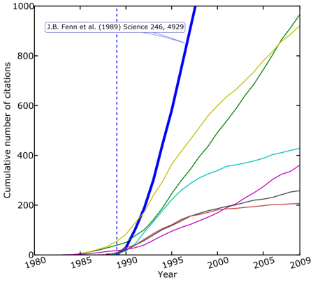
## Line Chart: Cumulative Citations Over Time for Multiple Publications
### Overview
The image is a line chart displaying the cumulative number of citations received by several academic publications over time, from 1980 to 2009. The chart highlights one specific paper, "J.B. Fenn et al. (1989) Science 246, 4929," which shows a dramatically higher citation rate compared to the others plotted. The data is presented as a series of colored lines on a white background with a black border.
### Components/Axes
* **X-Axis (Horizontal):** Labeled "Year". It spans from 1980 to 2009, with major tick marks and labels every 5 years (1980, 1985, 1990, 1995, 2000, 2005, 2009).
* **Y-Axis (Vertical):** Labeled "Cumulative number of citations". It spans from 0 to 1000, with major tick marks and labels every 200 units (0, 200, 400, 600, 800, 1000).
* **Annotation:** Located in the top-left quadrant of the chart area. It contains the text "J.B. Fenn et al. (1989) Science 246, 4929" with a light blue arrow pointing down and to the right, indicating the corresponding data line.
* **Vertical Reference Line:** A dashed blue vertical line is positioned at the year 1989, aligning with the publication year of the annotated paper.
* **Data Series (Lines):** There are seven distinct colored lines representing different publications. A legend is **not visible** in the provided image, so the specific identities of the papers corresponding to each color (other than the annotated one) are unknown.
### Detailed Analysis
The chart plots the growth in citation count for each paper as a function of time. All lines start at or near zero citations before their respective publication dates and show non-decreasing, cumulative trends.
1. **Thick Blue Line (Annotated Paper - J.B. Fenn et al., 1989):**
* **Trend:** This line exhibits the steepest and most sustained upward slope of all series. It begins its ascent around 1989-1990.
* **Data Points (Approximate):**
* 1990: ~50 citations
* 1995: ~500 citations
* 2000: ~1000+ citations (exceeds the top of the y-axis scale before 2000)
* **Spatial Grounding:** The annotation arrow in the top-left points directly to this line. It is the most prominent line due to its thickness and color.
2. **Yellow/Gold Line:**
* **Trend:** Shows a strong, steady upward slope, second only to the blue line.
* **Data Points (Approximate):** Starts rising in the mid-1980s. Reaches ~200 by 1995, ~600 by 2000, and ends near ~950 by 2009.
3. **Green Line:**
* **Trend:** Also shows a strong, steady upward slope, very similar in trajectory to the yellow line but slightly lower.
* **Data Points (Approximate):** Starts rising around 1990. Reaches ~150 by 1995, ~500 by 2000, and ends near ~900 by 2009.
4. **Cyan/Light Blue Line:**
* **Trend:** Shows a moderate, steady upward slope.
* **Data Points (Approximate):** Starts rising in the mid-1980s. Reaches ~100 by 1995, ~300 by 2000, and ends near ~420 by 2009.
5. **Magenta/Pink Line:**
* **Trend:** Shows a moderate upward slope, beginning later than most others.
* **Data Points (Approximate):** Starts rising around 1990. Reaches ~50 by 1995, ~200 by 2000, and ends near ~350 by 2009.
6. **Brown Line:**
* **Trend:** Shows a shallow upward slope, flattening significantly after 2000.
* **Data Points (Approximate):** Starts rising in the mid-1980s. Reaches ~100 by 1995, ~200 by 2000, and ends near ~200 by 2009 (showing very little growth in the final decade).
7. **Gray Line:**
* **Trend:** Shows a shallow upward slope, similar to the brown line.
* **Data Points (Approximate):** Starts rising around 1990. Reaches ~50 by 1995, ~150 by 2000, and ends near ~250 by 2009.
### Key Observations
* **Dominant Outlier:** The paper by Fenn et al. (1989) is a clear outlier, accumulating citations at a rate far exceeding the other six papers shown. Its line crosses the 1000-citation mark before the year 2000, while the next closest papers (yellow, green) approach that level only by 2009.
* **Growth Phases:** Most lines show an inflection point around 1990-1995 where the rate of citation accumulation increases. The brown line is notable for plateauing after approximately 2000.
* **Clustering:** The yellow and green lines follow very similar trajectories. The cyan, magenta, brown, and gray lines form a lower cluster with more modest cumulative totals.
* **Missing Legend:** The absence of a legend is a critical limitation, preventing the association of the yellow, green, cyan, magenta, brown, and gray lines with specific publications.
### Interpretation
This chart is a classic representation of citation impact in scientific literature. It visually demonstrates the concept of a "seminal paper" or "breakthrough study." The Fenn et al. (1989) paper, which is for the development of electrospray ionization for mass spectrometry (a fact known from external context but not stated in the image), exhibits the characteristic "hockey stick" growth curve of a highly influential work that opened a new field or enabled widespread technological adoption.
The other lines likely represent important but less transformative papers within the same or related fields. Their varying slopes and final totals illustrate the natural hierarchy of impact in academia. The vertical line at 1989 serves as a temporal anchor, emphasizing that the explosive growth of the Fenn paper began immediately after its publication. The chart effectively argues, through pure data visualization, that the 1989 *Science* paper had an exceptional and outsized influence on its field compared to its contemporaries shown here. The primary investigative reading is one of comparative impact and the identification of a landmark publication through its bibliometric footprint.