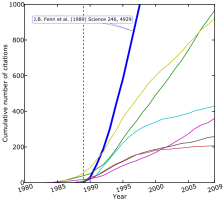
## Line Chart: Cumulative Citations Over Time
### Overview
The chart displays cumulative citation counts for six distinct studies or publications over a 30-year period (1980–2009). Each colored line represents a unique data series, with a vertical dashed line marking the year 1990 as a reference point.
---
### Components/Axes
- **X-axis (Horizontal)**: Labeled "Year," with markers at 1980, 1985, 1990, 1995, 2000, 2005, and 2009.
- **Y-axis (Vertical)**: Labeled "Cumulative number of citations," scaled from 0 to 1000 in increments of 200.
- **Legend**: Located in the top-left corner, associating six colors with specific studies:
- Blue: J.B. Fenn et al. (1989) Science 246, 4929
- Yellow: Unlabeled (likely a second study)
- Green: Unlabeled (third study)
- Cyan: Unlabeled (fourth study)
- Red: Unlabeled (fifth study)
- Gray: Unlabeled (sixth study)
---
### Detailed Analysis
1. **Blue Line (J.B. Fenn et al.)**:
- **Trend**: Sharp upward trajectory starting ~1990, reaching ~800 citations by 2009.
- **Key Points**:
- 1990: ~10 citations
- 1995: ~300 citations
- 2000: ~600 citations
- 2005: ~750 citations
- 2009: ~800 citations
2. **Yellow Line**:
- **Trend**: Gradual rise beginning ~1995, surpassing all other lines by 2009 (~900 citations).
- **Key Points**:
- 1995: ~50 citations
- 2000: ~400 citations
- 2005: ~700 citations
- 2009: ~900 citations
3. **Green Line**:
- **Trend**: Steady increase from ~1990, peaking at ~700 citations by 2009.
- **Key Points**:
- 1990: ~10 citations
- 1995: ~200 citations
- 2000: ~500 citations
- 2005: ~650 citations
- 2009: ~700 citations
4. **Cyan Line**:
- **Trend**: Slow initial growth, accelerating after 2000 to ~400 citations by 2009.
- **Key Points**:
- 1990: ~10 citations
- 1995: ~100 citations
- 2000: ~300 citations
- 2005: ~350 citations
- 2009: ~400 citations
5. **Red Line**:
- **Trend**: Minimal growth until ~2000, plateauing at ~150 citations.
- **Key Points**:
- 1990: ~10 citations
- 1995: ~50 citations
- 2000: ~150 citations
- 2005: ~150 citations
- 2009: ~150 citations
6. **Gray Line**:
- **Trend**: Moderate growth, reaching ~200 citations by 2009.
- **Key Points**:
- 1990: ~10 citations
- 1995: ~100 citations
- 2000: ~180 citations
- 2005: ~200 citations
- 2009: ~200 citations
---
### Key Observations
- **Dominant Growth**: The blue line (J.B. Fenn et al.) shows the steepest rise, suggesting rapid academic impact post-1990.
- **Late Surge**: The yellow line overtakes all others by 2009, indicating a delayed but significant citation accumulation.
- **Stagnation**: The red line remains flat after 2000, implying limited ongoing influence.
- **Dashed Line (1990)**: Coincides with the blue line’s acceleration, potentially marking a pivotal event (e.g., publication date or methodological shift).
---
### Interpretation
The data highlights divergent citation trajectories among studies. The blue line’s sharp ascent aligns with the 1990 dashed marker, suggesting J.B. Fenn et al.’s work gained critical traction around its publication year. The yellow line’s late but dominant growth may reflect delayed recognition or broader interdisciplinary adoption. The red line’s stagnation contrasts with others, possibly indicating niche relevance or limited dissemination. Overall, the chart underscores how publication timing and academic reception shape long-term scholarly impact.