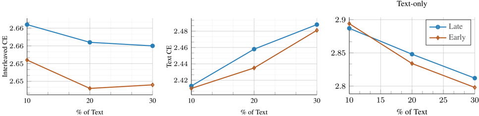
## Line Charts: Cross-Entropy (CE) vs. Percentage of Text
### Overview
This image presents three line charts comparing Cross-Entropy (CE) values for "Late" and "Early" data, plotted against the percentage of text. The charts appear to be examining the relationship between the amount of text present and the CE for different data timings.
### Components/Axes
Each chart shares the following components:
* **X-axis:** "% of Text" ranging from 10 to 30.
* **Y-axis:** The left chart is labeled "Interleaved CE", the middle chart is labeled "Text CE", and the right chart has no label.
* **Legend:** Located in the top-right corner of the rightmost chart, with two entries:
* "Late" (represented by a blue line with circle markers)
* "Early" (represented by an orange line with triangle markers)
### Detailed Analysis or Content Details
**Chart 1: Interleaved CE**
* **"Late" Line (Blue):** The line slopes downward overall.
* At 10% Text: Approximately 2.66 CE.
* At 20% Text: Approximately 2.62 CE.
* At 30% Text: Approximately 2.61 CE.
* **"Early" Line (Orange):** The line slopes downward more steeply than the "Late" line.
* At 10% Text: Approximately 2.65 CE.
* At 20% Text: Approximately 2.58 CE.
* At 30% Text: Approximately 2.53 CE.
**Chart 2: Text CE**
* **"Late" Line (Blue):** The line slopes upward overall.
* At 10% Text: Approximately 2.42 CE.
* At 20% Text: Approximately 2.45 CE.
* At 30% Text: Approximately 2.49 CE.
* **"Early" Line (Orange):** The line slopes upward, but less steeply than the "Late" line.
* At 10% Text: Approximately 2.42 CE.
* At 20% Text: Approximately 2.43 CE.
* At 30% Text: Approximately 2.46 CE.
**Chart 3: Text-only (No Y-axis label)**
* **"Late" Line (Blue):** The line slopes downward.
* At 10% Text: Approximately 2.90 CE.
* At 20% Text: Approximately 2.86 CE.
* At 30% Text: Approximately 2.82 CE.
* **"Early" Line (Orange):** The line slopes downward more steeply than the "Late" line.
* At 10% Text: Approximately 2.90 CE.
* At 20% Text: Approximately 2.85 CE.
* At 30% Text: Approximately 2.80 CE.
### Key Observations
* The "Late" and "Early" lines consistently exhibit opposite trends in the "Interleaved CE" and "Text-only" charts: "Late" is generally higher in "Text CE" and lower in "Interleaved CE" and "Text-only" than "Early".
* The "Interleaved CE" chart shows both lines decreasing with increasing percentage of text.
* The "Text CE" chart shows both lines increasing with increasing percentage of text.
* The "Text-only" chart also shows both lines decreasing with increasing percentage of text.
### Interpretation
The data suggests that the timing of the data ("Late" vs. "Early") significantly impacts the Cross-Entropy values, and this impact is modulated by the percentage of text present. The opposing trends in the "Interleaved CE" and "Text CE" charts indicate a complex interaction between the data timing, text content, and the evaluation metric.
Specifically:
* **Interleaved CE:** As the percentage of text increases, the CE decreases for both "Late" and "Early" data. This suggests that adding more text improves the model's performance when the data is interleaved.
* **Text CE:** As the percentage of text increases, the CE increases for both "Late" and "Early" data. This suggests that adding more text *decreases* the model's performance when evaluating only the text component.
* **Text-only:** Similar to "Interleaved CE", increasing the percentage of text decreases the CE.
The difference between "Late" and "Early" data suggests that the model's ability to process and learn from text changes over time. The "Late" data appears to benefit more from the addition of text in the interleaved context, while the "Early" data shows a more consistent, but less pronounced, response. The "Text-only" chart suggests that the "Early" data is more sensitive to the amount of text present.
The lack of a Y-axis label on the third chart is a minor data quality issue, but the context of the other charts allows for a reasonable interpretation.