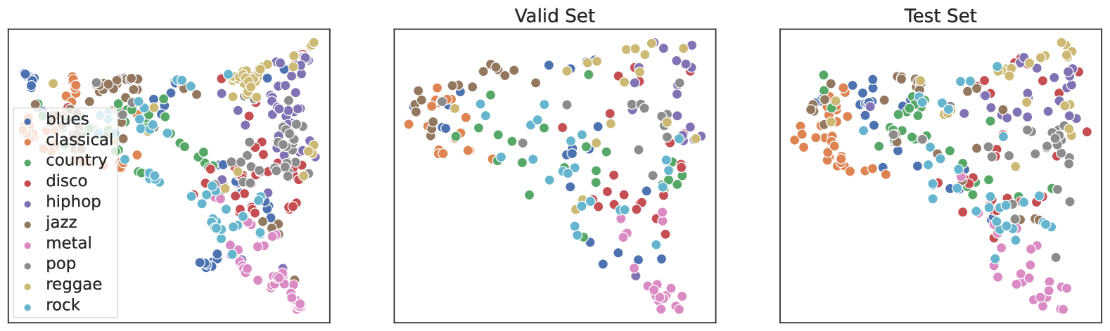
## Scatter Plots: Music Genre Distribution Across Valid and Test Sets
### Overview
The image contains three scatter plots labeled "Valid Set" and "Test Set," each displaying colored dots representing different music genres. A legend on the left maps colors to genres (e.g., blues = blue, classical = orange, etc.). The plots lack axis labels, but the spatial distribution of dots suggests clustering and variability in genre representation.
### Components/Axes
- **Legend**: Positioned in the top-left corner of the first plot, with 10 genres listed: blues, classical, country, disco, hiphop, jazz, metal, pop, reggae, rock. Colors are assigned as follows:
- Blues: Blue
- Classical: Orange
- Country: Green
- Disco: Red
- Hiphop: Purple
- Jazz: Brown
- Metal: Pink
- Pop: Gray
- Reggae: Yellow
- Rock: Cyan
- **Axes**: No explicit labels or scales are visible. The x- and y-axes appear to represent abstract dimensions (e.g., "genre similarity" or "data point density"), inferred from the clustering patterns.
### Detailed Analysis
#### Valid Set
- **Blues (Blue)**: Clustered in the top-left quadrant, with ~15–20 dots.
- **Classical (Orange)**: Concentrated in the upper-middle region, ~10–12 dots.
- **Country (Green)**: Spread across the middle-left, ~8–10 dots.
- **Disco (Red)**: Scattered in the lower-middle, ~5–7 dots.
- **Hiphop (Purple)**: Clustered in the upper-right, ~12–15 dots.
- **Jazz (Brown)**: Dispersed in the middle, ~10–12 dots.
- **Metal (Pink)**: Concentrated in the lower-right, ~8–10 dots.
- **Pop (Gray)**: Scattered throughout, ~15–20 dots.
- **Reggae (Yellow)**: Clustered in the upper-middle, ~6–8 dots.
- **Rock (Cyan)**: Spread across the lower-right, ~10–12 dots.
#### Test Set
- **Blues (Blue)**: More dispersed, with ~10–12 dots in the top-left and middle regions.
- **Classical (Orange)**: Clustered in the upper-middle, ~8–10 dots.
- **Country (Green)**: Spread across the middle-left, ~7–9 dots.
- **Disco (Red)**: Scattered in the lower-middle, ~4–6 dots.
- **Hiphop (Purple)**: Clustered in the upper-right, ~10–12 dots.
- **Jazz (Brown)**: Dispersed in the middle, ~9–11 dots.
- **Metal (Pink)**: Concentrated in the lower-right, ~7–9 dots.
- **Pop (Gray)**: Scattered throughout, ~12–15 dots.
- **Reggae (Yellow)**: Clustered in the upper-middle, ~5–7 dots.
- **Rock (Cyan)**: Spread across the lower-right, ~9–11 dots.
### Key Observations
1. **Clustering vs. Spread**: The Valid Set shows tighter clustering for genres like blues, hiphop, and pop, while the Test Set exhibits broader dispersion, suggesting greater variability in the test data.
2. **Genre Prevalence**: Pop and blues dominate both sets, with pop appearing most frequently in the Test Set.
3. **Outliers**: Disco and reggae have fewer data points in both sets, indicating underrepresentation.
4. **Spatial Trends**: In the Valid Set, blues and hiphop are tightly grouped, while in the Test Set, blues are more spread out, possibly reflecting a larger or more diverse dataset.
### Interpretation
The scatter plots likely visualize the distribution of music genres in two distinct datasets (Valid and Test). The Valid Set’s clustering may indicate a smaller, more homogeneous sample, while the Test Set’s spread suggests broader coverage or higher diversity. The lack of axis labels limits quantitative analysis, but the visual patterns imply that the Test Set could be designed to test model generalization across varied genre representations. Outliers like disco and reggae highlight potential gaps in data collection or model training.