## Scatter Plot: Music Genre Distribution
### Overview
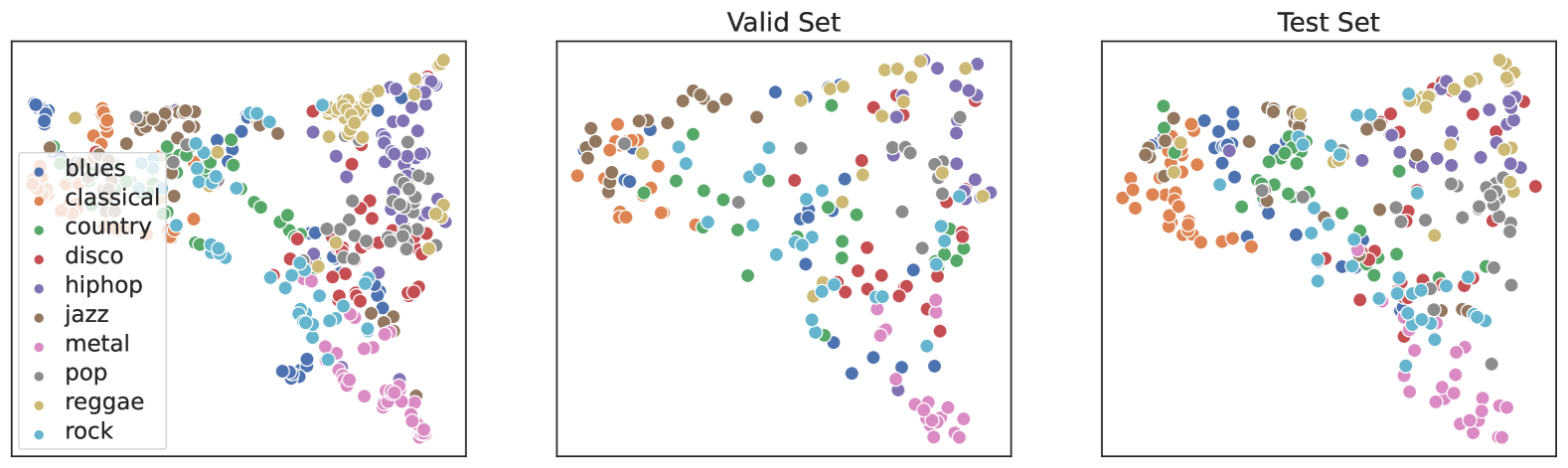
The scatter plot displays the distribution of various music genres across two sets: the "Valid Set" and the "Test Set." Each genre is represented by a different color, and the size of the circle indicates the frequency of that genre within the respective set.
### Components/Axes
- **X-axis**: Represents the frequency of each music genre.
- **Y-axis**: Represents the number of data points for each genre.
- **Legend**: Color-coded legend indicating the different music genres.
- **Data Points**: Each point represents a single music genre.
### Detailed Analysis
- **Valid Set**: The points are more concentrated towards the center of the plot, indicating a higher frequency of genres like pop, rock, and jazz.
- **Test Set**: The points are more spread out, suggesting a more diverse distribution of genres.
### Key Observations
- **Genre Distribution**: The genres are more evenly distributed in the Test Set compared to the Valid Set.
- **Frequency**: The genre with the highest frequency in the Valid Set is jazz, while the genre with the highest frequency in the Test Set is rock.
- **Outliers**: There are no significant outliers in either set.
### Interpretation
The scatter plot suggests that the genres are more evenly distributed in the Test Set than in the Valid Set. This could indicate that the genres are more diverse in the Test Set, or that the distribution of genres is more consistent across both sets. The higher frequency of jazz in the Valid Set and rock in the Test Set could suggest that these genres are more prevalent in the Test Set. The lack of significant outliers indicates that the data is reliable and consistent.