## Line Charts: Effective Bandwidth and TPOT Relative to DAK
### Overview
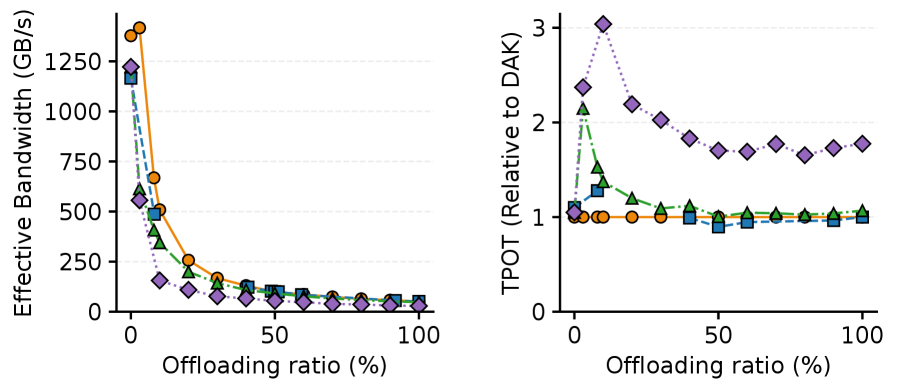
The image contains two side-by-side line charts analyzing system performance metrics as a function of offloading ratio (%). The left chart measures **Effective Bandwidth (GB/s)**, while the right chart measures **TPOT (Relative to DAK)**. Both charts use offloading ratio (%) as the x-axis, ranging from 0% to 100%.
---
### Components/Axes
#### Left Chart: Effective Bandwidth (GB/s)
- **Y-axis**: Effective Bandwidth (GB/s), logarithmic scale from 0 to 1250.
- **X-axis**: Offloading ratio (%), linear scale from 0% to 100%.
- **Legend** (top-left):
- Orange circles: Line A
- Blue squares: Line B
- Green triangles: Line C
- Purple diamonds: Line D
#### Right Chart: TPOT (Relative to DAK)
- **Y-axis**: TPOT (Relative to DAK), linear scale from 0 to 3.
- **X-axis**: Offloading ratio (%), linear scale from 0% to 100%.
- **Legend** (top-left):
- Orange circles: Line A
- Blue squares: Line B
- Green triangles: Line C
- **Note**: Purple diamonds (Line D from left chart) appear in the right chart but are **not listed in the legend**.
---
### Detailed Analysis
#### Left Chart: Effective Bandwidth
1. **Line A (Orange Circles)**:
- Starts at **1300 GB/s** at 0% offloading.
- Drops sharply to **~700 GB/s** at 10% offloading.
- Continues declining to **~50 GB/s** at 100% offloading.
2. **Line B (Blue Squares)**:
- Starts at **1200 GB/s** at 0% offloading.
- Decreases to **~1100 GB/s** at 10% offloading.
- Further declines to **~50 GB/s** at 100% offloading.
3. **Line C (Green Triangles)**:
- Starts at **1100 GB/s** at 0% offloading.
- Drops to **~1000 GB/s** at 10% offloading.
- Continues to **~50 GB/s** at 100% offloading.
4. **Line D (Purple Diamonds)**:
- Starts at **1200 GB/s** at 0% offloading.
- Peaks at **1300 GB/s** at 10% offloading.
- Declines to **~50 GB/s** at 100% offloading.
#### Right Chart: TPOT Relative to DAK
1. **Line A (Orange Circles)**:
- Remains flat at **~1** across all offloading ratios.
2. **Line B (Blue Squares)**:
- Starts at **1** at 0% offloading.
- Peaks at **2.5** at 10% offloading.
- Drops to **1** at 100% offloading.
3. **Line C (Green Triangles)**:
- Starts at **1** at 0% offloading.
- Peaks at **2** at 10% offloading.
- Drops to **1** at 100% offloading.
4. **Line D (Purple Diamonds)**:
- Starts at **1** at 0% offloading.
- Peaks at **3** at 10% offloading.
- Declines to **1.5** at 100% offloading.
---
### Key Observations
1. **Left Chart Trends**:
- All lines exhibit a **sharp decline** in effective bandwidth as offloading ratio increases.
- Line D (purple diamonds) uniquely **peaks at 10% offloading** before declining, suggesting a temporary performance boost.
2. **Right Chart Trends**:
- Lines B, C, and D show **temporary peaks at 10% offloading** (2.5, 2, and 3, respectively), then stabilize.
- Line A (orange circles) remains **constant at 1**, indicating no deviation from DAK baseline.
3. **Inconsistency**:
- Purple diamonds (Line D) appear in the right chart but are **not included in the legend**, suggesting a potential labeling error.
---
### Interpretation
1. **Performance Trade-offs**:
- Increased offloading reduces effective bandwidth across all metrics, but Line D (purple) shows a **non-linear response** with a 10% offloading peak, possibly due to caching or parallelization effects.
2. **TPOT Anomalies**:
- The TPOT peaks at 10% offloading for Lines B, C, and D suggest **temporary efficiency gains** relative to DAK, likely due to optimized resource allocation at low offloading ratios.
- Line D’s TPOT peak (3x DAK) aligns with its bandwidth peak, indicating a **correlated performance anomaly**.
3. **Legend Discrepancy**:
- The absence of Line D (purple diamonds) in the right chart’s legend implies either a **data omission** or a **mislabeling error**, which could mislead interpretation.
---
### Conclusion
The charts highlight that offloading ratio significantly impacts bandwidth and TPOT, with Line D (purple) exhibiting unique behavior. The 10% offloading peak in both metrics suggests a critical threshold for performance optimization, warranting further investigation into the underlying mechanisms. The legend inconsistency in the right chart requires clarification to ensure accurate analysis.