# Technical Document Extraction: Performance Heatmap Analysis
## 1. Document Overview
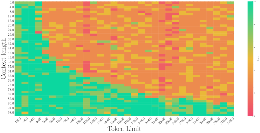
This image is a technical heatmap chart visualizing the relationship between two variables—**Token Limit** and **Context Length**—and their resulting **Score**. The chart uses a color gradient to represent performance levels across a 32x26 grid of data points.
## 2. Component Isolation
### A. Header / Metadata
* **Language:** English.
* **Title:** None explicitly provided in the image.
### B. Main Chart Area (Data Visualization)
* **Type:** Heatmap.
* **X-Axis (Horizontal):** Labeled "**Token Limit**".
* **Range:** 1,000 to 32,000.
* **Intervals:** Increments of 1,000 (32 distinct columns).
* **Y-Axis (Vertical):** Labeled "**Context length**".
* **Range:** 0.0 to 98.0.
* **Intervals:** Non-uniform increments (0.0, 4.0, 8.0, 12.0, 16.0, 20.0, 24.0, 29.0, 33.0, 37.0, 41.0, 45.0, 49.0, 53.0, 57.0, 61.0, 65.0, 69.0, 73.0, 78.0, 82.0, 86.0, 90.0, 94.0, 98.0). There are 26 distinct rows.
### C. Legend (Spatial Grounding: Right Side [x=far right, y=centered])
* **Label:** "Score"
* **Scale:** 0 to 10.
* **Color Mapping:**
* **10 (Top):** Bright Teal/Green (High Performance).
* **8:** Light Green.
* **6:** Yellow/Gold.
* **4:** Orange.
* **2:** Light Red/Coral.
* **0 (Bottom):** Deep Pink/Magenta (Low Performance).
---
## 3. Trend Verification and Data Analysis
### Visual Trend Description
The heatmap displays a distinct diagonal "frontier" or boundary.
* **High Score Region (Teal/Green):** Concentrated in the bottom-left quadrant. This indicates that high scores are achieved when the **Token Limit** is low and the **Context length** is high, or when both are relatively low.
* **Low Score Region (Orange/Red):** Concentrated in the top-right quadrant. As the **Token Limit** increases (moving right) and the **Context length** decreases (moving up), the performance score generally degrades.
* **Degradation Pattern:** The transition from Teal (10) to Orange (4) is sharpest along a diagonal line starting roughly at [Token Limit: 5000, Context length: 0.0] and ending at [Token Limit: 32000, Context length: 90.0].
### Key Data Observations
1. **Stability Zone:** For Token Limits between 1,000 and 4,000, the score remains consistently high (Teal, Score ~10) across almost all Context lengths.
2. **The "Cliff":** At a Token Limit of 5,000, there is a significant drop-off in performance for Context lengths above 45.0.
3. **Anomalies:**
* There are scattered "noise" pixels of yellow/green within the orange field (e.g., at Token Limit 29,000, Context length 45.0).
* There are scattered "noise" pixels of red (Score ~2) primarily in the center-right of the chart (e.g., Token Limit 11,000, Context length 57.0).
4. **Bottom Edge Performance:** Interestingly, at the very highest Context lengths (94.0 - 98.0), the model maintains a high score (Teal) even as the Token Limit increases up to approximately 20,000, before becoming more erratic.
---
## 4. Data Table Reconstruction (Representative Sample)
Due to the 32x26 grid size (832 data points), a representative sample of the corners and center is provided:
| Context Length \ Token Limit | 1,000 | 8,000 | 16,000 | 24,000 | 32,000 |
| :--- | :--- | :--- | :--- | :--- | :--- |
| **0.0** | Teal (10) | Orange (4) | Orange (4) | Orange (4) | Orange (4) |
| **24.0** | Teal (10) | Orange (4) | Orange (4) | Orange (4) | Orange (4) |
| **49.0** | Teal (10) | Orange (4) | Yellow (6) | Orange (4) | Orange (4) |
| **73.0** | Teal (10) | Teal (10) | Orange (4) | Orange (4) | Orange (4) |
| **98.0** | Teal (10) | Teal (10) | Teal (10) | Teal (10) | Teal (10) |
---
## 5. Summary of Findings
The chart illustrates a performance trade-off. The system performs optimally (Score 10) in a "safe zone" defined by lower token limits or very high context lengths. There is a large "failure zone" (Score 4) occupying the upper-right majority of the graph, where increasing the token limit while maintaining a low-to-mid context length results in significantly lower scores.