## Chart Type: Probability Distribution Shift with Quantile Comparison
### Overview
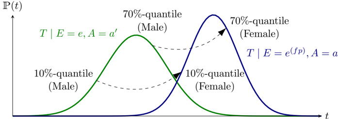
This image displays two bell-shaped probability distribution curves, one green and one blue, plotted against a horizontal axis `t` and a vertical axis `P(t)`. The chart illustrates a shift in the distribution of a variable `T` under different conditions, explicitly comparing the 10% and 70% quantiles between what are labeled as "Male" and "Female" distributions. Dashed arrows visually connect corresponding quantiles across the two distributions, highlighting the shift.
### Components/Axes
* **X-axis Label**: `t` (positioned at the bottom-right of the axis).
* **Y-axis Label**: `P(t)` (positioned at the top-left of the axis).
* **Green Curve Label (top-left, above the green curve)**: `T | E = e, A = a'`
* **Blue Curve Label (top-right, above the blue curve)**: `T | E = e^(fp), A = a`
### Detailed Analysis
The chart presents two distinct probability distributions:
1. **Green Distribution (Left Curve)**:
* **Associated Label**: `T | E = e, A = a'`
* **Visual Trend**: This curve is bell-shaped, rising from the left, peaking approximately in the left-center region of the chart, and then falling back towards the x-axis on the right. It represents a distribution centered at a lower `t` value.
* **Quantile Markers**:
* **10%-quantile (Male)**: Located on the rising left slope of the green curve, approximately at `t` value of 0.2-0.3 relative to the chart's width. The text "10%-quantile (Male)" is positioned to the left and slightly below this point.
* **70%-quantile (Male)**: Located on the falling right slope of the green curve, approximately at `t` value of 0.4-0.5 relative to the chart's width. The text "70%-quantile (Male)" is positioned above and slightly to the left of this point.
2. **Blue Distribution (Right Curve)**:
* **Associated Label**: `T | E = e^(fp), A = a`
* **Visual Trend**: This curve is also bell-shaped, rising from the left, peaking approximately in the right-center region of the chart, and then falling back towards the x-axis on the far right. It is visibly shifted to the right compared to the green curve, indicating a distribution centered at a higher `t` value.
* **Quantile Markers**:
* **10%-quantile (Female)**: Located on the rising left slope of the blue curve, approximately at `t` value of 0.4-0.5 relative to the chart's width. The text "10%-quantile (Female)" is positioned below and slightly to the left of this point.
* **70%-quantile (Female)**: Located on the falling right slope of the blue curve, approximately at `t` value of 0.6-0.7 relative to the chart's width. The text "70%-quantile (Female)" is positioned above and slightly to the left of this point.
3. **Connecting Arrows**:
* A dashed arrow originates from the `10%-quantile (Male)` on the green curve and points towards the `10%-quantile (Female)` on the blue curve. This arrow indicates a shift to a higher `t` value for the 10% quantile.
* Another dashed arrow originates from the `70%-quantile (Male)` on the green curve and points towards the `70%-quantile (Female)` on the blue curve. This arrow also indicates a shift to a higher `t` value for the 70% quantile.
### Key Observations
* The green curve is associated with "Male" quantiles, and the blue curve with "Female" quantiles.
* The blue distribution (Female) is shifted to the right along the `t`-axis relative to the green distribution (Male). This means that for any given probability quantile, the corresponding `t` value is higher for the "Female" distribution.
* The peak of the "Female" distribution occurs at a higher `t` value than the peak of the "Male" distribution.
* The dashed arrows explicitly demonstrate that both the 10% and 70% quantiles for the "Female" distribution occur at greater `t` values than their "Male" counterparts.
### Interpretation
This chart illustrates a scenario where the distribution of a variable `T` (likely representing time or some other continuous quantity) differs significantly between two groups, labeled "Male" and "Female," or under two different sets of conditions.
The green curve, representing `T` under conditions `E=e, A=a'`, is associated with "Male" quantiles. The blue curve, representing `T` under conditions `E=e^(fp), A=a'`, is associated with "Female" quantiles. The notation `T | E = e, A = a'` suggests a conditional probability distribution, where `T` is dependent on variables `E` and `A`. The change from `e` to `e^(fp)` and `a'` to `a` signifies a change in these underlying conditions or parameters that define the distribution.
The most prominent finding is the rightward shift of the "Female" distribution relative to the "Male" distribution. This indicates that, on average, the values of `T` are higher for the "Female" group or under the `E=e^(fp), A=a` conditions. For instance, the 10% of "Male" individuals (or instances under `E=e, A=a'`) have `T` values up to a certain point, but 10% of "Female" individuals (or instances under `E=e^(fp), A=a`) have `T` values up to a *higher* point. The same pattern holds for the 70% quantile.
In a practical context, if `T` represents a time duration (e.g., time to complete a task, time to onset of an event), this chart suggests that "Females" (or the second set of conditions) tend to have longer durations for `T` compared to "Males" (or the first set of conditions). If `T` represents a score or a measurement, it implies "Females" tend to have higher scores/measurements. The explicit labeling of quantiles and the connecting arrows emphasize that this shift is consistent across different parts of the distribution, not just the mean or median. The use of `e^(fp)` suggests a potential exponential relationship or a transformation of the variable `E` for the "Female" group, implying a specific mathematical relationship driving the observed difference.