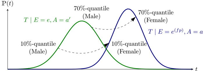
## Chart/Diagram Type: Probability Distribution Curves
### Overview
The image presents two probability distribution curves, one green and one blue, representing male and female distributions respectively. The x-axis represents time (t), and the y-axis represents probability P(t). The curves are labeled with quantiles and conditional probabilities.
### Components/Axes
* **X-axis:** Labeled as "t" (time).
* **Y-axis:** Labeled as "P(t)" (probability).
* **Green Curve:** Represents the distribution for males.
* Labeled "T | E = e, A = a'"
* "10%-quantile (Male)" is located on the left side of the green curve.
* "70%-quantile (Male)" is located near the peak of the green curve.
* **Blue Curve:** Represents the distribution for females.
* Labeled "T | E = e^(fp), A = a"
* "10%-quantile (Female)" is located on the left side of the blue curve.
* "70%-quantile (Female)" is located near the peak of the blue curve.
* **Dashed Arrows:** Two dashed arrows connect the 10% and 70% quantiles of the male and female distributions.
### Detailed Analysis or Content Details
* **Green Curve (Male):**
* The green curve starts near P(t) = 0 at a low 't' value, rises to a peak, and then decreases back to near P(t) = 0 at a higher 't' value.
* The peak of the green curve (70%-quantile) is located at approximately t = 2.
* **Blue Curve (Female):**
* The blue curve starts near P(t) = 0 at a low 't' value, rises to a peak, and then decreases back to near P(t) = 0 at a higher 't' value.
* The peak of the blue curve (70%-quantile) is located at approximately t = 4.
* **10%-quantile (Male):** Located at approximately t = 1.
* **10%-quantile (Female):** Located at approximately t = 3.
* **Dashed Arrows:**
* One arrow points from the 70%-quantile (Male) to the 70%-quantile (Female).
* The other arrow points from the 10%-quantile (Male) to the 10%-quantile (Female).
### Key Observations
* The female distribution (blue curve) is shifted to the right (higher 't' values) compared to the male distribution (green curve).
* The peaks of the distributions (70%-quantiles) are separated by approximately 2 units on the 't' axis.
* The 10%-quantiles are also separated by approximately 2 units on the 't' axis.
### Interpretation
The chart illustrates the probability distributions of a variable 't' for males and females. The shift of the female distribution to the right suggests that, on average, females have higher values of 't' compared to males. The dashed arrows connecting the quantiles highlight the difference in the distributions between the two groups. The conditional probabilities "T | E = e, A = a'" and "T | E = e^(fp), A = a" likely represent the probability of 't' given certain conditions 'E' and 'A', which differ between males and females. The specific meaning of 'E' and 'A' is not provided in the image.