\n
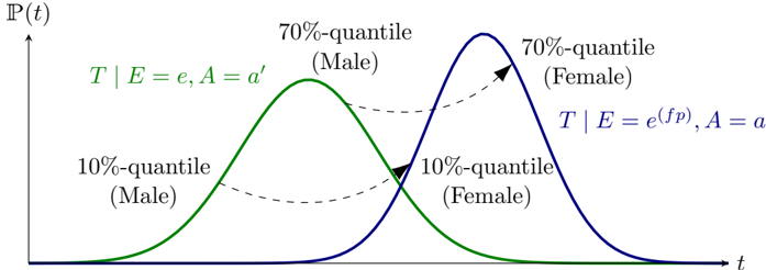
## Diagram: Probability Distribution Comparison - Male vs. Female
### Overview
The image presents a diagram comparing probability distributions for two groups: Male and Female. The distributions are represented by bell-shaped curves, indicating a normal distribution. The diagram highlights the 10th and 70th percentile values for each group along the time axis. The diagram is a visual representation of how the probability of an event occurring changes over time for each group.
### Components/Axes
* **Y-axis:** Labeled "P(t)", representing probability as a function of time. The scale is not explicitly marked, but it appears to be linear and positive.
* **X-axis:** Labeled "t", representing time. The scale is not explicitly marked, but it appears to be linear.
* **Curves:** Two bell-shaped curves are present:
* Green curve: Represents the distribution for "Male".
* Blue curve: Represents the distribution for "Female".
* **Labels:**
* "T | E = e, A = a'" (above the green curve)
* "T | E = e(fp), A = a" (above the blue curve)
* "70%-quantile (Male)" - points to the peak of the green curve.
* "70%-quantile (Female)" - points to the peak of the blue curve.
* "10%-quantile (Male)" - points to the left tail of the green curve.
* "10%-quantile (Female)" - points to the left tail of the blue curve.
* **Dashed Lines:** Dashed lines connect the 10th and 70th percentile points for each gender, visually comparing their spread.
### Detailed Analysis or Content Details
The green curve (Male) is centered slightly to the left of the blue curve (Female). This indicates that the peak probability for the event occurring is at a lower time value for males compared to females.
* **Male Distribution:**
* The 10th percentile appears to be at approximately t = 1.5.
* The 70th percentile appears to be at approximately t = 4.5.
* **Female Distribution:**
* The 10th percentile appears to be at approximately t = 2.5.
* The 70th percentile appears to be at approximately t = 6.5.
The female distribution appears to have a wider spread than the male distribution, as indicated by the larger distance between the 10th and 70th percentiles.
### Key Observations
* The distributions are both approximately normal, as indicated by their bell shapes.
* The male distribution is shifted to the left, suggesting an earlier peak probability.
* The female distribution is wider, indicating greater variability.
* The dashed lines visually emphasize the difference in the spread of the distributions.
### Interpretation
The diagram suggests that the event being modeled has a different timing and variability for males and females. The shift in the male distribution to the left implies that males tend to experience the event earlier in time. The wider spread of the female distribution suggests that there is more variation in the timing of the event for females.
The labels "T | E = e, A = a'" and "T | E = e(fp), A = a" suggest that the distributions are conditional probabilities. "T" likely represents time, "E" represents evidence, "A" represents age, and "fp" likely stands for false positive. The labels indicate that the probability of time is conditional on evidence and age, with different parameters for males and females. The diagram is likely illustrating a difference in the timing of an event based on gender, potentially related to a biological or physiological process. The use of quantiles (10th and 70th) allows for a comparison of the distributions beyond just their central tendency.