## Probability Density Function Chart: Gender-Based Quantile Comparison
### Overview
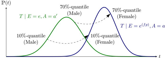
The image displays a statistical chart comparing two probability density functions (PDFs) for a variable `t`. The chart illustrates how the distribution of `t` differs between two groups (labeled "Male" and "Female") under specific conditional parameters. The visual focus is on the shift between distributions and the comparison of corresponding quantiles (10% and 70%) across the two groups.
### Components/Axes
* **X-axis:** Labeled `t`. Represents the continuous variable being measured. No numerical markers or scale are provided.
* **Y-axis:** Labeled `P(t)`. Represents the probability density of the variable `t`. No numerical markers or scale are provided.
* **Data Series (Curves):**
1. **Green Curve:** Labeled `T | E = e, A = a'`. This represents the conditional probability distribution of `T` given event `E = e` and attribute `A = a'`. Visually associated with the "Male" group.
2. **Blue Curve:** Labeled `T | E = e^(fp), A = a`. This represents the conditional probability distribution of `T` given event `E = e^(fp)` and attribute `A = a`. Visually associated with the "Female" group.
* **Annotations & Legend:**
* **Quantile Labels:** Four text annotations identify specific quantiles on the curves.
* `10%-quantile (Male)`: Positioned on the left tail of the green curve.
* `70%-quantile (Male)`: Positioned on the right side of the green curve's peak.
* `10%-quantile (Female)`: Positioned on the left tail of the blue curve.
* `70%-quantile (Female)`: Positioned on the right side of the blue curve's peak.
* **Dashed Arrows:** Two dashed, curved arrows connect corresponding quantiles between the two distributions.
* One arrow connects the `10%-quantile (Male)` to the `10%-quantile (Female)`.
* Another arrow connects the `70%-quantile (Male)` to the `70%-quantile (Female)`.
* Both arrows point from the green (Male) curve to the blue (Female) curve, indicating a directional comparison or shift.
### Detailed Analysis
* **Distribution Shapes:** Both curves are unimodal and roughly bell-shaped, resembling normal or similar distributions.
* **Relative Positioning:** The green curve (Male) is positioned to the left of the blue curve (Female). This indicates that, for the same probability density, the values of `t` are generally lower for the Male group compared to the Female group under the given conditions.
* **Peak Height & Spread:** The blue curve (Female) has a higher peak and appears slightly narrower than the green curve (Male). This suggests the Female distribution has a higher mode and potentially lower variance.
* **Quantile Comparison (Visual Trend):** The dashed arrows explicitly show that for both the 10th and 70th percentiles, the corresponding value of `t` is higher for the Female distribution than for the Male distribution. The shift appears consistent across the distribution.
### Key Observations
1. **Systematic Shift:** There is a clear, systematic rightward shift from the Male (green) distribution to the Female (blue) distribution. This shift is visualized at multiple points (10% and 70% quantiles).
2. **Conditional Parameters:** The labels specify different conditions for each group: `E = e, A = a'` for Male vs. `E = e^(fp), A = a` for Female. The difference in these conditions (`e` vs. `e^(fp)` and `a'` vs. `a`) is presented as the cause for the differing distributions of `T`.
3. **Lack of Numerical Scale:** The chart is conceptual. It demonstrates a relationship and direction of effect but does not provide specific numerical values for `t` or `P(t)`.
### Interpretation
This chart is a conceptual model used to illustrate a **causal or statistical disparity** between two groups (Male and Female) regarding an outcome variable `T`. The core message is that the conditions experienced by the Female group (`E = e^(fp), A = a`) lead to a distribution of outcomes `T` that is shifted to higher values compared to the conditions of the Male group (`E = e, A = a'`).
* **What it Demonstrates:** It visually argues that the difference in outcomes is not just a change in average but a shift across the entire distribution, as evidenced by the comparison at both the lower (10%) and upper (70%) tails. The higher peak for the Female curve may also imply more consistency or concentration around a higher modal value.
* **Relationship Between Elements:** The dashed arrows are critical. They don't just point to quantiles; they map the *same statistical point* (e.g., the value below which 10% of the data falls) from one group's reality to the other's. This emphasizes that the entire experience of the variable `T` is different.
* **Notable Implications:** The chart is likely used in contexts like sociology, economics, or medicine to argue that observed differences between groups are attributable to specific, differing conditions (`E` and `A` parameters) rather than inherent group characteristics. The use of formal probability notation (`T | E = e, A = a'`) grounds the argument in a statistical or causal inference framework. The absence of numbers focuses the viewer on the qualitative nature of the shift.