## Bar Chart: Country Data Distribution by Original and Translated Counts
### Overview
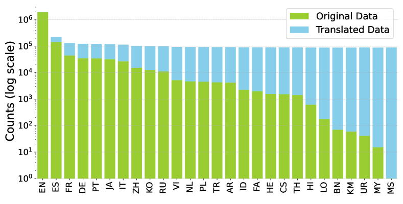
The image is a vertical bar chart comparing two data series across 26 country codes (e.g., EN, ES, FR). The y-axis uses a logarithmic scale (10⁰ to 10⁶) to represent counts, while the x-axis lists country codes in alphabetical order. Two data series are distinguished by color: green for "Original Data" and blue for "Translated Data." The legend is positioned in the top-right corner.
### Components/Axes
- **X-axis**: Country codes (EN, ES, FR, DE, PT, JA, IT, ZH, KO, RU, VI, NL, PL, TR, AR, ID, FA, HE, CS, TH, HI, LO, BN, KM, UR, MY, MS).
- **Y-axis**: Counts on a logarithmic scale (10⁰ to 10⁶).
- **Legend**: Top-right corner, with green labeled "Original Data" and blue labeled "Translated Data."
- **Bars**: Green bars represent Original Data; blue bars represent Translated Data.
### Detailed Analysis
1. **Original Data (Green)**:
- Starts at ~10⁶ for EN (highest value).
- Declines steadily across countries, reaching ~10¹ for MY and MS.
- Notable drops: EN (~10⁶) → ES (~10⁵) → FR (~10⁴) → DE (~10⁴) → PT (~10⁴) → JA (~10⁴) → IT (~10⁴) → ZH (~10³) → KO (~10³) → RU (~10³) → VI (~10³) → NL (~10³) → PL (~10³) → TR (~10³) → AR (~10³) → ID (~10³) → FA (~10³) → HE (~10³) → CS (~10³) → TH (~10³) → HI (~10²) → LO (~10²) → BN (~10¹) → KM (~10¹) → UR (~10¹) → MY (~10¹) → MS (~10¹).
2. **Translated Data (Blue)**:
- Starts at ~10⁵ for EN (second-highest value).
- Increases progressively across countries, peaking at ~10⁶ for MS.
- Notable rises: EN (~10⁵) → ES (~10⁴) → FR (~10⁴) → DE (~10⁴) → PT (~10⁴) → JA (~10⁴) → IT (~10⁴) → ZH (~10³) → KO (~10³) → RU (~10³) → VI (~10³) → NL (~10³) → PL (~10³) → TR (~10³) → AR (~10³) → ID (~10³) → FA (~10³) → HE (~10³) → CS (~10³) → TH (~10³) → HI (~10³) → LO (~10³) → BN (~10³) → KM (~10³) → UR (~10³) → MY (~10³) → MS (~10⁶).
### Key Observations
- **EN Dominance**: EN has the highest Original Data (~10⁶) and second-highest Translated Data (~10⁵).
- **Translated Data Growth**: Translated Data increases exponentially from EN to MS, with MS showing the largest Translated Data (~10⁶).
- **Original Data Decline**: Original Data decreases by ~5 orders of magnitude from EN to MS.
- **Log Scale Impact**: The logarithmic y-axis emphasizes exponential differences (e.g., EN Original Data is 10× larger than ES).
### Interpretation
- **Language Prevalence**: The data suggests Original Data is concentrated in English-speaking countries (EN, ES, FR), while Translated Data grows in non-English countries (e.g., MS, MY).
- **Translation Demand**: Translated Data surpasses Original Data in later countries (e.g., MS), indicating higher reliance on translation in these regions.
- **Data Skew**: The log scale reveals stark disparities (e.g., EN Original Data is 10× larger than ES, despite similar bar heights).
- **MS Anomaly**: MS has the lowest Original Data (~10¹) but the highest Translated Data (~10⁶), suggesting a critical need for translation in this region.
### Spatial Grounding
- Legend: Top-right corner, clearly associating green with Original Data and blue with Translated Data.
- Bar Alignment: Country codes are evenly spaced on the x-axis; bars are grouped by country, with green and blue bars stacked vertically.
### Trend Verification
- Original Data: Consistent downward slope (logarithmic decline).
- Translated Data: Steady upward slope (logarithmic growth), with a sharp increase in MS.
### Content Details
- **EN**: Original Data ~10⁶, Translated Data ~10⁵.
- **MS**: Original Data ~10¹, Translated Data ~10⁶.
- **Intermediate Countries**: Original Data ~10³–10⁴; Translated Data ~10³–10⁴.
### Final Notes
The chart highlights a stark contrast between Original and Translated Data distributions, likely reflecting language-specific data generation or translation requirements. The logarithmic scale is critical for visualizing the exponential scale of counts.