## Line Chart: Efficiency vs. Semiconductor Node Size
### Overview
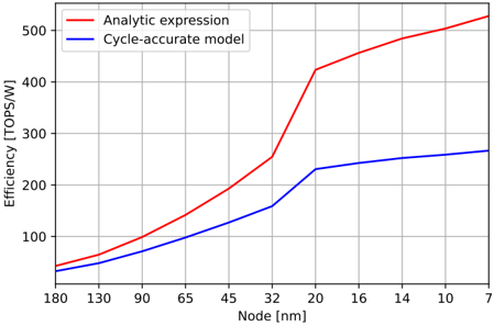
The image is a line chart comparing the computational efficiency (in TOPS/W) of two different models as the semiconductor manufacturing node size decreases. The chart shows that efficiency increases for both models as the node size shrinks, but the "Analytic expression" model predicts a significantly higher efficiency gain, especially at smaller nodes.
### Components/Axes
* **Chart Type:** Line chart with two data series.
* **X-Axis (Horizontal):**
* **Label:** `Node [nm]`
* **Scale:** Decreasing from left to right, representing smaller semiconductor feature sizes.
* **Markers/Ticks:** 180, 130, 90, 65, 45, 32, 20, 16, 14, 10, 7.
* **Y-Axis (Vertical):**
* **Label:** `Efficiency [TOPS/W]` (Tera Operations Per Second per Watt).
* **Scale:** Linear, from 0 to 500.
* **Markers/Ticks:** 0, 100, 200, 300, 400, 500.
* **Legend:**
* **Position:** Top-left corner, slightly inset from the chart boundaries.
* **Entry 1:** `Analytic expression` - Represented by a solid **red** line.
* **Entry 2:** `Cycle-accurate model` - Represented by a solid **blue** line.
* **Grid:** A light gray grid is present, aligning with the major tick marks on both axes.
### Detailed Analysis
**Trend Verification:**
* **Red Line (Analytic expression):** Shows a continuous, accelerating upward trend. The slope becomes notably steeper after the 32 nm node.
* **Blue Line (Cycle-accurate model):** Also shows a continuous upward trend, but with a more moderate and steady slope compared to the red line.
**Data Point Extraction (Approximate Values):**
| Node [nm] | Analytic expression (Red) [TOPS/W] | Cycle-accurate model (Blue) [TOPS/W] |
| :--- | :--- | :--- |
| 180 | ~40 | ~30 |
| 130 | ~60 | ~45 |
| 90 | ~100 | ~70 |
| 65 | ~140 | ~95 |
| 45 | ~190 | ~120 |
| 32 | ~250 | ~160 |
| 20 | ~420 | ~230 |
| 16 | ~450 | ~240 |
| 14 | ~470 | ~250 |
| 10 | ~500 | ~260 |
| 7 | ~520 | ~265 |
### Key Observations
1. **Diverging Predictions:** The two models begin to diverge significantly around the 65 nm node. The gap widens dramatically after 32 nm.
2. **Sharp Increase:** The "Analytic expression" (red line) exhibits a pronounced "knee" or sharp increase in slope between 32 nm and 20 nm, where efficiency jumps from ~250 to ~420 TOPS/W.
3. **Saturation vs. Growth:** The "Cycle-accurate model" (blue line) shows signs of saturation or diminishing returns below 20 nm, with its curve flattening. In contrast, the "Analytic expression" continues a strong upward trajectory.
4. **Consistent Relationship:** The red line is consistently above the blue line across all node sizes, indicating the analytic model always predicts higher efficiency.
### Interpretation
This chart illustrates a comparison between a theoretical, possibly simplified, model ("Analytic expression") and a more detailed, simulation-based model ("Cycle-accurate model") for predicting the energy efficiency of computing hardware as transistor sizes shrink.
* **What the data suggests:** The data suggests that while both models agree that smaller nodes lead to better efficiency, they disagree profoundly on the magnitude of the improvement at advanced nodes (below ~32 nm). The analytic model is far more optimistic.
* **How elements relate:** The x-axis (node size) is the independent variable driving change in the dependent variable (efficiency). The divergence of the lines highlights a fundamental uncertainty or different set of assumptions in the underlying models. The sharp knee in the red line could represent a theoretical threshold where new architectural or physical effects are assumed to dominate.
* **Notable anomalies:** The most significant anomaly is the dramatic divergence post-32 nm. This likely indicates that the "Cycle-accurate model" incorporates real-world constraints (e.g., power density, thermal limits, interconnect delays, non-ideal transistor behavior) that the "Analytic expression" may simplify or ignore. The flattening of the blue curve suggests practical limits to efficiency scaling are being reached in the more detailed model.
* **Peircean investigative reading:** The chart is an argument about the future of computing efficiency. It visually poses the question: "Will efficiency gains continue their historical exponential trend (red line), or are we approaching fundamental physical limits (blue line)?" The choice of which model to trust has massive implications for the roadmap of semiconductor technology and energy consumption in computing.