## Scatter Plot with Error Bars and Fit Lines: Gradient Updates vs. Dimension
### Overview
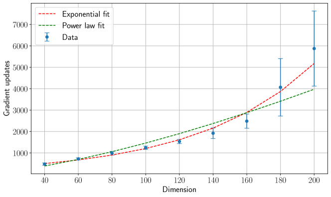
The image is a technical scatter plot chart displaying the relationship between "Dimension" (x-axis) and "Gradient updates" (y-axis). It includes experimental data points with error bars and two theoretical fit lines: an exponential fit and a power law fit. The chart is designed to compare how well these two mathematical models describe the observed data.
### Components/Axes
* **Chart Type:** Scatter plot with error bars and overlaid trend lines.
* **X-Axis:**
* **Label:** "Dimension"
* **Scale:** Linear scale.
* **Markers/Ticks:** 40, 60, 80, 100, 120, 140, 160, 180, 200.
* **Y-Axis:**
* **Label:** "Gradient updates"
* **Scale:** Linear scale.
* **Markers/Ticks:** 0, 1000, 2000, 3000, 4000, 5000, 6000, 7000.
* **Legend:**
* **Position:** Top-left corner of the plot area.
* **Entries:**
1. `--- Exponential fit` (Red dashed line)
2. `--- Power law fit` (Green dashed line)
3. `• Data` (Blue circle marker with vertical error bar)
* **Grid:** A light gray grid is present for both major x and y ticks.
### Detailed Analysis
**Data Points (Blue with Error Bars):**
The data shows a clear increasing trend. The approximate values (y) and their associated error ranges (±) are estimated from the chart:
* Dimension 40: ~500 (± ~50)
* Dimension 60: ~700 (± ~100)
* Dimension 80: ~1000 (± ~150)
* Dimension 100: ~1200 (± ~200)
* Dimension 120: ~1500 (± ~250)
* Dimension 140: ~1900 (± ~300)
* Dimension 160: ~2500 (± ~400)
* Dimension 180: ~4000 (± ~1300)
* Dimension 200: ~5900 (± ~1700)
**Trend Verification:**
* **Data Trend:** The data points follow a curve that accelerates upward as dimension increases.
* **Exponential Fit (Red Dashed Line):** This line starts near the first data point and curves upward, closely following the data's accelerating trend. It passes within the error bars of most points, especially at higher dimensions (160-200).
* **Power Law Fit (Green Dashed Line):** This line also starts near the first data point but follows a less severe upward curve. It begins to diverge below the data points and the exponential fit line starting around dimension 120-140. By dimension 200, it is significantly below the data point and the exponential fit.
### Key Observations
1. **Positive Correlation:** There is a strong positive, non-linear correlation between Dimension and Gradient updates.
2. **Model Comparison:** The exponential fit appears to be a better model for the data than the power law fit, particularly for dimensions greater than 120.
3. **Increasing Variance:** The size of the error bars (uncertainty) increases substantially with dimension, indicating greater variability or measurement difficulty at higher dimensions.
4. **Divergence Point:** The two fit lines are nearly indistinguishable below dimension 80 but begin to clearly diverge after dimension 100.
### Interpretation
The chart demonstrates that the number of gradient updates required grows **more than linearly** with the dimension of the problem (likely a machine learning model parameter space). The superior fit of the exponential model suggests this growth is potentially exponential, which has significant implications for computational cost and training time as model complexity (dimension) scales.
The increasing error bars at higher dimensions could indicate that the process becomes inherently more stochastic or harder to measure precisely as the system grows larger. The clear divergence between the power law and exponential models provides a visual test for theoretical predictions; in this case, the data supports an exponential scaling law over a power law for the observed range. This type of analysis is crucial for understanding the scalability of algorithms and predicting resource requirements for large-scale systems.