\n
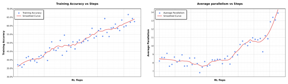
## Charts: Training Performance Metrics
### Overview
The image presents two line charts displaying training performance metrics over training steps (measured in RL Flops). The left chart shows "Training Accuracy vs Steps", while the right chart shows "Average Parallelism vs Steps". Both charts include a scatter plot of raw data points and a smoothed curve representing the trend.
### Components/Axes
**Left Chart: Training Accuracy vs Steps**
* **Title:** Training Accuracy vs Steps
* **X-axis:** RL Flops (Scale is not explicitly labeled, but ranges approximately from 0 to 100)
* **Y-axis:** Training Accuracy (Scale ranges from 30% to 70%)
* **Legend:**
* Training Accuracy (Blue dots)
* Smoothed Curve (Red line)
**Right Chart: Average Parallelism vs Steps**
* **Title:** Average Parallelism vs Steps
* **X-axis:** RL Flops (Scale is not explicitly labeled, but ranges approximately from 0 to 100)
* **Y-axis:** Average Parallelism (Scale ranges from 7 to 14)
* **Legend:**
* Average Parallelism (Blue dots)
* Smoothed Curve (Red line)
### Detailed Analysis or Content Details
**Left Chart: Training Accuracy vs Steps**
The blue scatter plot representing "Training Accuracy" shows a generally upward trend, with significant variance. The data starts around 35% accuracy at approximately 0 RL Flops and increases to around 65% accuracy at approximately 100 RL Flops. The red "Smoothed Curve" follows this upward trend, providing a more generalized representation of the accuracy improvement.
* Approximate Data Points (Training Accuracy):
* (0 RL Flops, 35% Accuracy)
* (20 RL Flops, 40% Accuracy)
* (40 RL Flops, 48% Accuracy)
* (60 RL Flops, 54% Accuracy)
* (80 RL Flops, 60% Accuracy)
* (100 RL Flops, 65% Accuracy)
**Right Chart: Average Parallelism vs Steps**
The blue scatter plot representing "Average Parallelism" shows a more complex trend. Initially, the parallelism decreases from approximately 10 to a minimum of around 8 at approximately 30 RL Flops. After this point, the parallelism increases sharply, reaching approximately 14 at 100 RL Flops. The red "Smoothed Curve" attempts to capture this non-linear behavior.
* Approximate Data Points (Average Parallelism):
* (0 RL Flops, 10 Parallelism)
* (20 RL Flops, 9 Parallelism)
* (30 RL Flops, 8 Parallelism)
* (50 RL Flops, 9 Parallelism)
* (70 RL Flops, 11 Parallelism)
* (90 RL Flops, 13 Parallelism)
* (100 RL Flops, 14 Parallelism)
### Key Observations
* Both charts exhibit an upward trend in the later stages of training.
* The "Average Parallelism" chart shows an initial decrease followed by a significant increase, suggesting a change in the training dynamics.
* The scatter plots show considerable noise, indicating variability in the training process.
* The smoothed curves provide a clearer view of the overall trends, but may obscure some of the underlying fluctuations.
### Interpretation
The charts demonstrate the training progress of a model. The increasing "Training Accuracy" indicates that the model is learning and improving its performance over time. The "Average Parallelism" chart suggests that the training process may have initially been limited by parallelism, but as training progressed, the system was able to leverage more parallel processing, leading to a significant increase in parallelism and potentially faster training. The initial dip in parallelism could be due to overhead or synchronization costs at the beginning of training. The divergence between the raw data and the smoothed curves highlights the importance of considering both the overall trend and the underlying variability when evaluating training performance. The data suggests a successful training run, with both accuracy and parallelism improving over time.