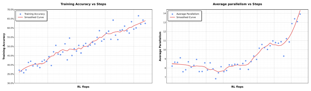
## Line Charts: Training Accuracy vs Steps and Average Parallelism vs Steps
### Overview
Two line charts are presented side-by-side, comparing metrics over "RL flops" (reinforcement learning steps). The left chart tracks **Training Accuracy**, while the right chart tracks **Average Parallelism**. Both include blue data points and red smoothed curves to highlight trends.
---
### Components/Axes
#### Left Chart: Training Accuracy vs Steps
- **X-axis**: RL flops (horizontal axis, labeled "RL flops").
- **Y-axis**: Training Accuracy (vertical axis, labeled "Training Accuracy", range 30%–70%).
- **Legend**:
- Blue: "Training Accuracy" (data points).
- Red: "Smoothed Curve" (trend line).
- **Grid**: Light gray grid lines for reference.
#### Right Chart: Average Parallelism vs Steps
- **X-axis**: RL flops (horizontal axis, labeled "RL flops").
- **Y-axis**: Average Parallelism (vertical axis, labeled "Average Parallelism", range 7–14).
- **Legend**:
- Blue: "Average Parallelism" (data points).
- Red: "Smoothed Curve" (trend line).
- **Grid**: Light gray grid lines for reference.
---
### Detailed Analysis
#### Left Chart: Training Accuracy
- **Data Points (Blue)**:
- Start at ~35–36% for early RL flops.
- Gradually increase to ~65–66% by the final steps.
- Notable fluctuations (e.g., dips to ~40% at mid-range flops).
- **Smoothed Curve (Red)**:
- Mirrors the upward trend of data points.
- Smooths out minor fluctuations, showing a consistent rise.
#### Right Chart: Average Parallelism
- **Data Points (Blue)**:
- Begin at ~8.0–8.5 for early flops.
- Dip to ~7.5–7.8 around mid-range flops.
- Sharp increase to ~13.5–14.0 by the final steps.
- **Smoothed Curve (Red)**:
- Follows the data points closely.
- Highlights the initial dip and subsequent steep rise.
---
### Key Observations
1. **Training Accuracy**:
- Steady improvement over RL flops, with minor mid-range dips.
- Final accuracy reaches ~65–66%, suggesting effective learning.
2. **Average Parallelism**:
- Initial inefficiency (dip to ~7.5) followed by rapid improvement.
- Final parallelism exceeds initial values by ~50%.
3. **Smoothed Curves**:
- Both charts show red curves aligning tightly with data trends, confirming consistency.
---
### Interpretation
- **Training Dynamics**: The left chart demonstrates that training accuracy improves with more RL flops, though mid-range fluctuations suggest potential instability or optimization challenges.
- **Parallelism Behavior**: The right chart reveals a non-linear relationship. The initial dip in parallelism may reflect resource contention or algorithmic inefficiencies, while the later surge indicates successful scaling or parallelization optimizations.
- **Smoothed Curves**: These emphasize the overall trend, filtering out noise. The red lines validate that the observed patterns are not random but reflect underlying system behavior.
- **Practical Implications**: The data suggests that increasing RL flops enhances model performance (accuracy) and computational efficiency (parallelism), though initial phases may require careful tuning to avoid early inefficiencies.