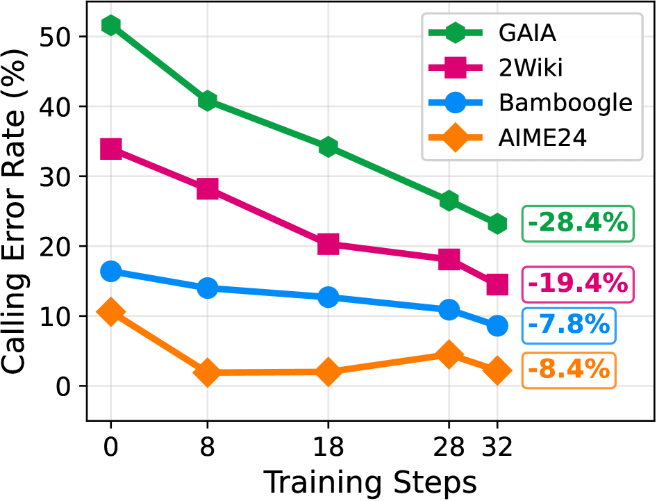
## Line Chart: Calling Error Rate vs. Training Steps
### Overview
This is a line chart illustrating the reduction in "Calling Error Rate (%)" across four different datasets or benchmarks (GAIA, 2Wiki, Bamboogle, AIME24) as the number of "Training Steps" increases. The chart demonstrates a general downward trend in error rates for all series, indicating improved performance with more training.
### Components/Axes
* **X-Axis (Horizontal):** Labeled "Training Steps". It has discrete markers at values: 0, 8, 18, 28, and 32.
* **Y-Axis (Vertical):** Labeled "Calling Error Rate (%)". The scale runs from 0 to 50, with major gridlines at intervals of 10 (0, 10, 20, 30, 40, 50).
* **Legend:** Located in the top-right corner of the chart area. It maps colors and marker shapes to dataset names:
* **Green line with hexagon markers:** GAIA
* **Magenta/Pink line with square markers:** 2Wiki
* **Blue line with circle markers:** Bamboogle
* **Orange line with diamond markers:** AIME24
* **Annotations:** Four colored boxes on the right side of the chart, aligned with the final data points, indicate the total percentage point reduction for each series from step 0 to step 32.
### Detailed Analysis
**1. GAIA (Green Line, Hexagon Markers)**
* **Trend:** Shows the steepest and most consistent downward slope across all training steps.
* **Data Points (Approximate):**
* Step 0: ~51%
* Step 8: ~41%
* Step 18: ~34%
* Step 28: ~26%
* Step 32: ~23%
* **Total Reduction:** Annotated as **-28.4%** (from ~51% to ~23%).
**2. 2Wiki (Magenta Line, Square Markers)**
* **Trend:** Also shows a strong, steady decline, though starting from a lower initial error rate than GAIA.
* **Data Points (Approximate):**
* Step 0: ~34%
* Step 8: ~28%
* Step 18: ~20%
* Step 28: ~18%
* Step 32: ~15%
* **Total Reduction:** Annotated as **-19.4%** (from ~34% to ~15%).
**3. Bamboogle (Blue Line, Circle Markers)**
* **Trend:** Exhibits a gradual, shallow decline. The rate of improvement slows after step 18.
* **Data Points (Approximate):**
* Step 0: ~16%
* Step 8: ~14%
* Step 18: ~13%
* Step 28: ~11%
* Step 32: ~9%
* **Total Reduction:** Annotated as **-7.8%** (from ~16% to ~9%).
**4. AIME24 (Orange Line, Diamond Markers)**
* **Trend:** Starts low, drops sharply by step 8, then plateaus with minor fluctuations between steps 8 and 32.
* **Data Points (Approximate):**
* Step 0: ~10%
* Step 8: ~2%
* Step 18: ~2%
* Step 28: ~4%
* Step 32: ~2%
* **Total Reduction:** Annotated as **-8.4%** (from ~10% to ~2%).
### Key Observations
1. **Universal Improvement:** All four datasets show a net decrease in calling error rate from step 0 to step 32.
2. **Magnitude of Improvement:** The scale of improvement is highly dataset-dependent. GAIA and 2Wiki, which start with higher error rates (>30%), show large absolute reductions (~20-30 percentage points). Bamboogle and AIME24, starting with lower error rates (<20%), show smaller absolute reductions (~8 percentage points).
3. **Convergence:** The lines for GAIA, 2Wiki, and Bamboogle appear to be converging slightly as training progresses, though they maintain their relative ordering.
4. **AIME24 Anomaly:** The AIME24 series behaves differently. After a rapid initial improvement, it hits a performance floor near 2-4% error and does not show further consistent improvement, even exhibiting a slight increase at step 28 before dropping again.
### Interpretation
The chart provides strong evidence that increasing training steps is an effective strategy for reducing calling errors across a variety of tasks or benchmarks. The data suggests a **law of diminishing returns**: datasets that begin with high error rates (GAIA, 2Wiki) benefit most dramatically from additional training, while those that start with relatively low error rates (Bamboogle, AIME24) see more modest gains.
The distinct behavior of AIME24 is particularly noteworthy. Its rapid plateau suggests that the model may have quickly learned the core patterns required for this specific benchmark, and further training steps provide little to no benefit. This could indicate that AIME24 represents a different class of problem or that the model's capacity for this task is saturated early. The slight uptick at step 28 for AIME24 could be statistical noise or an indication of minor overfitting, though the final point at step 32 returns to the low baseline.
Overall, the visualization effectively communicates that training progress is not uniform across all domains, and the potential for improvement is heavily influenced by the initial difficulty of the task as measured by the starting error rate.