\n
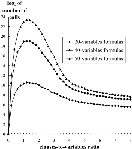
## Line Chart: Computational Complexity vs. Clause-to-Variable Ratio
### Overview
The image is a line chart plotting the logarithmic measure of computational effort against a problem density metric. It displays three data series representing formulas with different numbers of variables (20, 40, and 50). The chart illustrates a characteristic "phase transition" pattern common in computational problems like SAT solving, where difficulty peaks at a specific ratio before declining.
### Components/Axes
* **Y-Axis (Vertical):**
* **Label:** `log₂ of number of calls`
* **Scale:** Linear scale from 0 to 24, with major tick marks every 2 units (0, 2, 4, ..., 24).
* **Interpretation:** Represents the base-2 logarithm of the number of computational calls (e.g., solver steps). A value of 10 corresponds to 2¹⁰ = 1024 calls; a value of 20 corresponds to 2²⁰ ≈ 1,048,576 calls.
* **X-Axis (Horizontal):**
* **Label:** `clauses-to-variables ratio`
* **Scale:** Linear scale from 0 to 8, with major tick marks every 1 unit (0, 1, 2, ..., 8).
* **Interpretation:** Represents the ratio of clauses to variables in a formula, a measure of problem constraint density.
* **Legend:**
* **Position:** Top-right quadrant of the chart area.
* **Entries:**
1. `20-variables formulas` - Represented by a line with diamond (♦) markers.
2. `40-variables formulas` - Represented by a line with circle (●) markers.
3. `50-variables formulas` - Represented by a line with triangle (▲) markers.
### Detailed Analysis
**Trend Verification & Data Points:**
All three series follow the same fundamental trend: a sharp, near-vertical increase from the origin (0,0) to a distinct peak, followed by a gradual, monotonic decline as the clauses-to-variables ratio increases.
1. **50-variables formulas (▲ line):**
* **Trend:** Rises most steeply to the highest peak, then declines, remaining the topmost line throughout.
* **Key Data Points (Approximate):**
* At ratio ≈ 0.1: y ≈ 12
* **Peak:** At ratio ≈ 1.5, y ≈ 23.5 (the global maximum of the chart).
* At ratio = 4: y ≈ 12
* At ratio = 8: y ≈ 8
2. **40-variables formulas (● line):**
* **Trend:** Rises to a peak lower than the 50-variable series but higher than the 20-variable series. It sits between the other two lines.
* **Key Data Points (Approximate):**
* At ratio ≈ 0.1: y ≈ 10.5
* **Peak:** At ratio ≈ 1.2, y ≈ 19
* At ratio = 4: y ≈ 10
* At ratio = 8: y ≈ 7
3. **20-variables formulas (♦ line):**
* **Trend:** Has the lowest peak and remains the bottommost line. Its decline is the shallowest.
* **Key Data Points (Approximate):**
* At ratio ≈ 0.1: y ≈ 6
* **Peak:** At ratio ≈ 1.0, y ≈ 10.5
* At ratio = 4: y ≈ 7
* At ratio = 8: y ≈ 5.5
**Spatial Relationships:** The vertical ordering of the lines (50-var on top, 40-var middle, 20-var bottom) is consistent across the entire x-axis range shown. The horizontal spacing between the peaks is notable: the peak for 20-var formulas occurs at the lowest ratio (~1.0), followed by 40-var (~1.2), and then 50-var (~1.5).
### Key Observations
1. **Phase Transition Peak:** All series exhibit a clear maximum difficulty (peak number of calls) at a clauses-to-variables ratio between 1.0 and 1.5. This is the "hard" region.
2. **Scaling with Problem Size:** The peak height (log₂ calls) increases significantly with the number of variables. The jump from 20 to 40 variables nearly doubles the peak log value (from ~10.5 to ~19), implying an exponential increase in actual calls.
3. **Asymptotic Behavior:** For high ratios (x > 4), the curves flatten and converge slightly, but maintain their strict ordering. The computational cost decreases and becomes less sensitive to further increases in constraint density.
4. **Initial Growth:** The initial ascent from ratio=0 is extremely steep for all series, indicating that adding the first few constraints dramatically increases problem difficulty.
### Interpretation
This chart visualizes a fundamental phenomenon in computational complexity, likely for Boolean Satisfiability (SAT) or similar constraint satisfaction problems.
* **What the data suggests:** Problem difficulty is not monotonic with constraint density. There is a critical region (ratio ≈ 1-1.5) where problems are maximally difficult to solve, requiring an exponential number of computational steps (as shown by the high log₂ values). This is the well-known "phase transition" between under-constrained (easily satisfiable) and over-constrained (easily proven unsatisfiable) regions.
* **How elements relate:** The number of variables acts as a scaling factor. Larger problems (more variables) are exponentially harder at the peak, as evidenced by the large vertical gaps between the lines. The shift in the peak's position to the right for larger problems suggests that the critical density ratio itself may scale slightly with problem size.
* **Notable implications:** The chart provides empirical evidence for the "easy-hard-easy" pattern. For practitioners, it highlights that the most challenging instances to solve or benchmark are not those with the most clauses, but those with a clause-to-variable ratio near 1. The consistent ordering of the lines confirms that, for a fixed ratio, more variables invariably lead to harder problems. The use of a log₂ scale is crucial, as it compresses the enormous range of computational effort (from hundreds to millions of calls) into a readable, linear trend.