## Heatmap: Relationship Between Percentage p and Width of Near-Zero Range c
### Overview
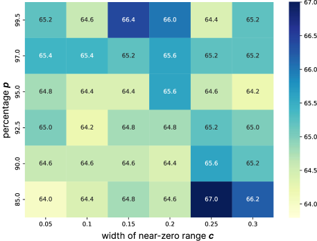
The image is a heatmap visualizing the relationship between two variables: "percentage p" (y-axis) and "width of near-zero range c" (x-axis). Each cell contains a numerical value representing a metric (likely a percentage or score) that varies based on the combination of p and c. The color gradient transitions from light yellow (low values) to dark blue (high values), with a legend on the right indicating the scale.
---
### Components/Axes
- **X-axis (width of near-zero range c)**:
- Labels: 0.05, 0.1, 0.15, 0.2, 0.25, 0.3
- Scale: Linear increments of 0.05
- **Y-axis (percentage p)**:
- Labels: 85.0, 90.0, 92.5, 95.0, 97.0, 99.5
- Scale: Linear increments of 2.5 (except 85.0 to 90.0, which is 5.0)
- **Legend**:
- Position: Right side of the heatmap
- Color gradient: Light yellow (64.0) to dark blue (67.0)
- Label: Implied to represent the metric values in the cells
---
### Detailed Analysis
#### Data Table Structure
The heatmap is organized as a 6x6 grid, with rows corresponding to percentage p values and columns to width c values. Each cell contains a numerical value and a color intensity matching the legend. Below is the reconstructed table:
| **p (%)** | **c = 0.05** | **c = 0.1** | **c = 0.15** | **c = 0.2** | **c = 0.25** | **c = 0.3** |
|-----------|--------------|-------------|--------------|-------------|--------------|-------------|
| 99.5 | 65.2 | 64.6 | 66.4 | 66.0 | 64.4 | 65.2 |
| 97.0 | 65.4 | 65.4 | 65.2 | 65.6 | 65.2 | 65.2 |
| 95.0 | 64.8 | 64.4 | 64.4 | 65.6 | 64.6 | 64.2 |
| 92.5 | 65.0 | 64.2 | 64.8 | 64.8 | 65.2 | 65.0 |
| 90.0 | 64.6 | 64.6 | 64.6 | 64.4 | 65.6 | 65.2 |
| 85.0 | 64.0 | 64.4 | 64.8 | 64.6 | 67.0 | 66.2 |
#### Color-Space Verification
- **Darkest blue (67.0)**: Located at (85.0%, 0.3)
- **Lightest yellow (64.0)**: Located at (99.5%, 0.05)
- All other values align with the legend’s gradient (e.g., 65.2 corresponds to a medium-blue shade).
---
### Key Observations
1. **Highest Value**: 67.0 at (85.0%, 0.3) — the lowest p and widest c.
2. **Lowest Value**: 64.0 at (99.5%, 0.05) — the highest p and narrowest c.
3. **Trend**:
- Values generally increase as c increases (e.g., 64.0 → 66.2 for p=85.0%).
- For fixed c, values fluctuate slightly with p but show no clear monotonic trend.
4. **Anomalies**:
- At p=95.0%, the value drops to 64.2 at c=0.3, breaking the upward trend observed in other rows.
- At p=90.0%, the value at c=0.2 is 64.4, lower than adjacent cells.
---
### Interpretation
The heatmap suggests a **trade-off relationship** between p and c:
- **Lower p (85.0%)** and **wider c (0.3)** yield the highest values (67.0), indicating optimal performance under these conditions.
- **Higher p (99.5%)** and **narrow c (0.05)** result in the lowest values (64.0), suggesting suboptimal performance.
- The anomaly at p=95.0% and c=0.3 (64.2) may indicate a non-linear interaction or an outlier in the dataset.
The color gradient reinforces that the metric being measured (e.g., efficiency, accuracy) improves as the width of the near-zero range increases, particularly when the percentage p is lower. This could imply that broader near-zero ranges are more effective in scenarios with lower p values, though further context is needed to confirm causality.
---
### Spatial Grounding
- **Legend**: Right-aligned, vertically oriented, with a clear gradient from yellow to blue.
- **Axes**: Labeled with precise numerical increments; grid lines divide the heatmap into discrete cells.
- **Cell Values**: Centered in each cell, ensuring readability.
This structured layout ensures the data is both visually accessible and quantitatively precise.