## Line Chart: ATE Trends Across Income Quartiles
### Overview
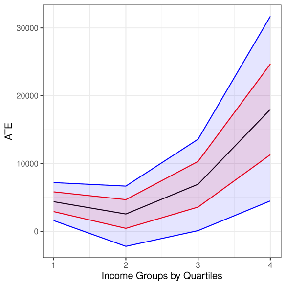
The image is a line chart depicting the relationship between income quartiles (1–4) and ATE (Average Treatment Effect). Four distinct lines, each with a unique color (blue, black, red, pink), represent different data series. The chart includes a legend on the right, axis labels, and gridlines for reference.
---
### Components/Axes
- **X-Axis**: Labeled "Income Groups by Quartiles" with values 1, 2, 3, 4 (representing quartiles).
- **Y-Axis**: Labeled "ATE" with a scale from 0 to 30,000.
- **Legend**: Located on the right, with four entries:
- **Blue**: Line 1
- **Black**: Line 2
- **Red**: Line 3
- **Pink**: Line 4
- **Gridlines**: Horizontal and vertical lines for alignment.
---
### Detailed Analysis
#### Line 1 (Blue)
- **Trend**: Starts at ~5,000 (quartile 1), dips to ~-5,000 (quartile 2), rises to ~10,000 (quartile 3), and peaks at ~30,000 (quartile 4).
- **Key Points**:
- Quartile 1: ~5,000
- Quartile 2: ~-5,000
- Quartile 3: ~10,000
- Quartile 4: ~30,000
#### Line 2 (Black)
- **Trend**: Starts at ~5,000 (quartile 1), dips to ~2,000 (quartile 2), rises to ~7,000 (quartile 3), and peaks at ~18,000 (quartile 4).
- **Key Points**:
- Quartile 1: ~5,000
- Quartile 2: ~2,000
- Quartile 3: ~7,000
- Quartile 4: ~18,000
#### Line 3 (Red)
- **Trend**: Starts at ~3,000 (quartile 1), dips to ~0 (quartile 2), rises to ~10,000 (quartile 3), and peaks at ~25,000 (quartile 4).
- **Key Points**:
- Quartile 1: ~3,000
- Quartile 2: ~0
- Quartile 3: ~10,000
- Quartile 4: ~25,000
#### Line 4 (Pink)
- **Trend**: Starts at ~2,000 (quartile 1), dips to ~-2,000 (quartile 2), rises to ~5,000 (quartile 3), and peaks at ~22,000 (quartile 4).
- **Key Points**:
- Quartile 1: ~2,000
- Quartile 2: ~-2,000
- Quartile 3: ~5,000
- Quartile 4: ~22,000
---
### Key Observations
1. **Upward Trend**: All lines show a general increase in ATE from quartile 3 to 4, with the pink line (Line 4) exhibiting the steepest rise.
2. **Fluctuations**: The blue line (Line 1) has the most pronounced dip in quartile 2, dropping below zero.
3. **Relative Positions**:
- At quartile 4, the pink line (Line 4) surpasses the red line (Line 3) as the highest.
- The black line (Line 2) consistently lies between the blue and red lines.
4. **Shaded Areas**: The chart includes shaded regions around the lines, likely representing confidence intervals or error margins, though exact values are not labeled.
---
### Interpretation
- **Income-ATE Relationship**: The data suggests a positive correlation between income quartiles and ATE, with higher quartiles (3–4) showing significantly larger ATE values. This could imply that treatment effects are more pronounced in higher-income groups.
- **Anomalies**: The blue line’s dip in quartile 2 (-5,000) and the pink line’s dip in quartile 2 (-2,000) may indicate outliers or specific contextual factors affecting these groups.
- **Steepest Growth**: The pink line’s sharp increase from quartile 3 to 4 (5,000 → 22,000) highlights a potential "threshold effect" in the highest income group.
- **Uncertainty**: Approximate values are derived from visual estimation; exact numerical data is not provided in the image.
---
### Spatial Grounding
- **Legend**: Right-aligned, with colors matching the lines (blue, black, red, pink).
- **Lines**: Positioned centrally, with the pink line (Line 4) consistently above the red line (Line 3), which is above the black line (Line 2), and the blue line (Line 1) below the black line.
---
### Content Details
- **Textual Elements**: No additional text blocks or annotations are present beyond axis labels and the legend.
- **Language**: All text is in English. No non-English content is visible.
---
### Final Notes
The chart emphasizes the variability of ATE across income groups, with the pink line (Line 4) showing the most dramatic growth. The shaded areas suggest uncertainty in the data, but without explicit error bars or confidence intervals, further analysis is limited. The trends align with the hypothesis that higher income correlates with greater ATE, though the reasons for fluctuations (e.g., the dips in quartile 2) require deeper investigation.