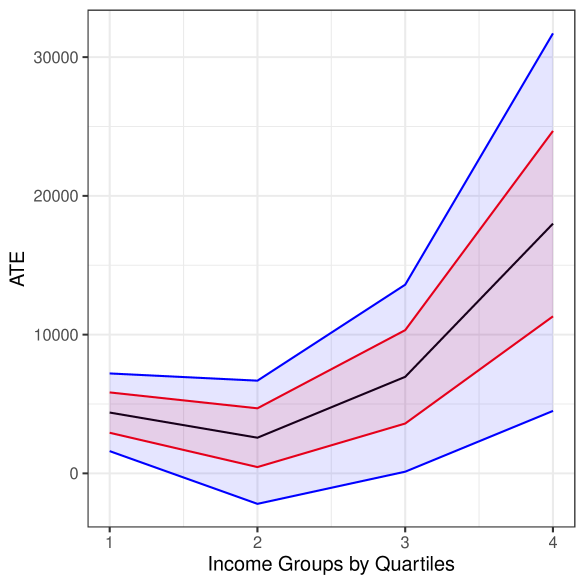
## Line Chart: ATE vs. Income Groups by Quartiles
### Overview
The image is a line chart showing the relationship between Average Treatment Effect (ATE) and Income Groups by Quartiles. The chart displays a central tendency line (black) along with upper and lower bounds (red lines) and a shaded area (blue) representing the confidence interval. The x-axis represents income groups divided into quartiles (1 to 4), and the y-axis represents the ATE.
### Components/Axes
* **X-axis:** "Income Groups by Quartiles" with markers at 1, 2, 3, and 4.
* **Y-axis:** "ATE" with markers at 0, 10000, 20000, and 30000.
* **Data Series:**
* Black line: Represents the central tendency of ATE for each income quartile.
* Red lines: Represents the upper and lower bounds of ATE for each income quartile.
* Blue shaded area: Represents the confidence interval around the ATE.
### Detailed Analysis
* **Income Group 1:**
* Black line (ATE): Approximately 4000.
* Red line (Upper Bound): Approximately 7000.
* Red line (Lower Bound): Approximately 2000.
* Blue shaded area: Extends from approximately 7000 to 2000.
* **Income Group 2:**
* Black line (ATE): Approximately 3000.
* Red line (Upper Bound): Approximately 6000.
* Red line (Lower Bound): Approximately 500.
* Blue shaded area: Extends from approximately 6000 to 500.
* **Income Group 3:**
* Black line (ATE): Approximately 9000.
* Red line (Upper Bound): Approximately 13000.
* Red line (Lower Bound): Approximately 4000.
* Blue shaded area: Extends from approximately 13000 to 4000.
* **Income Group 4:**
* Black line (ATE): Approximately 18000.
* Red line (Upper Bound): Approximately 23000.
* Red line (Lower Bound): Approximately 11000.
* Blue shaded area: Extends from approximately 23000 to 11000.
### Key Observations
* The ATE generally increases as the income group quartile increases.
* The confidence interval (blue shaded area) widens as the income group quartile increases, indicating greater uncertainty in the ATE for higher income groups.
* The red lines representing the upper and lower bounds also diverge as the income group quartile increases.
### Interpretation
The chart suggests a positive correlation between income group quartile and Average Treatment Effect (ATE). As income increases, the ATE tends to increase as well. However, the widening confidence interval indicates that the effect of treatment may be more variable or less precisely estimated for higher income groups. This could be due to various factors, such as differences in treatment adherence, access to resources, or other confounding variables that are more prevalent or have a greater impact on higher income individuals. The initial dip in ATE from Income Group 1 to Income Group 2 could be due to a variety of factors and warrants further investigation.