\n
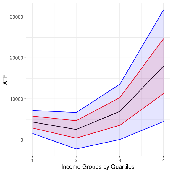
## Line Chart: ATE vs. Income Groups by Quartiles
### Overview
The image presents a line chart illustrating the relationship between Average Treatment Effect (ATE) and Income Groups categorized by Quartiles. The chart displays multiple lines, each representing a different data series, with shaded areas indicating confidence intervals.
### Components/Axes
* **X-axis:** Labeled "Income Groups by Quartiles", with markers at 1, 2, 3, and 4.
* **Y-axis:** Labeled "ATE", with a scale ranging from 0 to 30000, incrementing by approximately 5000.
* **Lines:** Four distinct lines are visible, colored in shades of blue and red.
* **Shaded Areas:** Light purple shaded areas surround each line, representing confidence intervals.
* **Grid:** A light gray grid is present in the background, aiding in value estimation.
### Detailed Analysis
The chart displays four lines, each representing a different data series. The lines generally trend upwards as income quartile increases, but with varying degrees of steepness and fluctuation.
* **Line 1 (Darkest Blue):** This line starts at approximately 3000 ATE at Income Group 1, dips to around 1000 at Income Group 2, rises sharply to approximately 18000 at Income Group 3, and continues to increase to approximately 31000 at Income Group 4.
* **Line 2 (Medium Blue):** This line begins at approximately 5000 ATE at Income Group 1, decreases to around 2000 at Income Group 2, increases to approximately 12000 at Income Group 3, and rises to approximately 24000 at Income Group 4.
* **Line 3 (Red):** This line starts at approximately 2000 ATE at Income Group 1, decreases to around -2000 at Income Group 2, increases to approximately 8000 at Income Group 3, and rises to approximately 16000 at Income Group 4.
* **Line 4 (Light Red):** This line begins at approximately 1000 ATE at Income Group 1, decreases to around -4000 at Income Group 2, increases to approximately 4000 at Income Group 3, and rises to approximately 10000 at Income Group 4.
The confidence intervals (purple shaded areas) widen as the income quartile increases, indicating greater uncertainty in the ATE estimates for higher income groups.
### Key Observations
* All four lines exhibit a positive correlation between income quartile and ATE, suggesting that the treatment effect increases with income.
* The darkest blue line consistently shows the highest ATE values across all income quartiles.
* The light red line has the lowest ATE values, and even dips into negative values at Income Group 2.
* The largest increase in ATE across all lines occurs between Income Group 2 and Income Group 3.
* The confidence intervals become wider at higher income levels, suggesting greater variability or uncertainty in the ATE estimates.
### Interpretation
The chart suggests a positive relationship between income and the Average Treatment Effect (ATE). This implies that the treatment is more effective for individuals in higher income groups. The widening confidence intervals at higher income levels could be due to a smaller sample size in those groups, increased heterogeneity within those groups, or other factors contributing to greater uncertainty. The negative ATE values for the light red line at Income Group 2 suggest that, for that specific data series, the treatment may have a detrimental effect on individuals in the second income quartile. The substantial increase in ATE between Income Group 2 and 3 across all lines indicates a potential threshold effect, where the treatment becomes significantly more effective after a certain income level is reached. Further investigation would be needed to understand the underlying reasons for these observed patterns and to determine the practical implications of these findings.