\n
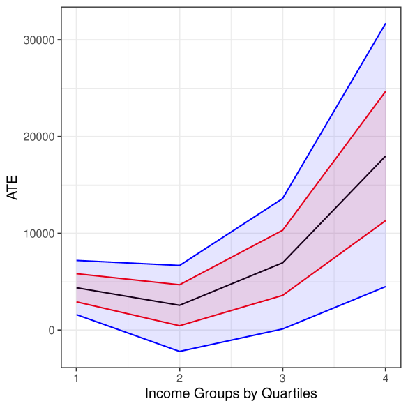
## Line Chart with Confidence Intervals: ATE by Income Quartiles
### Overview
The image is a line chart displaying the Average Treatment Effect (ATE) across four income groups, categorized by quartiles. The chart includes three distinct data series (blue, red, and black lines), each accompanied by a shaded region representing a confidence interval or range of uncertainty. The overall trend shows that ATE increases with income quartile, with a particularly sharp rise from the third to the fourth quartile for all series.
### Components/Axes
* **X-Axis (Horizontal):** Labeled "Income Groups by Quartiles". It has four discrete, equally spaced tick marks labeled "1", "2", "3", and "4", representing the income quartiles from lowest (1) to highest (4).
* **Y-Axis (Vertical):** Labeled "ATE". The scale is linear, with major tick marks and labels at 0, 10000, 20000, and 30000. The axis extends slightly beyond 30000 at the top.
* **Data Series & Legend:** There is no explicit legend box within the chart area. The three series are distinguished solely by line color:
* **Blue Line:** The topmost line with the widest shaded confidence interval (light blue fill).
* **Red Line:** The middle line with a medium-width shaded confidence interval (light red/pink fill).
* **Black Line:** The bottom line with the narrowest shaded confidence interval (light gray fill).
* **Spatial Layout:** The chart area is bounded by a light gray border. The plot background is white with a faint gray grid. The axis labels are positioned conventionally: the x-axis label is centered below the axis, and the y-axis label is rotated 90 degrees and centered to the left of the axis.
### Detailed Analysis
**Trend Verification & Data Point Extraction (Approximate Values):**
* **Blue Line Trend:** Starts relatively flat, dips slightly at quartile 2, then rises sharply through quartiles 3 and 4.
* Quartile 1: ~7,000
* Quartile 2: ~6,500
* Quartile 3: ~13,500
* Quartile 4: ~31,000
* *Confidence Interval (Blue Shading):* At Quartile 4, the interval spans from approximately 4,500 to 31,000, indicating very high uncertainty for the highest income group.
* **Red Line Trend:** Follows a similar shape to the blue line but at a lower magnitude. It dips at quartile 2 and increases thereafter.
* Quartile 1: ~5,500
* Quartile 2: ~4,500
* Quartile 3: ~10,000
* Quartile 4: ~24,500
* *Confidence Interval (Red Shading):* At Quartile 4, the interval spans from approximately 11,000 to 24,500.
* **Black Line Trend:** Also follows the same general pattern: a dip at quartile 2 followed by an increase.
* Quartile 1: ~3,500
* Quartile 2: ~2,500
* Quartile 3: ~7,000
* Quartile 4: ~18,000
* *Confidence Interval (Gray Shading):* At Quartile 4, the interval spans from approximately 11,000 to 18,000, the narrowest of the three.
**Cross-Reference Check:** The ordering of the lines (Blue > Red > Black) is consistent across all four quartiles. The shaded confidence intervals do not cross between the blue and black series at any point, suggesting a statistically significant difference between these estimates. The red series' interval overlaps with both the blue and black intervals at lower quartiles.
### Key Observations
1. **Non-Monotonic Initial Trend:** All three series show a slight decrease in ATE from the first to the second income quartile before rising.
2. **Divergence at the Top:** The difference in ATE between the three series is smallest at quartile 2 and largest at quartile 4. The blue line's estimate grows the most dramatically.
3. **Increasing Uncertainty:** The width of the confidence intervals (the vertical spread of the shaded areas) increases significantly for all series as income quartile increases. This is most extreme for the blue series.
4. **Steep Final Slope:** The slope of all lines is steepest between quartile 3 and quartile 4, indicating the largest incremental change in ATE occurs between the third and fourth income groups.
### Interpretation
This chart suggests that the effect of the treatment being measured (ATE) is not uniform across the income distribution. The data indicates a **positive correlation between income level and treatment effect**, particularly for the highest earners (quartile 4). The treatment appears to be most beneficial for the highest income group according to all three models or estimates (represented by the colored lines).
The **diverging lines and widening confidence intervals** at the top end are critical findings. They imply that while the estimated benefit is largest for high-income individuals, there is also the greatest uncertainty about the precise magnitude of that benefit. This could be due to greater heterogeneity within the high-income group or less data available for that segment.
The initial dip from quartile 1 to 2 is an interesting anomaly. It suggests the treatment effect might be slightly lower for the second-lowest income group compared to the very lowest, before beginning its upward trajectory. Without context on what the "treatment" is, it's difficult to speculate on the cause, but this pattern would warrant further investigation.
**In summary, the key takeaway is that the treatment effect appears to increase with income, but our confidence in the exact size of that effect decreases for the wealthiest group.**