## PCA Trajectory Plot: PCA1 vs PCA2 Analysis
### Overview
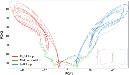
The image displays a two-dimensional trajectory plot generated using Principal Component Analysis (PCA). The plot visualizes the state-space dynamics of a system, characterized by two distinct, symmetric loops connected by a central transition corridor. An inset in the bottom-right corner provides a simplified, miniature representation of the main plot.
### Components/Axes
* **X-Axis:** Labeled "PCA1". The scale ranges from approximately -50 to +50, with major tick marks at -40, -20, 0, 20, and 40.
* **Y-Axis:** Labeled "PCA2". The scale ranges from approximately -25 to +45, with major tick marks at -20, -10, 0, 10, 20, 30, and 40.
* **Legend (Bottom-Left):**
* **Red line:** Labeled "Right loop".
* **Green line:** Labeled "Middle corridor".
* **Blue line:** Labeled "Left loop".
* **Inset (Bottom-Right):** A small, simplified version of the main plot, showing the same butterfly-like structure. The axes labels are illegible due to size, but the color coding matches the main plot.
### Detailed Analysis
#### Data Series Trends
1. **Red Series ("Right loop"):**
* **Visual Trend:** This series occupies the left side of the plot (negative PCA1 values). The lines originate from the center, loop outward to the top-left (reaching PCA1 ≈ -45, PCA2 ≈ +45), and curve back down toward the center.
* **Spatial Positioning:** Exclusively in the negative PCA1 quadrant.
2. **Blue Series ("Left loop"):**
* **Visual Trend:** This series occupies the right side of the plot (positive PCA1 values). The lines originate from the center, loop outward to the top-right (reaching PCA1 ≈ +50, PCA2 ≈ +45), and curve back down toward the center.
* **Spatial Positioning:** Exclusively in the positive PCA1 quadrant.
3. **Green Series ("Middle corridor"):**
* **Visual Trend:** This series acts as a bridge. It traverses the bottom-center region of the plot (PCA1 between -10 and +10, PCA2 between -25 and 0). It connects the return paths of the red and blue loops.
#### Labeling Discrepancy
There is a notable contradiction between the legend labels and the visual spatial positioning:
* The **Red** lines are visually located on the **left** side of the graph, but the legend labels them "Right loop".
* The **Blue** lines are visually located on the **right** side of the graph, but the legend labels them "Left loop".
### Key Observations
* **Symmetry:** The plot exhibits high bilateral symmetry across the Y-axis (PCA1 = 0).
* **Density:** The loops are composed of multiple overlapping lines, suggesting a system that repeats its trajectory or cycles through these states multiple times.
* **Transition State:** The green "Middle corridor" represents a bottleneck or transition state where the system passes through the origin area before diverging into one of the two main loops.
### Interpretation
This plot is characteristic of a dynamical system phase portrait, likely representing a system with two stable attractors (the loops) and a transition region (the corridor).
**Reading between the lines:**
* **System Dynamics:** The system appears to oscillate between two distinct states. The "loops" represent periods of high activity or specific state-space occupancy, while the "middle corridor" represents the transition phase between these two states.
* **The Labeling Paradox:** The inversion of the labels ("Right loop" for the left-side data and "Left loop" for the right-side data) suggests that the naming convention is likely based on the *system's internal logic* or *directionality* (e.g., a loop that initiates a turn to the right) rather than the viewer's spatial perspective. Alternatively, this could indicate a coordinate system transformation where the axes are flipped relative to the data's origin.
* **Data Nature:** The density of the lines suggests this is likely time-series data projected into PCA space (e.g., neural firing patterns, mechanical vibration analysis, or financial market cycles), where the system repeatedly visits these states over time.