## Line Chart: Effective Dimension vs. log₁₀(2m+1) for Various n
### Overview
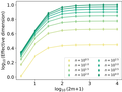
The image is a line chart plotting the base-10 logarithm of an "Effective dimension" against the base-10 logarithm of the quantity `(2m+1)`. It displays multiple data series, each corresponding to a different value of a parameter `n`. The chart demonstrates a clear, saturating trend where the effective dimension increases with `log₁₀(2m+1)` before plateauing, with the plateau level being strongly dependent on the value of `n`.
### Components/Axes
* **Chart Type:** Line chart with markers.
* **X-Axis:**
* **Label:** `log₁₀(2m+1)`
* **Scale:** Linear scale from approximately 0.5 to 4.0.
* **Major Ticks:** 1, 2, 3, 4.
* **Y-Axis:**
* **Label:** `log₁₀(Effective dimension)`
* **Scale:** Linear scale from 0.0 to 1.0.
* **Major Ticks:** 0.0, 0.2, 0.4, 0.6, 0.8, 1.0.
* **Legend:**
* **Position:** Bottom-right corner of the plot area.
* **Content:** A table mapping marker color/shape to values of `n`.
| Color/Shape | n Value |
|-------------|---------|
| Yellow diamond | n = 10^0.5 |
| Light green diamond | n = 10^1.0 |
| Medium green diamond | n = 10^1.5 |
| Dark green diamond | n = 10^2.0 |
| Teal diamond | n = 10^2.5 |
| Dark teal diamond | n = 10^3.0 |
| Dark blue-green diamond | n = 10^3.5 |
| Dark blue diamond | n = 10^4.0 |
### Detailed Analysis
**Data Series Trends and Approximate Values:**
All eight data series follow the same characteristic shape: a steep, near-linear increase at low `x` values, followed by a knee and a flat plateau at higher `x` values. The lines are strictly ordered by `n`; higher `n` values correspond to higher curves.
1. **n = 10^0.5 (Yellow):**
* **Trend:** Lowest curve. Starts near y=0.0 at x≈0.5, rises to a plateau.
* **Key Points:** Plateau begins around x=2.0. Plateau value is approximately y=0.45.
2. **n = 10^1.0 (Light Green):**
* **Trend:** Second lowest curve.
* **Key Points:** Plateau begins around x=2.0. Plateau value is approximately y=0.65.
3. **n = 10^1.5 (Medium Green):**
* **Trend:** Third curve from bottom.
* **Key Points:** Plateau begins around x=2.0. Plateau value is approximately y=0.78.
4. **n = 10^2.0 (Dark Green):**
* **Trend:** Fourth curve from bottom.
* **Key Points:** Plateau begins around x=2.0. Plateau value is approximately y=0.85.
5. **n = 10^2.5 (Teal):**
* **Trend:** Fifth curve from bottom.
* **Key Points:** Plateau begins around x=2.0. Plateau value is approximately y=0.90.
6. **n = 10^3.0 (Dark Teal):**
* **Trend:** Sixth curve from bottom.
* **Key Points:** Plateau begins around x=2.0. Plateau value is approximately y=0.94.
7. **n = 10^3.5 (Dark Blue-Green):**
* **Trend:** Seventh curve from bottom.
* **Key Points:** Plateau begins around x=2.0. Plateau value is approximately y=0.97.
8. **n = 10^4.0 (Dark Blue):**
* **Trend:** Highest curve.
* **Key Points:** Plateau begins around x=2.0. Plateau value is approximately y=0.99, very close to the maximum of 1.0.
**General Pattern:** For all series, the transition from the rising phase to the plateau phase occurs consistently around `log₁₀(2m+1) ≈ 2.0`. The initial slope of the rising phase appears similar across all series.
### Key Observations
1. **Saturation Behavior:** The primary observation is the saturation of the effective dimension. For a given `n`, increasing `log₁₀(2m+1)` beyond ~2.0 yields no further increase in the log effective dimension.
2. **Monotonic Dependence on n:** The plateau value is a strictly increasing, monotonic function of `n`. As `n` increases by factors of 10^0.5 (≈3.16x), the plateau value increases, but with diminishing returns as it approaches the asymptotic limit of 1.0 (which corresponds to an effective dimension of 10^1 = 10).
3. **Consistent Transition Point:** The "knee" of the curve, where saturation begins, is remarkably consistent across three orders of magnitude in `n` (from 10^0.5 to 10^4.0), occurring at `log₁₀(2m+1) ≈ 2.0` (i.e., `2m+1 ≈ 100`).
4. **No Outliers:** All data series conform perfectly to the described pattern. There are no anomalous points or lines that deviate from the expected trend.
### Interpretation
This chart likely illustrates a fundamental scaling law or capacity limit in a system (e.g., a machine learning model, a signal processing algorithm, or a physical simulation). The "Effective dimension" is a measure of the system's usable complexity or degrees of freedom.
* **What the data suggests:** The system's effective dimension is constrained by two parameters: `n` (which could represent model size, number of parameters, or resource allocation) and `(2m+1)` (which could represent input dimension, sequence length, or problem scale).
* **Relationship between elements:** The parameter `n` sets an upper bound (the plateau) on the effective dimension. The parameter `(2m+1)` determines how close the system gets to that bound. Once `(2m+1)` is sufficiently large (log₁₀(2m+1) > 2), the system reaches its capacity for that given `n`, and further increases in problem scale do not utilize more of the system's potential dimensionality.
* **Implications:** This has practical consequences for resource allocation. For a fixed problem scale `(2m+1)`, increasing `n` beyond a certain point (where the corresponding curve has already plateaued at that x-value) provides no benefit in terms of effective dimension. Conversely, for a fixed `n`, there is no benefit to increasing the problem scale `(2m+1)` beyond the saturation point (~100). The chart provides a visual guide for finding the optimal operating point where resources (`n`) are matched to the problem scale. The asymptotic approach to 1.0 suggests a theoretical maximum effective dimension of 10 for this system.