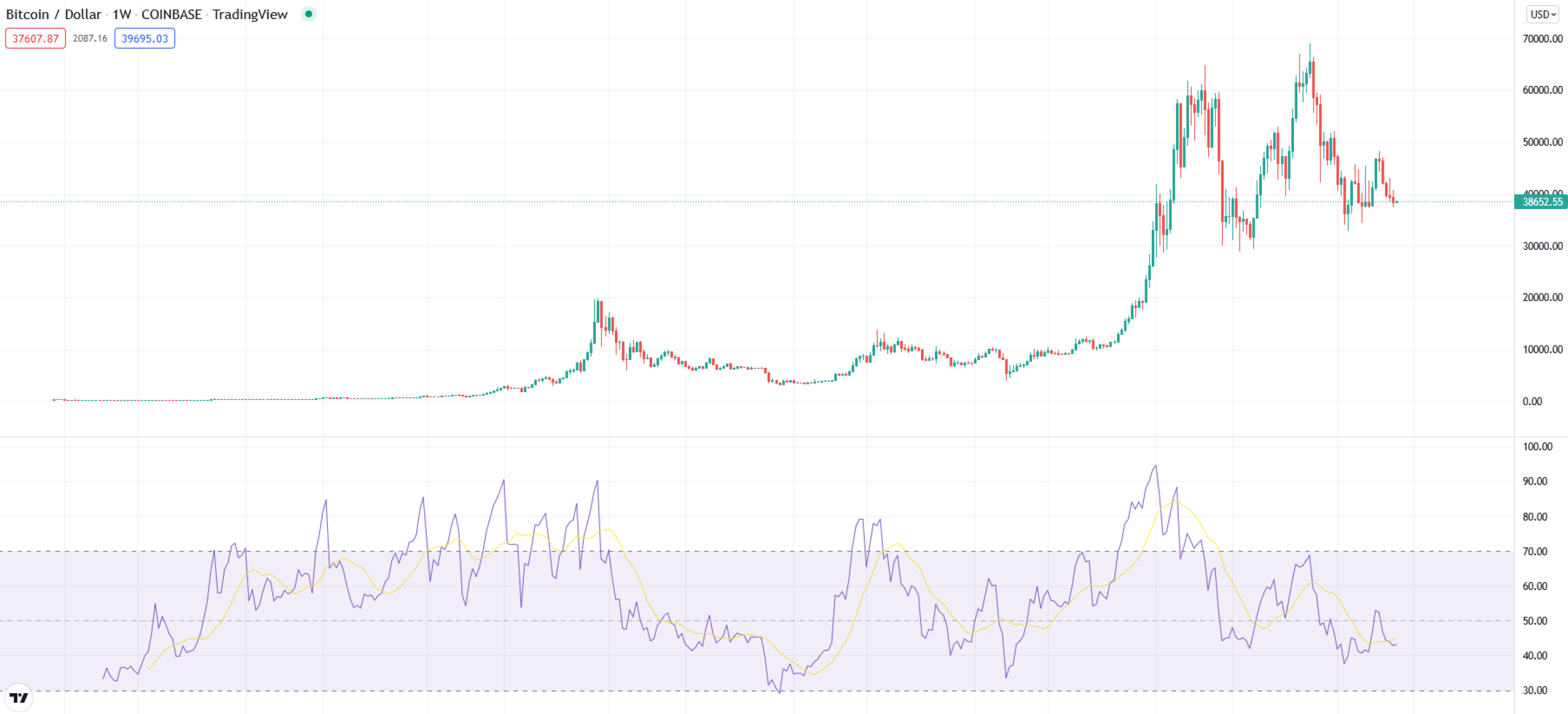
## Financial Chart: Bitcoin/USD Weekly Candlestick with RSI Indicator
### Overview
This image is a screenshot of a financial chart from the TradingView platform, displaying the weekly price action of Bitcoin against the US Dollar (BTC/USD) on the Coinbase exchange. The chart is composed of two primary sections: a main candlestick price chart at the top and a Relative Strength Index (RSI) momentum indicator at the bottom. The overall aesthetic is a standard, clean financial charting interface with a white background and light gray gridlines.
### Components/Axes
**Header Information (Top-Left):**
* **Asset & Timeframe:** "Bitcoin / Dollar · 1W · COINBASE · TradingView"
* **Data Boxes:**
* Red Box: `37607.87`
* Gray Box: `2087.16`
* Blue Box: `39695.03`
* **Current Price Label (Right Axis):** A green label displays the current price as `38652.55`.
**Main Price Chart (Upper Section):**
* **Chart Type:** Candlestick chart (green for up weeks, red for down weeks).
* **Y-Axis (Right):** Labeled "USD". Scale ranges from `0.00` to `70000.00` in increments of `10000.00`. Major gridlines are present at each increment.
* **X-Axis (Bottom):** Represents time. While specific date labels are not visible, the "1W" timeframe indicates each candle represents one week of trading data. The chart spans several years of historical data.
**RSI Indicator (Lower Section):**
* **Indicator Type:** Relative Strength Index (RSI).
* **Y-Axis (Right):** Scale ranges from `30.00` to `100.00` in increments of `10.00`.
* **Key Horizontal Levels:** Dashed lines are drawn at `30.00`, `50.00`, `70.00`, and `90.00`.
* **Shaded Region:** The area between the `30.00` and `70.00` lines is shaded in a light purple, indicating the typical "neutral" zone for the RSI.
* **Data Series:**
* **Purple Line:** The RSI value itself.
* **Yellow Line:** A moving average of the RSI, used as a signal line.
**Other Elements:**
* **TradingView Logo:** A small "TV" logo is present in the bottom-left corner.
* **Currency Selector:** A "USD" dropdown is visible in the top-right corner.
### Detailed Analysis
**Price Action (Candlestick Chart):**
* **Trend:** The chart shows a massive, multi-year uptrend from near-zero values to all-time highs, followed by a significant correction and consolidation.
* **Key Price Levels (Approximate):**
* **Early Phase:** Price consolidated near the bottom of the chart (below $1,000) for an extended period.
* **First Major Peak:** A sharp rally peaked near the `20000.00` level.
* **Second Major Bull Run:** A much larger rally began, surpassing the previous peak and reaching an all-time high slightly above `60000.00` (visually estimated between $60,000 and $65,000).
* **Correction & Consolidation:** Following the peak, the price experienced a sharp decline, finding support around the `30000.00` level. It then entered a volatile consolidation phase, trading roughly between `30000.00` and `50000.00`.
* **Current Position:** The most recent candles show the price trading near the `38652.55` label, within the upper half of the consolidation range.
**RSI Indicator Analysis:**
* **Trend:** The RSI line (purple) shows high volatility, oscillating between overbought and oversold conditions in correlation with the price trend.
* **Key RSI Levels (Approximate):**
* **Overbought Peaks:** The RSI spiked above the `90.00` level during the most intense phases of the two major bull runs, indicating extreme overbought conditions.
* **Oversold Troughs:** The RSI dipped below the `30.00` level (into the oversold region) during major price corrections, most notably after the first peak and during the deep correction from the all-time high.
* **Current Reading:** The RSI line is currently positioned around the `45-50` area, near its yellow moving average, suggesting neutral momentum. It is within the shaded `30-70` zone.
### Key Observations
1. **Parabolic Moves:** The price chart exhibits two distinct parabolic advance phases, each culminating in a sharp peak followed by a severe correction.
2. **RSI Extremes as Markers:** The most significant price tops correspond with RSI readings above 90, while major price bottoms align with RSI readings below 30.
3. **Consolidation Phase:** The latter part of the chart shows a transition from a clear trend to a ranging market, characterized by overlapping candles and a lack of clear directional momentum, reflected in the RSI hovering around its midpoint (50).
4. **Volume of Data:** The chart displays a long historical period, likely spanning from Bitcoin's early trading years (near-zero values) to a mature asset with a price in the tens of thousands of dollars.
### Interpretation
This chart tells the story of Bitcoin's evolution from a niche asset to a major financial instrument, marked by explosive growth cycles and severe volatility. The data suggests a market driven by intense speculative phases (parabolic advances with extreme RSI readings) followed by periods of correction and consolidation where the market digests gains and finds new equilibrium levels.
The relationship between the price and the RSI is textbook: the RSI acts as a momentum oscillator that confirms the strength of trends and warns of potential exhaustion. The current state—price consolidating in a wide range and RSI near neutral—indicates a market in a state of indecision, lacking the strong directional conviction seen in the earlier parabolic phases. The key takeaway is that while the long-term trend has been overwhelmingly positive, it is punctuated by dramatic boom-and-bust cycles, with the RSI providing clear signals of market extremes. The current consolidation could be interpreted as a period of accumulation or distribution, setting the stage for the next major trend.