## Heatmap Comparison: Dataset-Model Category Correlations
### Overview
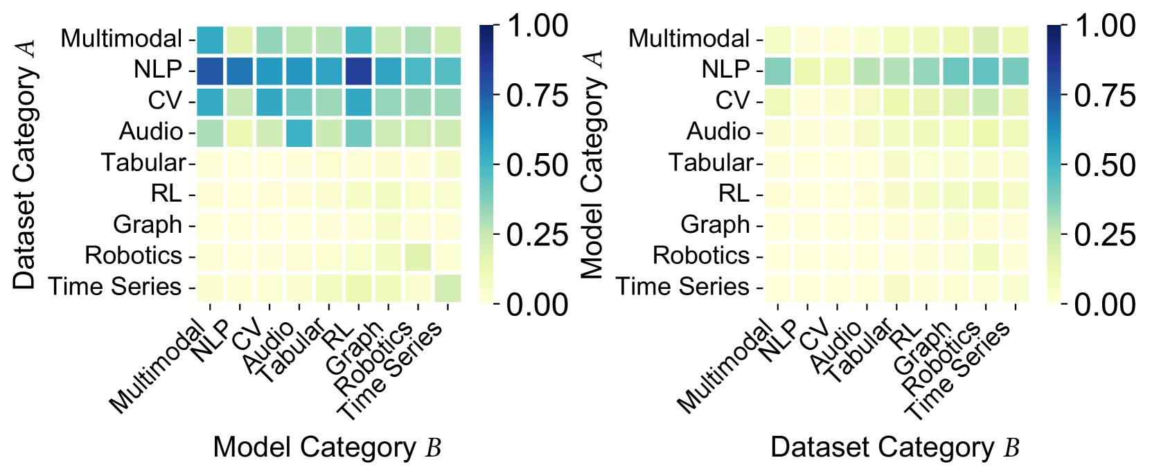
The image displays two side-by-side heatmaps visualizing numerical correlations (ranging from 0.00 to 1.00) between categories of datasets and models. The left heatmap correlates "Dataset Category A" (y-axis) with "Model Category B" (x-axis). The right heatmap correlates "Model Category A" (y-axis) with "Dataset Category B" (x-axis). The color intensity represents the correlation strength, with a shared color scale bar positioned to the right of each plot.
### Components/Axes
**Common Elements (Both Heatmaps):**
* **Color Scale Bar:** Located to the right of each heatmap. Scale ranges from 0.00 (light yellow) to 1.00 (dark blue), with labeled ticks at 0.00, 0.25, 0.50, 0.75, and 1.00.
* **Grid Categories (Identical for both axes on both plots):** The following nine categories are listed on both the x and y axes:
1. Multimodal
2. NLP
3. CV
4. Audio
5. Tabular
6. RL
7. Graph
8. Robotics
9. Time Series
**Left Heatmap Specifics:**
* **Y-axis Label:** "Dataset Category A" (positioned vertically on the far left).
* **X-axis Label:** "Model Category B" (positioned horizontally at the bottom).
* **X-axis Tick Labels:** Rotated approximately 45 degrees for readability.
**Right Heatmap Specifics:**
* **Y-axis Label:** "Model Category A" (positioned vertically between the two plots).
* **X-axis Label:** "Dataset Category B" (positioned horizontally at the bottom).
* **X-axis Tick Labels:** Rotated approximately 45 degrees for readability.
### Detailed Analysis
The heatmaps are 9x9 grids. Values are estimated based on color matching to the scale bar.
**Left Heatmap (Dataset Category A vs. Model Category B):**
* **High-Value Cluster (Approx. 0.75 - 1.00):** The "NLP" row (Dataset Category A) shows the strongest correlations. The darkest blue cells (≈1.00) are at the intersection with "NLP" and "CV" (Model Category B). The "NLP" row also shows strong correlations (≈0.75-0.90) with "Audio" and "Multimodal".
* **Moderate-Value Cluster (Approx. 0.50 - 0.75):** The "Multimodal" row (Dataset Category A) shows moderate to strong correlations with "NLP", "CV", and "Multimodal" models. The "CV" row shows moderate correlation primarily with "CV" and "NLP" models.
* **Low-Value Region (Approx. 0.00 - 0.25):** The rows for "Tabular", "RL", "Graph", "Robotics", and "Time Series" are predominantly light yellow, indicating very low correlation values (<0.25) with nearly all model categories. A slight exception is the "Robotics" row showing a faint green tint (≈0.25) with the "Robotics" model column.
**Right Heatmap (Model Category A vs. Dataset Category B):**
* **Overall Low Values:** This heatmap is significantly lighter overall, indicating generally weaker correlations when the category assignments are swapped.
* **Highest Values (Approx. 0.50 - 0.70):** The "NLP" row (Model Category A) shows the most noticeable correlations, appearing as teal squares. The strongest points (≈0.60-0.70) are at the intersection with "NLP" and "CV" (Dataset Category B).
* **Very Low Values (Approx. 0.00 - 0.25):** All other rows ("Multimodal", "CV", "Audio", etc.) are almost entirely light yellow, indicating correlations near zero with all dataset categories.
### Key Observations
1. **Asymmetry:** There is a stark asymmetry between the two plots. The left plot (Dataset A vs. Model B) shows strong, focused correlations, while the right plot (Model A vs. Dataset B) shows weak, diffuse correlations.
2. **NLP Dominance:** The "NLP" category is the strongest performer in both configurations, but its correlation strength is dramatically higher when it is the Dataset Category (left plot) compared to when it is the Model Category (right plot).
3. **Specialization:** High correlations are concentrated in the upper-left quadrant of the left heatmap, involving primarily Multimodal, NLP, and CV categories. This suggests these domains are more interconnected or that models/datasets from these areas generalize better to each other.
4. **Isolation of Other Domains:** Categories like Tabular, RL, Graph, Robotics, and Time Series show minimal cross-correlation in this visualization, suggesting they may be more specialized or that the evaluated models/datasets for these domains have limited transferability.
### Interpretation
This visualization likely represents a **transfer learning or generalization matrix**. It answers the question: "How well does a model trained on one type of data (Dataset Category) perform on another type of data (Model Category), and vice-versa?"
* **The left heatmap** suggests that **datasets** from the NLP, CV, and Multimodal domains are highly versatile. Models trained on them ("Model Category B") can achieve strong performance across a related set of tasks (especially NLP and CV tasks). This indicates these datasets contain rich, generalizable features.
* **The right heatmap** suggests that **models** specialized for a domain (e.g., an NLP model) are less versatile when applied to datasets from other domains. An NLP model ("Model Category A") retains some performance on NLP and CV datasets but fails to generalize to other data types like Audio or Tabular.
* **The core insight** is the **directionality of generalization**. The data implies that **broad, multi-domain datasets are a key driver for building generalizable models**, whereas **specialized models are less capable of adapting to new data modalities**. The asymmetry highlights that the path to general AI may be more effectively paved by creating diverse, multimodal datasets rather than by simply creating specialized models. The near-zero values for many categories indicate significant barriers to cross-domain transfer for those specific pairings.