## Histograms: Distribution of Tensor Values
### Overview
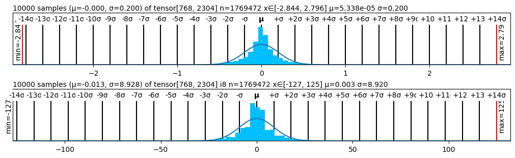
The image presents two histograms displaying the distribution of values from tensors. Each histogram is accompanied by statistical information including the number of samples, mean (μ), and standard deviation (σ). The histograms visually represent the frequency of values within specific bins.
### Components/Axes
Each histogram shares the following components:
* **X-axis:** Represents the value range of the tensor elements. The scale varies between the two histograms.
* **Y-axis:** Represents the frequency or count of values falling within each bin. The Y-axis is labeled with "min" and "max" values.
* **Histogram Bars:** Vertical bars representing the frequency of values within each bin.
* **Curve:** A smooth curve overlaid on the histogram, approximating the distribution.
* **μ Symbol:** Indicates the mean (average) value of the tensor.
* **σ Symbol:** Indicates the standard deviation of the tensor.
* **Textual Information:** Above each histogram, a string provides details about the tensor, including the number of samples, mean, and standard deviation.
**Histogram 1:**
* X-axis range: Approximately -140 to +140.
* Y-axis range: min = -2.844, max = 2.796
* Text: "10000 samples (μ=0.000, σ=0.200) of tensor[768, 2304] n=1769472 x∈[-2.844, 2.796] μ=5.338e-05 σ=0.200"
**Histogram 2:**
* X-axis range: Approximately -140 to +140.
* Y-axis range: min = -127, max = 125
* Text: "10000 samples (μ=-0.013, σ=8.928) of tensor[768, 2304] n=1769472 x∈[-127, 125] μ=0.003 σ=8.920"
### Detailed Analysis or Content Details
**Histogram 1:**
* The distribution is approximately symmetrical and centered around 0.
* The curve is bell-shaped, suggesting a normal distribution.
* The mean (μ) is 0.000, and the standard deviation (σ) is 0.200.
* The frequency is highest around 0, and decreases as you move away from 0 in either direction.
* The histogram shows a relatively narrow spread of data, as indicated by the small standard deviation.
**Histogram 2:**
* The distribution is approximately symmetrical and centered around 0.
* The curve is bell-shaped, suggesting a normal distribution.
* The mean (μ) is -0.013, and the standard deviation (σ) is 8.928.
* The frequency is highest around 0, and decreases as you move away from 0 in either direction.
* The histogram shows a much wider spread of data, as indicated by the large standard deviation.
### Key Observations
* Both histograms exhibit a roughly normal distribution.
* Histogram 2 has a significantly larger standard deviation than Histogram 1, indicating a wider spread of values.
* The mean of Histogram 1 is very close to 0, while the mean of Histogram 2 is slightly negative.
* The Y-axis scales are different for each histogram, reflecting the different frequencies of values.
### Interpretation
The two histograms represent the distribution of values within two different tensors (both of size 768x2304, with 1769472 elements). The first tensor has values clustered tightly around 0, with a small standard deviation, suggesting a relatively stable or consistent signal. The second tensor, however, has a much wider spread of values, indicated by the larger standard deviation, suggesting a more variable or noisy signal. The slight negative mean in the second tensor could indicate a systematic bias or offset in the data. The fact that both distributions are approximately normal suggests that the underlying processes generating these tensor values may be governed by similar statistical principles, but with different parameters (specifically, different scales of variation). The difference in standard deviations is the most striking feature, implying that the second tensor represents a more dynamic or less predictable quantity than the first.