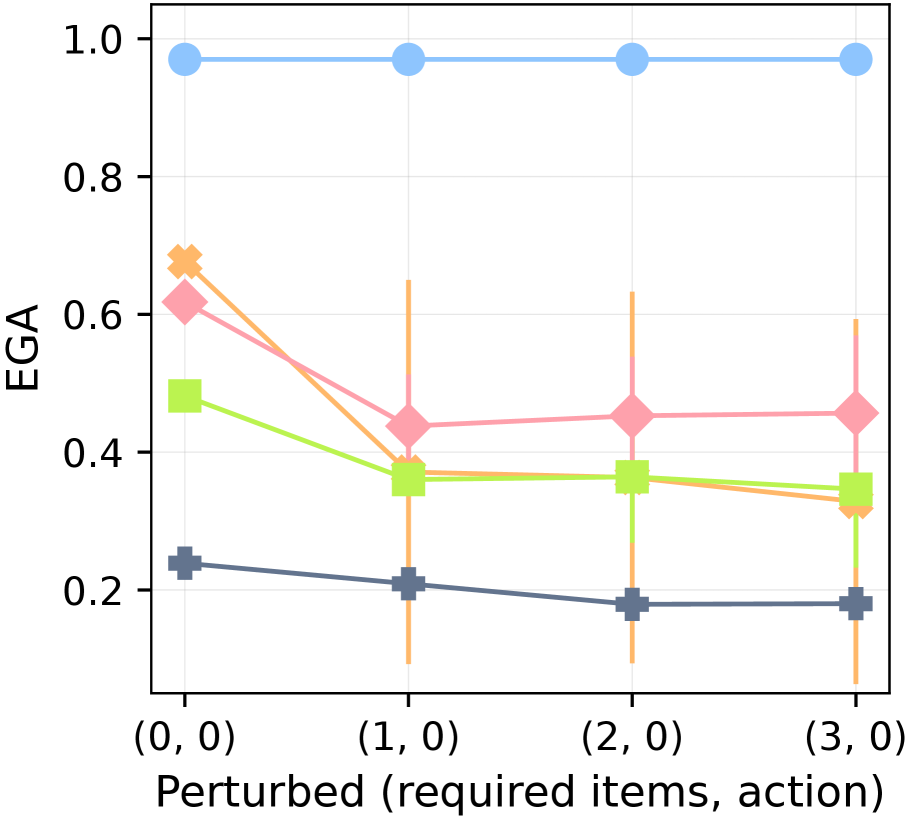
## Line Chart: EGA vs. Perturbed Items
### Overview
The image presents a line chart illustrating the relationship between "Perturbed (required items, action)" on the x-axis and "EGA" on the y-axis. Four distinct lines are plotted, each representing a different data series. The chart appears to demonstrate how EGA values change as the number of perturbed items increases.
### Components/Axes
* **X-axis Title:** "Perturbed (required items, action)"
* **X-axis Markers:** (0, 0), (1, 0), (2, 0), (3, 0)
* **Y-axis Title:** "EGA"
* **Y-axis Scale:** Ranges from 0.0 to 1.0, with increments of 0.2.
* **Data Series:** Four lines, each with a unique color and marker:
* Light Blue Line with Circle Markers
* Pink Line with Diamond Markers
* Green Line with Square Markers
* Dark Blue Line with Cross Markers
### Detailed Analysis
Let's analyze each line individually, noting trends and approximate data points.
* **Light Blue Line:** This line is relatively flat, starting at approximately 0.95 at (0, 0) and remaining consistently around 0.95-1.0 throughout the x-axis range.
* **Pink Line:** This line exhibits a downward trend. It begins at approximately 0.7 at (0, 0), decreases to around 0.45 at (1, 0), then plateaus around 0.35-0.4 for (2, 0) and (3, 0).
* **Green Line:** This line also shows a downward trend, but less pronounced than the pink line. It starts at approximately 0.55 at (0, 0), decreases to around 0.35 at (1, 0), and remains relatively stable around 0.3-0.35 for (2, 0) and (3, 0).
* **Dark Blue Line:** This line shows a slight downward trend. It starts at approximately 0.2 at (0, 0), decreases to around 0.18 at (1, 0), and remains relatively stable around 0.18-0.2 for (2, 0) and (3, 0).
Here's a table summarizing the approximate data points:
| Perturbed (required items, action) | Light Blue (EGA) | Pink (EGA) | Green (EGA) | Dark Blue (EGA) |
|---|---|---|---|---|
| (0, 0) | 0.95 | 0.7 | 0.55 | 0.2 |
| (1, 0) | 0.95 | 0.45 | 0.35 | 0.18 |
| (2, 0) | 0.95 | 0.35 | 0.3 | 0.18 |
| (3, 0) | 1.0 | 0.4 | 0.35 | 0.2 |
### Key Observations
* The light blue line consistently maintains a high EGA value, indicating minimal impact from the perturbed items.
* The pink and green lines show a clear decreasing trend in EGA as the number of perturbed items increases, suggesting a negative correlation.
* The dark blue line remains consistently low, indicating a consistently low EGA value regardless of the number of perturbed items.
* The rate of decrease in EGA is most significant between (0, 0) and (1, 0) for both the pink and green lines.
### Interpretation
The chart suggests that the "EGA" metric is sensitive to the number of "perturbed" items, particularly for the pink and green data series. The light blue line's stability indicates that this particular data series is robust to perturbations. The dark blue line's consistently low value suggests a fundamentally different behavior or baseline.
The x-axis label "(required items, action)" implies that the perturbations involve changes to required items or actions within a system. The EGA metric likely represents some measure of system performance, effectiveness, or goal achievement. The decreasing EGA values with increasing perturbations suggest that the system's ability to achieve its goals is compromised as more items or actions are altered.
The plateauing of the pink and green lines after (1, 0) could indicate a saturation point, where further perturbations have diminishing returns on the EGA value. The consistent low EGA of the dark blue line could represent a system component that is inherently less effective or more vulnerable to perturbations.
Further investigation would be needed to understand the specific meaning of "EGA" and the nature of the "perturbed" items and actions to draw more definitive conclusions.