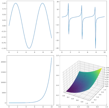
## Multi-Subplot Visualization: Mathematical and Data Trends
### Overview
The image contains four distinct subplots arranged in a 2x2 grid, each depicting different mathematical or data trends. The subplots include a sine wave, a series of vertical spikes, an exponential growth curve, and a 3D surface plot. All subplots use a consistent x-axis range (0–10) and y-axis scales varying by subplot. The 3D plot introduces a z-axis and a color gradient.
---
### Components/Axes
#### Top-Left Subplot (Sine Wave)
- **X-axis**: Labeled "0–10" with ticks at 0, 2, 4, 6, 8, 10.
- **Y-axis**: Labeled "-1.0 to 1.0" with ticks at -1.0, -0.5, 0.0, 0.5, 1.0.
- **Legend**: None explicitly visible. The curve is a single blue line.
- **Trend**: A periodic sine wave with two peaks (at x=1 and x=9) and a trough (at x=5). Crosses zero at x=3 and x=7.
#### Top-Right Subplot (Vertical Spikes)
- **X-axis**: Labeled "0–10" with ticks at 0, 2, 4, 6, 8, 10.
- **Y-axis**: Labeled "-40 to 40" with ticks at -40, -20, 0, 20, 40.
- **Legend**: None explicitly visible. The spikes are sharp vertical lines at x=2, 4, 6, 8.
- **Trend**: Four vertical spikes centered at x=2, 4, 6, 8, with y-values reaching ±20. The spikes are symmetric around the x-axis.
#### Bottom-Left Subplot (Exponential Growth)
- **X-axis**: Labeled "0–10" with ticks at 0, 2, 4, 6, 8, 10.
- **Y-axis**: Labeled "0 to 20,000" with ticks at 0, 5,000, 10,000, 15,000, 20,000.
- **Legend**: None explicitly visible. The curve is a single blue line.
- **Trend**: A rapidly increasing exponential curve starting near 0 at x=0 and rising to ~20,000 at x=10.
#### Bottom-Right Subplot (3D Surface Plot)
- **X-axis**: Labeled "0–1" with ticks at 0, 0.2, 0.4, 0.6, 0.8, 1.0.
- **Y-axis**: Labeled "0–1" with ticks at 0, 0.2, 0.4, 0.6, 0.8, 1.0.
- **Z-axis**: Labeled "-0.2 to 0.8" with ticks at -0.2, -0.1, 0.0, 0.1, 0.2, 0.3, 0.4, 0.5, 0.6, 0.7, 0.8.
- **Legend**: Located in the top-right corner of the subplot. Colors correspond to z-values: purple (low), green (mid), yellow (high).
- **Trend**: A saddle-shaped surface with a minimum at (x=0.5, y=0.5, z≈-0.2) and a maximum at (x=1, y=1, z≈0.8). The gradient transitions from purple (low z) to yellow (high z).
---
### Detailed Analysis
#### Top-Left Subplot (Sine Wave)
- **Key Data Points**:
- Peaks: (1, 1.0), (9, 1.0)
- Trough: (5, -1.0)
- Zero crossings: (3, 0.0), (7, 0.0)
- **Uncertainty**: Approximate values due to lack of grid lines. Peaks and troughs are visually estimated.
#### Top-Right Subplot (Vertical Spikes)
- **Key Data Points**:
- Spikes at x=2, 4, 6, 8 with y-values of ±20.
- No intermediate values between spikes.
- **Uncertainty**: Exact y-values are approximate; spikes are sharp and symmetric.
#### Bottom-Left Subplot (Exponential Growth)
- **Key Data Points**:
- At x=0: y≈0
- At x=10: y≈20,000
- Intermediate values: Exponential growth (e.g., x=5: y≈1,000; x=8: y≈10,000).
- **Uncertainty**: Values are estimated based on the curve's steepness.
#### Bottom-Right Subplot (3D Surface Plot)
- **Key Data Points**:
- Minimum: (0.5, 0.5, -0.2)
- Maximum: (1.0, 1.0, 0.8)
- Gradient: Purple (low z) to yellow (high z) indicates increasing z-values.
- **Uncertainty**: Z-values are approximate due to the color gradient.
---
### Key Observations
1. **Periodicity**: The sine wave (top-left) exhibits a clear periodic pattern with a frequency of ~2 cycles over the x-axis range.
2. **Impulse Response**: The vertical spikes (top-right) suggest discrete events or impulses at specific x-values.
3. **Exponential Growth**: The bottom-left plot shows rapid growth, likely representing a logarithmic or exponential function.
4. **Multivariable Relationship**: The 3D plot (bottom-right) demonstrates a saddle-shaped surface, indicating a nonlinear relationship between x, y, and z.
---
### Interpretation
- **Sine Wave**: Likely represents a periodic function (e.g., signal processing, oscillatory behavior).
- **Vertical Spikes**: Could model impulse responses in systems or discrete events in time-series data.
- **Exponential Growth**: Suggests a scenario with accelerating growth (e.g., population, financial growth, or computational complexity).
- **3D Surface Plot**: The saddle shape implies a trade-off or interaction between variables (e.g., optimization problems, multivariable functions).
The subplots collectively highlight diverse mathematical behaviors: periodicity, discrete events, exponential growth, and multivariable nonlinearity. The 3D plot’s color gradient emphasizes the z-axis dependency, while the other subplots focus on 2D trends. No outliers are present, but the exponential growth curve’s steepness may indicate sensitivity to input changes.