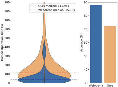
# Technical Data Extraction: Performance Comparison Analysis
This document provides a comprehensive extraction of data from the provided image, which consists of two side-by-side charts comparing "WebArena" and "Ours" (the proposed method) across two metrics: Human Operation Time and Accuracy.
## 1. Component Isolation
The image is divided into two primary regions:
* **Left Region (Violin Plot):** Displays the distribution and median values of "Human Operation Time (s)".
* **Right Region (Bar Chart):** Displays the "Accuracy (%)" for both categories.
---
## 2. Left Region: Human Operation Time (s)
This is a violin plot showing the density distribution of time taken for operations.
### Metadata and Legend
* **Y-Axis Title:** Human Operation Time (s)
* **Y-Axis Scale:** 0 to 900, with markers every 100 units.
* **Legend Location:** Top-center [approx. x=0.4, y=0.9].
* **Legend Items:**
* **Red dashed line:** "Ours median: 111.94s"
* **Blue dashed line:** "WebArena median: 35.38s"
### Data Series Analysis
| Series | Color | Visual Trend/Shape | Median Value |
| :--- | :--- | :--- | :--- |
| **WebArena** | Blue | Concentrated heavily at the bottom (0-100s range) with a very thin tail extending up to ~500s. | 35.38s |
| **Ours** | Orange | Much broader distribution; the bulk of the data is between 50s and 300s, with a significant long tail reaching up to 900s. | 111.94s |
### Key Observations
* The "Ours" dataset shows significantly higher variance and a much higher median operation time compared to "WebArena".
* The "Ours" distribution is shifted upward, indicating that tasks in this category generally take longer to complete.
---
## 3. Right Region: Accuracy (%)
This is a vertical bar chart comparing the success rate of the two methods.
### Metadata
* **Y-Axis Title:** Accuracy (%)
* **Y-Axis Scale:** 30 to 90, with markers every 10 units.
* **X-Axis Categories:** WebArena, Ours.
### Data Points
| Category | Bar Color | Visual Height | Estimated Value |
| :--- | :--- | :--- | :--- |
| **WebArena** | Blue | Near the top of the scale. | ~88% |
| **Ours** | Orange | Slightly above the 70 line. | ~72% |
### Key Observations
* **WebArena** outperforms the "Ours" method in terms of accuracy by approximately 16 percentage points.
* The colors of the bars (Blue for WebArena, Orange for Ours) correspond directly to the colors used in the violin plot on the left.
---
## 4. Summary of Findings
The combined data indicates a performance trade-off or a difference in task complexity:
1. **Efficiency:** WebArena is faster, with a median time of **35.38s** compared to **111.94s** for the "Ours" method.
2. **Reliability:** WebArena is more accurate (**~88%**) compared to the "Ours" method (**~72%**).
3. **Complexity:** The long tail in the "Ours" violin plot (reaching 900s) suggests that the "Ours" dataset may contain significantly more complex or time-consuming tasks than the WebArena dataset.