## Line Chart: Critic Score Mean Over Training Steps
### Overview
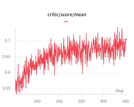
The image displays a line chart tracking a metric labeled "critic/score/mean" over a series of "Steps." The chart shows a single, highly volatile data series with a clear upward trend. The overall visual impression is of a noisy but improving signal.
### Components/Axes
* **Chart Title:** "critic/score/mean" (centered at the top).
* **Y-Axis (Vertical):** Represents the mean critic score. It is labeled with numerical markers at intervals of 0.05, ranging from **0.55** at the bottom to **0.70** at the top. The axis line itself is visible on the left.
* **X-Axis (Horizontal):** Represents "Step," likely indicating training iterations or time. It is labeled with numerical markers at intervals of 100, from **0** to **500**. The label "Step" is placed at the bottom-right corner of the axis.
* **Legend:** A small, horizontal red dash is present in the top-center area, just below the title. There is no accompanying text label for this dash. Based on the chart's single data series, this dash is inferred to represent the "critic/score/mean" line.
* **Data Series:** A single, continuous red line plotted across the chart area.
### Detailed Analysis
* **Trend Verification:** The red line exhibits a clear, positive slope from left to right. It begins at a low point and ends at a high point, confirming an overall upward trend despite significant local volatility.
* **Data Point Extraction (Approximate):**
* **Start (Step ~0):** The line begins at its lowest point, approximately **0.54 - 0.55**.
* **Mid-Point (Step ~250):** The line fluctuates around a central value of approximately **0.65 - 0.67**.
* **End (Step ~500):** The line reaches its highest point, approximately **0.70**.
* **Volatility/Noise:** The line is characterized by high-frequency, jagged fluctuations. The amplitude of these fluctuations appears relatively consistent throughout the chart, spanning roughly **±0.03 to ±0.05** units from the local trend line at any given point.
* **Notable Features:**
* There is a significant, sharp dip around **Step 300**, where the value drops to near **0.60** before recovering.
* The highest peaks in the latter half of the chart (Steps 400-500) approach or slightly exceed the **0.70** mark.
### Key Observations
1. **Positive Correlation:** There is a strong positive correlation between the step count and the mean critic score.
2. **High Variance:** The process generating this score is highly stochastic or noisy, as evidenced by the constant, large-magnitude fluctuations.
3. **Potential Convergence:** While the trend is upward, the rate of increase appears to slow slightly in the final 100 steps (400-500), and the values seem to oscillate within a narrower high band (approx. 0.67-0.70), which could suggest the beginning of convergence or a performance plateau.
4. **Anomaly:** The pronounced dip near Step 300 is an outlier in the general upward trend and could indicate a temporary instability, a change in parameters, or an external event in the process being measured.
### Interpretation
This chart likely visualizes the training progress of a machine learning model, specifically the performance of a "critic" component (common in reinforcement learning or GANs). The "mean critic score" is a performance metric.
* **What the data suggests:** The model's critic is improving its evaluation (or its ability to be evaluated) as training progresses. The upward trend indicates successful learning.
* **Relationship between elements:** The "Step" (x-axis) is the independent variable representing training time/effort. The "critic/score/mean" (y-axis) is the dependent variable, a measure of success. The noisy line shows that improvement is not smooth but occurs in a jagged, stepwise fashion amidst significant variance.
* **Why it matters:** The chart provides a diagnostic view of training health. The positive trend is good. The high noise level might be expected for the algorithm in use, but it could also suggest that the learning rate is high or the batch size is small. The dip at Step 300 would be a point for investigation—was there a bug, a data issue, or a deliberate change? The potential plateau near the end suggests it may be time to adjust training parameters (like a learning rate decay) or to consider the model sufficiently trained.
**Language Note:** All text in the image is in English.