\n
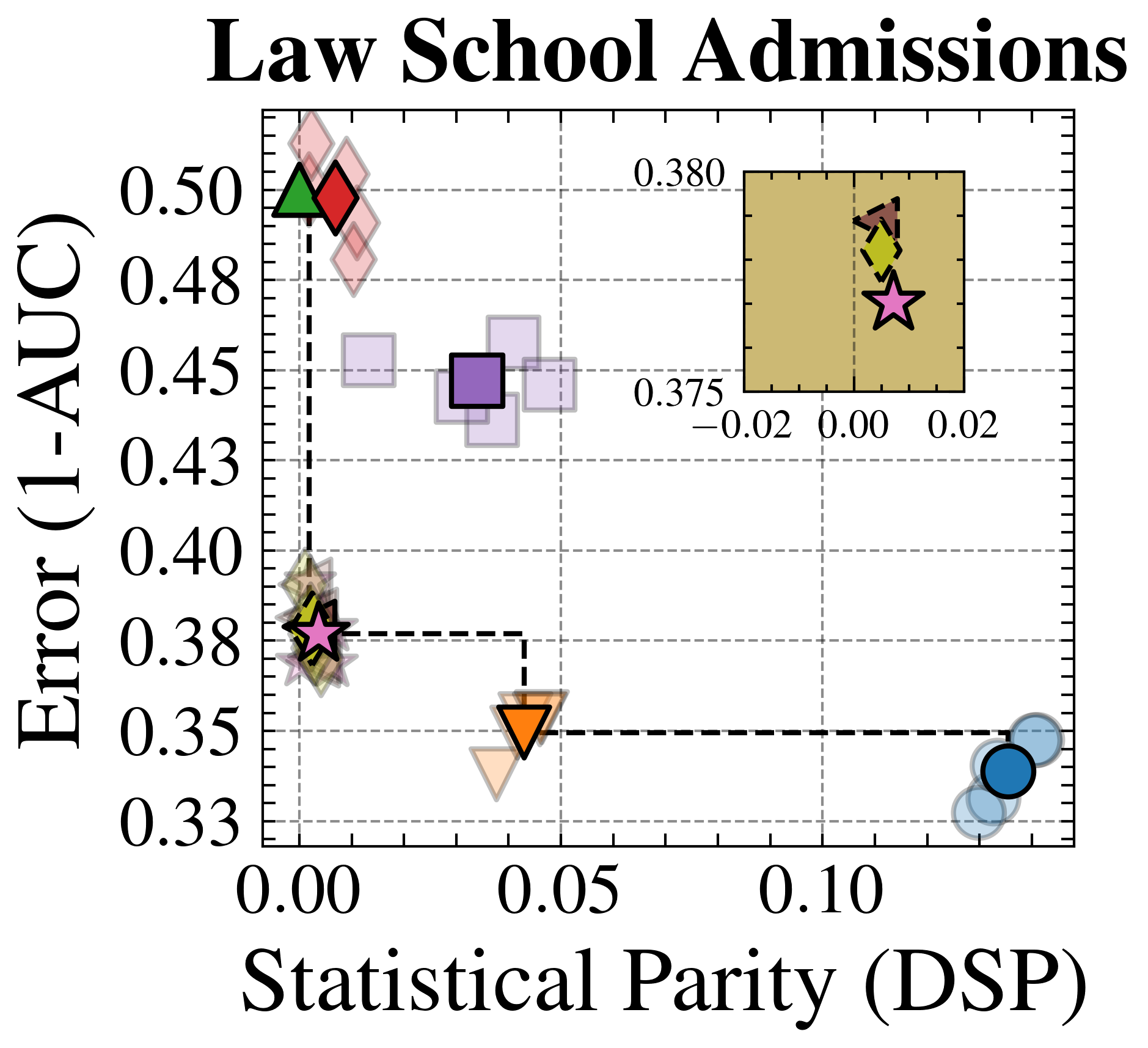
## Scatter Plot: Law School Admissions Fairness-Accuracy Trade-off
### Overview
The image is a scatter plot titled "Law School Admissions" that visualizes the trade-off between a model's predictive error and its statistical parity (a fairness metric). The plot compares multiple models or methods, represented by distinct markers, across two dimensions. An inset plot in the top-right corner provides a magnified view of a specific cluster of points near the origin.
### Components/Axes
* **Main Plot Title:** "Law School Admissions" (centered at the top).
* **X-Axis:** Labeled "Statistical Parity (DSP)". The scale runs from 0.00 to approximately 0.15, with major ticks at 0.00, 0.05, and 0.10. DSP likely stands for "Demographic Statistical Parity," a measure of fairness where a value of 0 indicates perfect parity.
* **Y-Axis:** Labeled "Error (1-AUC)". The scale runs from 0.33 to 0.50, with major ticks at 0.33, 0.35, 0.38, 0.40, 0.43, 0.45, 0.48, and 0.50. This represents the model's error rate, where a lower value indicates better predictive performance (higher AUC).
* **Data Series (Markers):** The plot contains multiple data series, each represented by a unique shape and color. There is no explicit legend box; identification is based on visual matching.
* **Green Triangle (▲):** Positioned at high error (~0.50) and very low DSP (~0.00).
* **Red Diamond (◆):** Positioned at high error (~0.50) and very low DSP (~0.00), slightly to the right of the green triangle.
* **Purple Square (■):** Positioned at moderate error (~0.45) and moderate DSP (~0.04).
* **Pink Star (★):** Positioned at lower error (~0.38) and very low DSP (~0.00). This point is connected by dashed lines to the orange inverted triangle and the blue circle.
* **Orange Inverted Triangle (▼):** Positioned at low error (~0.35) and moderate DSP (~0.05).
* **Blue Circle (●):** Positioned at the lowest error (~0.34) and the highest DSP (~0.14).
* **Other Markers:** Several semi-transparent or lighter-shaded versions of the above markers (e.g., light pink diamonds, light purple squares, light orange triangles, light blue circles) are scattered around their primary counterparts, likely representing variance, multiple runs, or related methods.
* **Inset Plot:** Located in the top-right quadrant of the main plot area.
* **Inset Axes:** X-axis from -0.02 to 0.02; Y-axis from 0.375 to 0.380.
* **Inset Content:** Contains a brown arrow pointing up and left, a yellow diamond, and a pink star (★). This provides a detailed view of the cluster near (DSP=0.00, Error=0.38).
* **Guides:** Dashed grid lines are present. Black dashed lines connect the pink star to the orange inverted triangle and the blue circle, suggesting a direct comparison or a Pareto frontier between these points.
### Detailed Analysis
* **Trend Verification:** The overall visual trend shows a negative correlation: as Statistical Parity (DSP) increases (moving right on the x-axis), the Error (1-AUC) generally decreases (moving down on the y-axis). This illustrates a classic fairness-accuracy trade-off.
* **Data Point Approximation:**
* **High Error / High Fairness Cluster:** Green Triangle and Red Diamond are near (DSP ≈ 0.00, Error ≈ 0.50).
* **Moderate Error / Moderate Fairness Cluster:** Purple Square is near (DSP ≈ 0.04, Error ≈ 0.45).
* **Lower Error / High Fairness Cluster:** Pink Star is near (DSP ≈ 0.00, Error ≈ 0.38). The inset shows this point in detail, with the pink star at approximately (DSP=0.00, Error=0.378).
* **Low Error / Moderate Fairness Point:** Orange Inverted Triangle is near (DSP ≈ 0.05, Error ≈ 0.35).
* **Lowest Error / Lowest Fairness Point:** Blue Circle is near (DSP ≈ 0.14, Error ≈ 0.34).
* **Spatial Grounding:** The legend is not in a separate box but is encoded in the markers themselves. The inset is positioned in the top-right, overlapping the main plot's grid. The dashed lines create a visual triangle connecting the Pink Star, Orange Inverted Triangle, and Blue Circle, highlighting them as key points of comparison.
### Key Observations
1. **Clear Trade-off:** There is a distinct downward slope from the top-left (high error, high fairness) to the bottom-right (low error, low fairness).
2. **Pareto Frontier:** The points connected by dashed lines (Pink Star, Orange Inverted Triangle, Blue Circle) appear to form a Pareto frontier, where improving one metric (e.g., lowering error) necessarily worsens the other (increasing DSP).
3. **Cluster at High Fairness:** Several methods achieve near-perfect statistical parity (DSP ≈ 0.00) but with widely varying error rates, from ~0.38 (Pink Star) to ~0.50 (Green Triangle/Red Diamond).
4. **Outlier/Best Compromise:** The Pink Star represents a method that achieves relatively low error (~0.38) while maintaining near-perfect fairness (DSP ≈ 0.00), making it a potentially optimal compromise point compared to others on the plot.
5. **Inset Purpose:** The inset magnifies the region around the Pink Star, suggesting it is a point of particular interest, possibly the proposed method in the study from which this plot originates.
### Interpretation
This chart demonstrates the inherent tension between predictive accuracy and group fairness in a law school admissions model. The "Statistical Parity (DSP)" metric measures whether the model's positive prediction rate is equal across demographic groups; a value of 0 is ideal. "Error (1-AUC)" measures the model's overall mistake rate.
The data suggests that achieving perfect fairness (DSP=0) comes at a significant cost to accuracy, as seen with the Green Triangle and Red Diamond points. However, the Pink Star point indicates that it is possible to attain a much better accuracy (Error ≈ 0.38) while still maintaining perfect fairness, outperforming other fair models. The Blue Circle shows the highest accuracy but with substantial unfairness (DSP ≈ 0.14).
The dashed lines connecting the Pink Star, Orange Inverted Triangle, and Blue Circle likely illustrate the "cost of fairness": moving from the Blue Circle to the Orange Inverted Triangle improves fairness (DSP decreases from ~0.14 to ~0.05) with a small error increase (~0.34 to ~0.35). Moving further to the Pink Star achieves perfect fairness (DSP=0) but with a larger error increase (to ~0.38). The plot argues that the method represented by the Pink Star offers a superior balance, achieving fairness without the extreme accuracy penalty seen in other fair models (Green/Red). The inset emphasizes the precision and stability of this key result.