## Bar Chart: Performance of Different Tools
### Overview
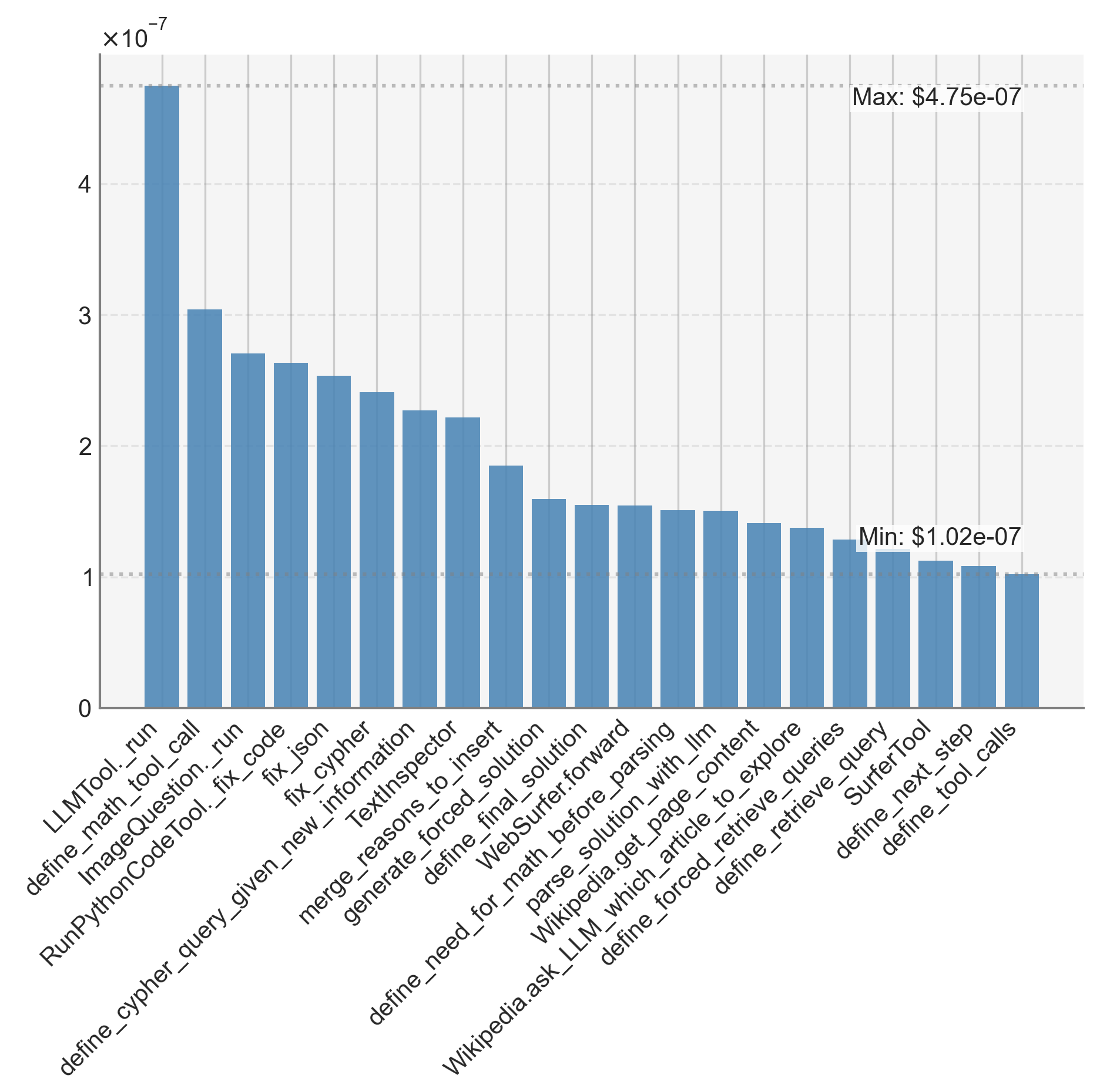
The image is a bar chart comparing the performance of different tools. The y-axis represents a value scaled by 10^-7, and the x-axis lists the names of the tools. The chart shows a decreasing trend in performance from left to right.
### Components/Axes
* **Y-axis:** Labeled as "x10^-7". The scale ranges from 0 to 4 with tick marks at every integer.
* **X-axis:** Lists the names of different tools. The labels are rotated for readability.
* **Bars:** Represent the performance of each tool. All bars are the same shade of blue.
* **Horizontal Gridlines:** Dotted lines at each integer value on the y-axis.
* **Max Value Annotation:** Located at the top-right, indicating "Max: $4.75e-07".
* **Min Value Annotation:** Located near the bottom-right, indicating "Min: $1.02e-07".
### Detailed Analysis
The following is a list of the tools and their approximate values, read from the bar chart:
1. **LLMTool.\_run:** 4.7 x 10^-7
2. **define\_math\_tool\_call:** 3.1 x 10^-7
3. **ImageQuestion.\_run:** 2.7 x 10^-7
4. **RunPythonCodeTool.\_fix\_code:** 2.6 x 10^-7
5. **fix\_json:** 2.6 x 10^-7
6. **fix\_cypher:** 2.4 x 10^-7
7. **define\_cypher\_query\_given\_new\_information:** 2.4 x 10^-7
8. **TextInspector:** 2.2 x 10^-7
9. **merge\_reasons\_to\_insert:** 2.2 x 10^-7
10. **generate\_forced\_solution:** 1.9 x 10^-7
11. **define\_final\_solution:** 1.6 x 10^-7
12. **WebSurfer.forward:** 1.6 x 10^-7
13. **define\_need\_for\_math\_before\_parsing:** 1.5 x 10^-7
14. **parse\_solution\_with\_llm:** 1.5 x 10^-7
15. **Wikipedia.get\_page\_content:** 1.5 x 10^-7
16. **Wikipedia.ask\_LLM\_which\_article\_to\_explore:** 1.4 x 10^-7
17. **define\_forced\_retrieve\_queries:** 1.4 x 10^-7
18. **define\_retrieve\_query:** 1.2 x 10^-7
19. **SurferTool:** 1.1 x 10^-7
20. **define\_next\_step:** 1.05 x 10^-7
21. **define\_tool\_calls:** 1.02 x 10^-7
### Key Observations
* The performance varies significantly across the different tools.
* "LLMTool.\_run" has the highest performance, almost double that of some other tools.
* The performance generally decreases from left to right, with some minor fluctuations.
* The minimum value is close to 1 x 10^-7, while the maximum is close to 4.75 x 10^-7.
### Interpretation
The bar chart visualizes the relative performance of various tools, likely in the context of a specific task or benchmark. The wide range of performance suggests that some tools are significantly more effective than others. The "LLMTool.\_run" tool stands out as a top performer. The chart provides a clear comparison, allowing for easy identification of the most and least effective tools. The values are scaled by 10^-7, which could represent a metric like time taken, cost, or error rate. The specific meaning of the y-axis would provide more context.