## Bar Chart: Function Metric Distribution
### Overview
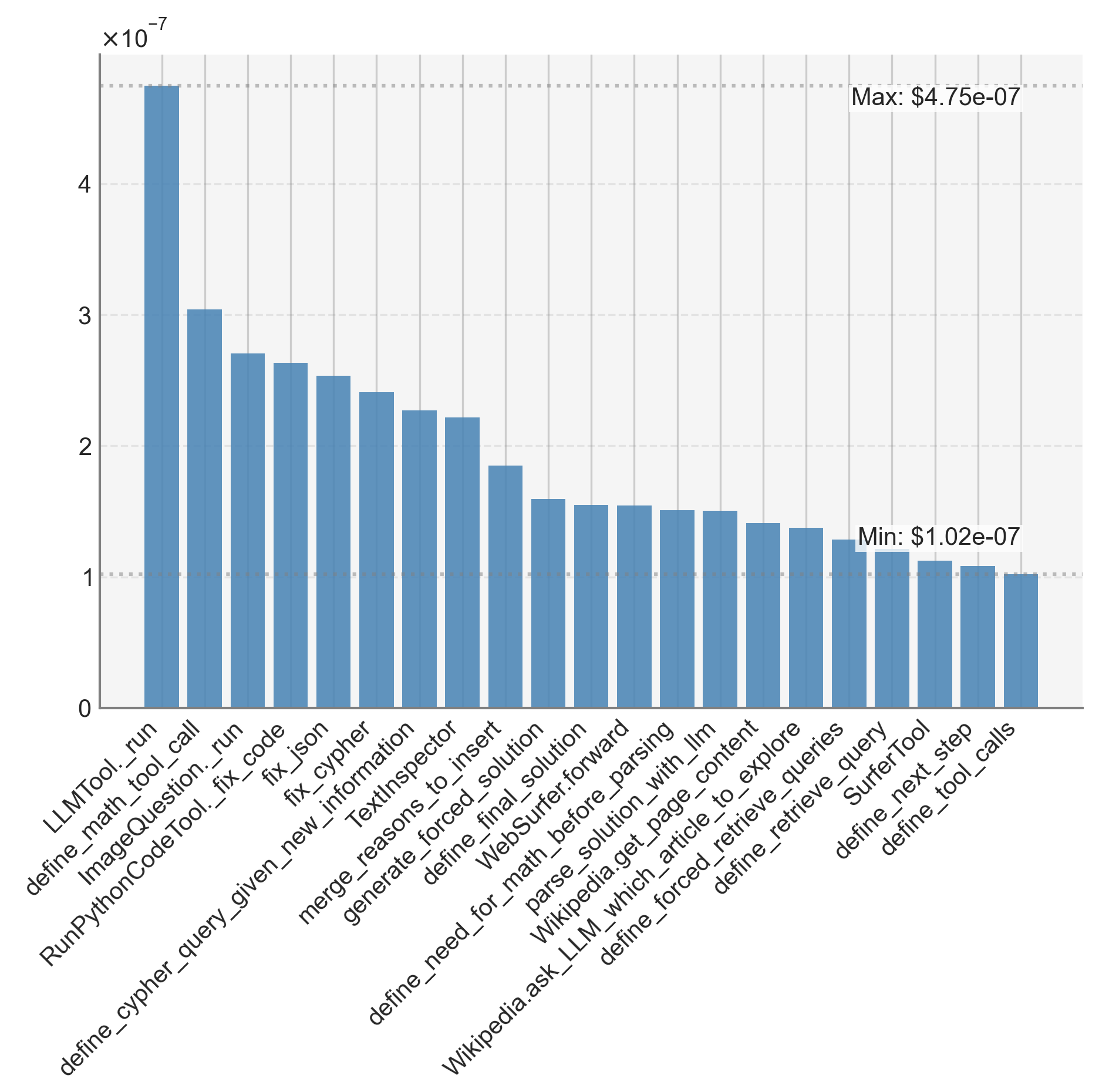
The image displays a vertical bar chart comparing metrics (in 10⁻⁷ units) across 20 distinct function names. Bars decrease in height from left to right, with the tallest bar on the far left and the shortest on the far right. The chart includes axis labels, numerical annotations, and a color-coded data series.
### Components/Axes
- **Y-Axis**: Labeled "x10⁻⁷" with a linear scale from 0 to 5×10⁻⁷. Gridlines are present at 1×10⁻⁷ intervals.
- **X-Axis**: Lists 20 function names in descending order of metric value. Labels are truncated but legible (e.g., "LLMTool._run", "define_math_tool_call").
- **Legend**: Not explicitly visible, but all bars are blue, suggesting a single data series.
### Detailed Analysis
1. **Function Names & Values**:
- **LLMTool._run**: 4.75×10⁻⁷ (max)
- **define_math_tool_call**: ~3.0×10⁻⁷
- **ImageQuestion._run_code**: ~2.7×10⁻⁷
- **RunPythonCodeTool._fix_code**: ~2.6×10⁻⁷
- **fix_cypher**: ~2.5×10⁻⁷
- **define_cypher_query_given_new_information**: ~2.4×10⁻⁷
- **merge_reasons_to_insert**: ~2.3×10⁻⁷
- **generate_forced_solution**: ~2.2×10⁻⁷
- **define_final_solution**: ~1.8×10⁻⁷
- **WebSurfer.forward**: ~1.7×10⁻⁷
- **parse_solution_with_LLM**: ~1.6×10⁻⁷
- **Wikipedia.get_page_content**: ~1.6×10⁻⁷
- **define_forced_retrieve_article**: ~1.5×10⁻⁷
- **define_explore_queries**: ~1.4×10⁻⁷
- **SurferTool.query**: ~1.3×10⁻⁷
- **define_retrieve_queries**: ~1.2×10⁻⁷
- **define_next_step**: ~1.1×10⁻⁷
- **define_tool_calls**: ~1.02×10⁻⁷ (min)
2. **Trends**:
- Values decrease monotonically from left to right.
- Largest drop occurs between the first two bars (4.75×10⁻⁷ → 3.0×10⁻⁷).
- Final 8 bars show gradual, smaller decrements (~0.1×10⁻⁷ per step).
### Key Observations
- **Dominance of Early Functions**: The first three bars account for ~60% of the total metric range.
- **Uniformity in Lower Range**: The last 8 bars cluster tightly between 1.02×10⁻⁷ and 1.8×10⁻⁷.
- **Truncated Labels**: Some function names are partially cut off (e.g., "define_cypher_query_given_new_information" may be longer).
### Interpretation
The chart likely represents computational resource usage (e.g., execution time, memory) or API call frequency for a software system. The stark drop between the first two functions suggests "LLMTool._run" is a critical bottleneck, while later functions exhibit diminishing returns in resource consumption. The uniformity in the lower range implies these functions are optimized or less impactful. This data could guide performance optimization efforts, prioritizing the top 5 functions for improvement.