\n
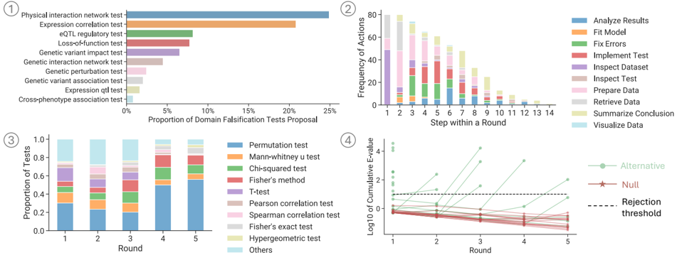
## Stacked Bar Charts: Domain Falsification Tests & Data Analysis Workflow
### Overview
The image presents four stacked bar charts visualizing data related to domain falsification tests and a data analysis workflow. Chart 1 shows the proportion of domain falsification tests proposed for different test types. Chart 2 displays the frequency of actions taken during each step of a data analysis round. Chart 3 illustrates the proportion of tests used in each round of falsification. Chart 4 shows the cumulative E-value over rounds, comparing alternative and null hypotheses against a rejection threshold.
### Components/Axes
**Chart 1:**
* **X-axis:** Proportion of Domain Falsification Tests Proposal (0% to 25%)
* **Y-axis:** Test Types (listed vertically)
* Physical interaction network test
* Expression correlation test
* eQTL regulatory test
* Loss-of-function test
* Genetic variant impact test
* Genetic interaction network test
* Genetic perturbation test
* Genetic association test
* Expression qtl test
* Cross-phenotype association test
* **Color:** Each test type is represented by a different color.
**Chart 2:**
* **X-axis:** Step within a Round (1 to 14)
* **Y-axis:** Frequency of Actions
* **Legend (Top-Right):**
* Analyze Results (Blue)
* Fit Model (Orange)
* Fix Errors (Red)
* Implement Test (Green)
* Inspect Dataset (Pink)
* Inspect Test (Purple)
* Prepare Data (Brown)
* Retrieve Data (Grey)
* Summarize Conclusion (Light Blue)
* Visualize Data (Yellow)
**Chart 3:**
* **X-axis:** Round (1 to 5)
* **Y-axis:** Proportion of Tests (0 to 1.0)
* **Legend (Top-Right):**
* Permutation test (Red)
* Mann-Whitney U test (Orange)
* Chi-squared test (Yellow)
* Fisher’s method (Green)
* T-test (Blue)
* Pearson correlation test (Purple)
* Spearman correlation test (Brown)
* Fisher’s exact test (Pink)
* Hypergeometric test (Grey)
* Others (Light Blue)
**Chart 4:**
* **X-axis:** Round (1 to 5)
* **Y-axis:** Log10 of Cumulative E-value
* **Legend (Top-Left):**
* Alternative (Blue)
* Null (Orange)
* Rejection threshold (Grey)
### Detailed Analysis or Content Details
**Chart 1:**
The "Physical interaction network test" has the highest proportion, approximately 23%. "Expression correlation test" is around 18%. "eQTL regulatory test" is approximately 15%. "Loss-of-function test" is around 10%. The remaining tests have proportions below 10%, with "Cross-phenotype association test" being the lowest at approximately 2%.
**Chart 2:**
The frequency of actions varies significantly across steps. "Inspect Dataset" and "Fix Errors" consistently show high frequencies (around 40-60) across most steps. "Analyze Results" has a peak around step 6 (approximately 70). "Implement Test" is relatively consistent around 20-30. "Prepare Data" and "Retrieve Data" are generally lower, around 10-20.
**Chart 3:**
In Round 1, "Permutation test" dominates, with a proportion of approximately 0.8. "Mann-Whitney U test" and "Chi-squared test" are also significant. As rounds progress, the proportions become more evenly distributed, with "Others" becoming more prominent in rounds 4 and 5 (reaching approximately 0.4). "Hypergeometric test" is consistently low, around 0.1.
**Chart 4:**
The "Alternative" line starts at approximately 1.5 and generally decreases over rounds, reaching around 0.5 in Round 5. The "Null" line starts at approximately 0.5 and increases to around 1.0 in Round 5. The "Rejection threshold" is a horizontal line at approximately 0.8. The "Alternative" line crosses below the "Rejection threshold" in Round 3.
### Key Observations
* Chart 1 indicates a strong preference for "Physical interaction network tests" in domain falsification.
* Chart 2 highlights the iterative nature of data analysis, with frequent dataset inspection and error correction.
* Chart 3 shows a shift in test usage over rounds, with a diversification of methods.
* Chart 4 suggests that the alternative hypothesis becomes less supported as rounds progress, eventually falling below the rejection threshold.
### Interpretation
The data suggests a systematic approach to domain falsification and data analysis. The initial focus on physical interaction network tests (Chart 1) may indicate a prioritization of biological mechanisms. The high frequency of dataset inspection and error correction (Chart 2) emphasizes the importance of data quality and validation. The changing test usage over rounds (Chart 3) could reflect an adaptive strategy, where different tests are employed to explore various aspects of the data. The decreasing E-value for the alternative hypothesis (Chart 4) suggests that the initial hypothesis is increasingly challenged by the data as the analysis progresses, leading to its eventual rejection. The overall workflow appears to be iterative, with each round refining the understanding of the domain and leading to more robust conclusions. The consistent use of "Inspect Dataset" and "Fix Errors" suggests a strong emphasis on data quality control throughout the process.