TECHNICAL ASSET FINGERPRINT
c419b8c31e8acafe97ff95da
Click to view fullscreen
Press ESC or click to close
FOUND IN PAPERS
EXPERT: healer-alpha-free VERSION 1
RUNTIME: free/openrouter/healer-alpha
INTEL_VERIFIED
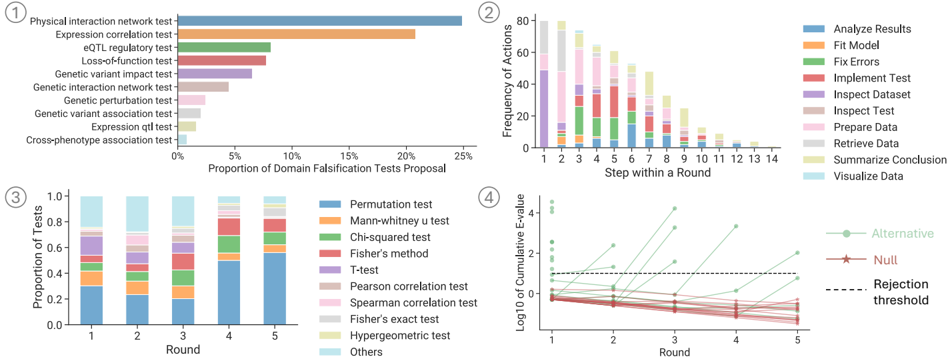
## [Chart Set]: Four Statistical Analysis Visualizations
### Overview
The image contains four distinct charts, labeled ① through ④, presenting data related to statistical testing, analysis workflows, and performance metrics. The charts appear to be from a technical or scientific report, likely in the field of bioinformatics, data science, or computational biology, given the test names (e.g., eQTL, permutation test).
### Components/Axes
The image is divided into four quadrants:
* **Top-Left (①):** A horizontal bar chart titled "Proportion of Domain Falsification Tests Proposal."
* **Top-Right (②):** A stacked bar chart titled "Frequency of Actions" vs. "Step within a Round."
* **Bottom-Left (③):** A stacked bar chart titled "Proportion of Tests" vs. "Round."
* **Bottom-Right (④):** A line plot titled "Log10 of Cumulative F-value" vs. "Round."
---
### Detailed Analysis
#### **Chart ①: Proportion of Domain Falsification Tests Proposal**
* **Type:** Horizontal Bar Chart.
* **X-Axis:** "Proportion of Domain Falsification Tests Proposal" (Scale: 0% to 25%, with major ticks at 0%, 5%, 10%, 15%, 20%, 25%).
* **Y-Axis:** Lists 11 distinct test categories.
* **Data (Approximate Proportions, from highest to lowest):**
1. Physical interaction network test: ~25%
2. Expression correlation test: ~21%
3. eQTL regulatory test: ~8%
4. Loss-of-function test: ~7%
5. Genetic variant impact test: ~6%
6. Genetic interaction network test: ~3%
7. Genetic perturbation test: ~2%
8. Genetic variant association test: ~2%
9. Expression qtl test: ~1%
10. Cross-phenotype association test: ~1%
11. (The final bar is unlabeled but appears to be a continuation or "Others" category with a very small proportion, <1%).
#### **Chart ②: Frequency of Actions**
* **Type:** Stacked Bar Chart.
* **X-Axis:** "Step within a Round" (Discrete values: 1 through 14).
* **Y-Axis:** "Frequency of Actions" (Scale: 0 to 80, with major ticks every 20 units).
* **Legend (Top-Right of chart, 10 items):** Analyze Results (blue), Fit Model (orange), Fix Errors (green), Implement Test (red), Inspect Dataset (purple), Inspect Test (brown), Prepare Data (pink), Retrieve Data (gray), Summarize Conclusion (yellow), Visualize Data (light blue).
* **Trend & Data:** The total frequency of actions is highest at Step 1 (~80) and decreases steadily to a very low value by Step 14 (~2). The composition of actions changes dramatically:
* **Early Steps (1-3):** Dominated by "Prepare Data" (pink) and "Retrieve Data" (gray).
* **Middle Steps (4-8):** "Implement Test" (red) and "Inspect Test" (brown) become prominent. "Analyze Results" (blue) and "Fit Model" (orange) also appear.
* **Late Steps (9-14):** "Summarize Conclusion" (yellow) and "Visualize Data" (light blue) become the dominant actions, while earlier actions fade out.
#### **Chart ③: Proportion of Tests**
* **Type:** Stacked Bar Chart.
* **X-Axis:** "Round" (Discrete values: 1 through 5).
* **Y-Axis:** "Proportion of Tests" (Scale: 0.0 to 1.0, with major ticks every 0.2).
* **Legend (Right of chart, 11 items):** Permutation test (blue), Mann-whitney u test (orange), Chi-squared test (green), Fisher's method (red), T-Test (purple), Pearson correlation test (brown), Spearman correlation test (pink), Fisher's exact test (gray), Hypergeometric test (yellow), Others (light blue).
* **Trend & Data:** The proportion of test types changes across rounds.
* **Round 1:** "Permutation test" (blue) is the largest component (~0.3). "Others" (light blue) is also significant (~0.25).
* **Round 2:** "Permutation test" proportion decreases (~0.2). "Mann-whitney u test" (orange) and "Chi-squared test" (green) increase.
* **Round 3:** "Permutation test" proportion is lowest (~0.18). "Fisher's method" (red) and "T-Test" (purple) are notable.
* **Round 4:** "Permutation test" proportion increases sharply (~0.5). "Others" proportion decreases.
* **Round 5:** "Permutation test" proportion is highest (~0.55). The composition is dominated by this single test type.
#### **Chart ④: Log10 of Cumulative F-value**
* **Type:** Line Plot with multiple series.
* **X-Axis:** "Round" (Discrete values: 1 through 5).
* **Y-Axis:** "Log10 of Cumulative F-value" (Scale: -1 to 4, with major ticks at -1, 0, 1, 2, 3, 4).
* **Legend (Right of chart, 3 items):** Alternative (green line with circle markers), Null (red line with star markers), Rejection threshold (black dashed line).
* **Trend & Data:**
* **Alternative (Green):** Shows a clear upward trend. Starts at ~0.5 in Round 1, increases to ~1.5 in Round 2, ~2.5 in Round 3, ~3.5 in Round 4, and ~2.0 in Round 5 (a drop from Round 4).
* **Null (Red):** Shows a clear downward trend. Starts at ~0.0 in Round 1, decreases to ~-0.2 in Round 2, ~-0.5 in Round 3, ~-0.8 in Round 4, and ~-1.0 in Round 5.
* **Rejection Threshold (Black Dashed):** A horizontal line at approximately y = 0.5.
* **Key Crossing Point:** The "Alternative" line crosses above the "Rejection threshold" between Round 1 and Round 2. The "Null" line remains below the threshold for all rounds.
### Key Observations
1. **Workflow Progression (Chart ②):** There is a clear, logical progression of analytical actions from data preparation and retrieval in early steps to testing, analysis, and finally summarization/visualization in later steps.
2. **Test Dominance Shift (Chart ③):** The "Permutation test" is a major component throughout but its dominance is non-linear, dipping in the middle rounds (2-3) before becoming overwhelmingly dominant in rounds 4 and 5.
3. **Statistical Significance (Chart ④):** The "Alternative" hypothesis model's cumulative F-value quickly surpasses the rejection threshold, indicating strong statistical signal. The "Null" model's value consistently decreases, reinforcing the rejection of the null hypothesis.
4. **Proposal Focus (Chart ①):** The proposed domain falsification tests are heavily skewed towards network-based ("Physical interaction network") and correlation-based ("Expression correlation") methods, which together account for nearly half of the proposed proportion.
### Interpretation
This set of charts likely illustrates the process and results of a multi-round analytical pipeline, possibly for evaluating biological hypotheses or data quality.
* **Process & Efficiency:** Chart ② maps the "anatomy" of a single analytical round, showing how effort is distributed across different tasks. The decreasing total frequency suggests rounds become more focused or efficient as they progress.
* **Methodological Evolution:** Chart ③ suggests the analytical strategy evolves. The initial diversity of tests (Round 1) gives way to a more focused approach in later rounds, heavily reliant on permutation testing. This could indicate an adaptive process where the most informative tests are identified and then applied more rigorously.
* **Hypothesis Validation:** Chart ④ provides the core statistical conclusion. The diverging paths of the "Alternative" and "Null" lines, with the Alternative crossing the rejection threshold early, demonstrate that the data provides strong evidence against the null hypothesis. The cumulative F-value metric suggests this evidence builds consistently over the first four rounds.
* **Strategic Planning:** Chart ① informs the design of such an analysis. It shows which types of falsification tests are considered most critical or common in the domain, guiding where to focus development and validation efforts.
**Overall Narrative:** The data suggests a robust, iterative analytical framework. It begins with a broad set of proposed tests (①), executes them in structured rounds with a clear workflow (②), adapts the mix of statistical methods used (③), and ultimately yields a statistically significant result that strongly supports the alternative hypothesis (④). The process appears designed to systematically reduce uncertainty and validate findings through repeated, focused rounds of analysis.
DECODING INTELLIGENCE...