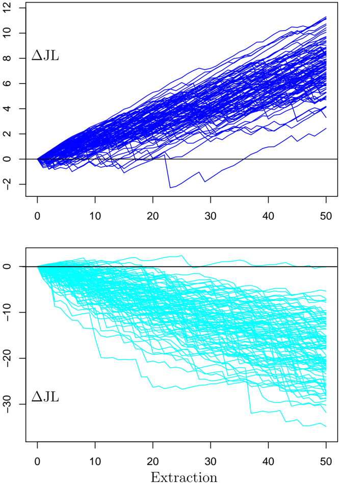
## Line Chart: Delta JL vs. Extraction
### Overview
The image presents two line charts stacked vertically. Both charts depict the change in a variable denoted as "ΔJL" (Delta JL) over a range of "Extraction" values. The top chart shows multiple blue lines generally trending upwards, while the bottom chart shows multiple cyan lines generally trending downwards.
### Components/Axes
**Top Chart:**
* **Y-axis:** Labeled "ΔJL", with a scale from -2 to 12, incrementing by 2.
* **X-axis:** Implicitly labeled "Extraction" (same as the bottom chart), with a scale from 0 to 50, incrementing by 10.
* **Data Series:** Multiple blue lines, each representing a different instance or condition.
**Bottom Chart:**
* **Y-axis:** Labeled "ΔJL", with a scale from -30 to 0, incrementing by 10.
* **X-axis:** Labeled "Extraction", with a scale from 0 to 50, incrementing by 10.
* **Data Series:** Multiple cyan lines, each representing a different instance or condition.
### Detailed Analysis
**Top Chart (Blue Lines):**
* **Trend:** The majority of the blue lines exhibit an upward trend as "Extraction" increases.
* **Starting Points:** Most lines start near or slightly below the 0 mark on the Y-axis.
* **Ending Points:** At "Extraction" = 50, the lines are distributed between approximately 2 and 10 on the Y-axis.
* **Specific Values:**
* At Extraction = 0, Delta JL is approximately 0 for most lines.
* At Extraction = 25, Delta JL ranges from approximately 1 to 6.
* At Extraction = 50, Delta JL ranges from approximately 2 to 10.
**Bottom Chart (Cyan Lines):**
* **Trend:** The majority of the cyan lines exhibit a downward trend as "Extraction" increases.
* **Starting Points:** All lines start near the 0 mark on the Y-axis.
* **Ending Points:** At "Extraction" = 50, the lines are distributed between approximately -10 and -30 on the Y-axis.
* **Specific Values:**
* At Extraction = 0, Delta JL is approximately 0 for all lines.
* At Extraction = 25, Delta JL ranges from approximately -5 to -20.
* At Extraction = 50, Delta JL ranges from approximately -10 to -30.
### Key Observations
* The top chart shows a general increase in ΔJL with increasing "Extraction", while the bottom chart shows a general decrease.
* The spread of the lines increases with "Extraction" in both charts, indicating greater variability in ΔJL at higher "Extraction" values.
* The starting point for all lines in both charts is near 0, suggesting a common initial condition.
### Interpretation
The charts likely represent the change in a variable (ΔJL) under two different conditions or processes related to "Extraction". The upward trend in the top chart suggests that "Extraction" positively influences ΔJL in one scenario, while the downward trend in the bottom chart suggests a negative influence in another scenario. The increasing spread of the lines indicates that the effect of "Extraction" becomes more variable as "Extraction" increases, possibly due to other factors influencing ΔJL. The common starting point suggests that both processes begin from a similar baseline.