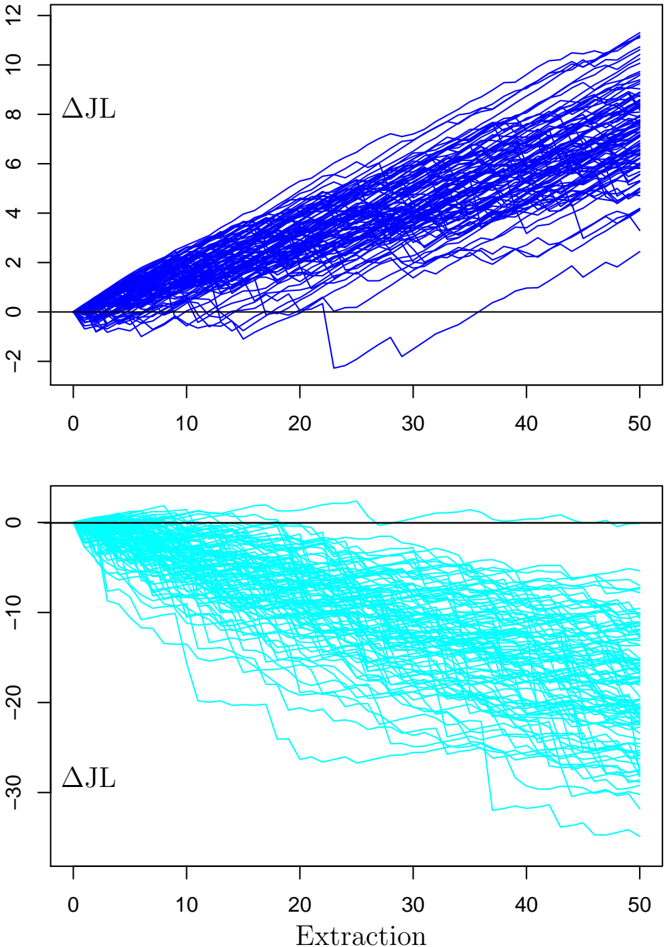
## Line Charts: ΔJL vs. Extraction
### Overview
The image contains two vertically stacked line charts sharing a common x-axis. Each chart displays multiple time-series lines, representing different trials or samples, plotting a variable labeled "ΔJL" against an "Extraction" step. The top chart shows predominantly positive trends, while the bottom chart shows predominantly negative trends.
### Components/Axes
* **Chart Type:** Two-panel line chart (spaghetti plot).
* **X-Axis (Shared):**
* **Label:** "Extraction" (centered at the bottom of the entire figure).
* **Scale:** Linear, from 0 to 50.
* **Major Ticks:** 0, 10, 20, 30, 40, 50.
* **Y-Axis (Top Panel):**
* **Label:** "ΔJL" (positioned to the left of the axis).
* **Scale:** Linear, from -2 to 12.
* **Major Ticks:** -2, 0, 2, 4, 6, 8, 10, 12.
* **Reference Line:** A solid horizontal line at y=0.
* **Y-Axis (Bottom Panel):**
* **Label:** "ΔJL" (positioned to the left of the axis).
* **Scale:** Linear, from -30 to 0.
* **Major Ticks:** -30, -20, -10, 0.
* **Reference Line:** A solid horizontal line at y=0.
* **Data Series:**
* **Top Panel:** Approximately 50-100 individual lines, all colored **blue**. No legend is present; each line is a distinct series.
* **Bottom Panel:** Approximately 50-100 individual lines, all colored **cyan**. No legend is present; each line is a distinct series.
* **Spatial Layout:** The top chart occupies the upper half of the image frame. The bottom chart occupies the lower half. The x-axis label "Extraction" is positioned below the bottom chart's x-axis.
### Detailed Analysis
**Top Chart (Blue Lines):**
* **Trend Verification:** The overwhelming trend is **upward**. Lines begin clustered near y=0 at Extraction=0. As Extraction increases, the lines fan out, with the majority rising to positive values.
* **Data Points & Spread:**
* At Extraction=0: All lines originate at or very near ΔJL = 0.
* At Extraction=50: The lines show significant spread. The highest line reaches approximately ΔJL = 11.5. The lowest line (a clear outlier) is near ΔJL = 2. The dense central cluster of lines ends between ΔJL = 4 and ΔJL = 10.
* **Outlier:** One distinct blue line deviates from the main trend. It dips below zero around Extraction=20-30, reaching a minimum of approximately ΔJL = -2.5, before recovering to a positive value (~2) by Extraction=50.
**Bottom Chart (Cyan Lines):**
* **Trend Verification:** The overwhelming trend is **downward**. Lines begin clustered near y=0 at Extraction=0. As Extraction increases, the lines fan out, with the majority descending to negative values.
* **Data Points & Spread:**
* At Extraction=0: All lines originate at or very near ΔJL = 0.
* At Extraction=50: The lines show very large spread. The highest line (least negative) is near ΔJL = -1. The lowest line reaches approximately ΔJL = -28. The dense central cluster of lines ends between ΔJL = -10 and ΔJL = -25.
* **Pattern:** The descent is not perfectly smooth for all lines; many exhibit a "stepped" or jagged downward progression.
### Key Observations
1. **Symmetry of Extremes:** The two charts appear to show opposite, almost mirror-image behaviors. The top chart's maximum positive change (~+11.5) is roughly comparable in magnitude to the bottom chart's maximum negative change (~-28), though the negative scale is larger.
2. **Increasing Variance:** In both charts, the variance (spread) of the ΔJL values increases substantially as the Extraction step progresses from 0 to 50. The outcomes become more diverse over time.
3. **Common Origin:** All series in both charts start from the same point (ΔJL=0 at Extraction=0), suggesting a common baseline or initial condition.
4. **Absence of Legend:** The charts lack a legend to identify individual lines. Each line presumably represents a separate experimental run, simulation, or sample, but this is not explicitly stated.
### Interpretation
This visualization likely compares the performance or outcome of two different methods, conditions, or models over a series of extraction steps (e.g., in machine learning, optimization, or a physical process). "ΔJL" probably represents a change in a key metric, such as a loss function, error rate, or a specific measured property (where J and L could be variables).
* **What the data suggests:** The method/condition represented by the **top (blue) chart** generally leads to an **improvement** (positive ΔJL) that grows with more extraction steps, though with increasing variability and a risk of occasional poor performance (the negative outlier). The method/condition represented by the **bottom (cyan) chart** generally leads to a **degradation** (negative ΔJL) that also worsens with more steps, and with even greater final variability.
* **Relationship between elements:** The shared x-axis allows for direct comparison of the progression of the two groups. The stark contrast in trends indicates a fundamental difference in how the two groups respond to the "Extraction" process.
* **Notable anomalies:** The single blue line that dips significantly negative is a critical outlier. It demonstrates that while the blue method is generally positive, it can occasionally fail or produce a detrimental result mid-process before recovering. The stepped descent in the cyan lines might indicate discrete events or thresholds causing drops in the metric.
* **Underlying message:** The data argues strongly that the process or condition associated with the top chart is superior for achieving a positive ΔJL, but it is not without risk. The bottom chart's process is consistently detrimental. The increasing spread in both suggests that the outcome becomes less predictable as the process continues.