## Line Charts: COVID-19 Cases by Age Group Over Time
### Overview
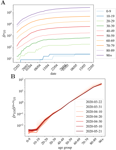
The image presents two line charts analyzing COVID-19 cases across different age groups over time. Chart A displays the cumulative number of cases for each age group as a function of time, while Chart B shows the relative distribution of cases across age groups normalized by the 50-59 age group.
### Components/Axes
**Chart A:**
* **Title:** Implicitly, cumulative COVID-19 cases by age group over time.
* **X-axis:** Date, with tick marks at approximately weekly intervals from 22/03 to 22/05.
* **Y-axis:** $\hat{D}^a(t)$, likely representing the cumulative number of cases, displayed on a logarithmic scale from 10^1 to 10^5.
* **Legend:** Located on the right side of the chart, mapping age groups to line colors:
* 0-9: Light Blue
* 10-19: Blue
* 20-29: Green
* 30-39: Lime Green
* 40-49: Pink
* 50-59: Red
* 60-69: Orange
* 70-79: Brown/Dark Orange
* 80-89: Light Gray
* 90+: Purple
**Chart B:**
* **Title:** Implicitly, relative COVID-19 case distribution by age group.
* **X-axis:** Age group, with categories: 0-9, 10-19, 20-29, 30-39, 40-49, 50-59, 60-69, 70-79, 80-89, 90+.
* **Y-axis:** $\hat{D}^a(t) / \hat{D}^{50-59}(t)$, representing the ratio of cases in each age group to the cases in the 50-59 age group, displayed on a logarithmic scale from 10^-2 to 10^2.
* **Legend:** Located on the right side of the chart, mapping dates to line colors:
* 2020-03-22: Very Light Pink
* 2020-03-31: Light Pink
* 2020-04-10: Pink
* 2020-04-20: Red
* 2020-04-30: Dark Red
* 2020-05-10: Brown
* 2020-05-21: Dark Brown
### Detailed Analysis
**Chart A:**
* **0-9 (Light Blue):** The number of cases remains very low, staying below 10 for most of the period, with a slight increase towards the end.
* **10-19 (Blue):** The number of cases is also relatively low, starting around 5 and increasing to approximately 20 by the end of the period.
* **20-29 (Green):** The number of cases starts around 10 and increases to approximately 100 by the end of the period.
* **30-39 (Lime Green):** The number of cases starts around 20 and increases to approximately 200 by the end of the period.
* **40-49 (Pink):** The number of cases starts around 50 and increases to approximately 500 by the end of the period.
* **50-59 (Red):** The number of cases starts around 100 and increases to approximately 1000 by the end of the period.
* **60-69 (Orange):** The number of cases starts around 200 and increases to approximately 2000 by the end of the period.
* **70-79 (Brown/Dark Orange):** The number of cases starts around 500 and increases to approximately 5000 by the end of the period.
* **80-89 (Light Gray):** The number of cases starts around 1000 and increases to approximately 10000 by the end of the period.
* **90+ (Purple):** The number of cases starts around 5000 and increases to approximately 50000 by the end of the period.
**Chart B:**
* The y-axis represents the ratio of cases in each age group to the cases in the 50-59 age group.
* For all dates, the ratio for the 50-59 age group is 1.
* The ratios for the younger age groups (0-9, 10-19) are consistently below 0.1.
* The ratios for the older age groups (60-69, 70-79, 80-89, 90+) are consistently above 1.
* The lines for different dates are very close to each other, indicating that the relative distribution of cases across age groups is relatively stable over time.
* The ratios for the 0-9 and 10-19 age groups are very similar, and the ratios for the 80-89 and 90+ age groups are also very similar.
### Key Observations
* **Chart A:** The cumulative number of cases increases with age. The rate of increase appears to be relatively constant for each age group over the observed period.
* **Chart B:** The relative distribution of cases across age groups is relatively stable over time. The older age groups have a higher proportion of cases relative to the 50-59 age group, while the younger age groups have a lower proportion.
### Interpretation
The data suggests that older age groups are disproportionately affected by COVID-19, both in terms of cumulative case numbers and relative distribution. The consistent trends across different dates in Chart B indicate that the age-related vulnerability to COVID-19 remained relatively constant during the observed period. The logarithmic scale on the y-axes highlights the exponential growth in case numbers, particularly in the older age groups. The normalization in Chart B allows for a direct comparison of the relative impact of the virus on different age demographics, controlling for the overall scale of the pandemic.