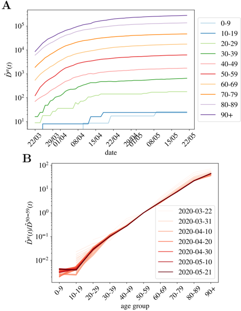
## Line Chart: Cumulative Incidence by Age Group and Date
### Overview
The image presents two line charts (labeled A and B) depicting the cumulative incidence of a disease or condition over time, stratified by age group. Chart A shows the cumulative incidence (D^(0)) over time (date) for different age groups. Chart B shows the cumulative incidence of cases in each age group relative to the 50-59 age group (D^(0)(D^(50-59)(t))).
### Components/Axes
**Chart A:**
* **X-axis:** Date, ranging from approximately 22/03 to 22/05. Markers are present at roughly 22/03, 29/03, 01/04, 08/04, 15/04, 22/04, 29/04, 06/05, 08/05, 15/05, and 22/05.
* **Y-axis:** Cumulative Incidence (D^(0)), on a logarithmic scale from approximately 10^1 to 10^5.
* **Legend (top-right):** Age groups with corresponding line colors:
* 0-9 (light blue)
* 10-19 (cyan)
* 20-29 (green)
* 30-39 (light green)
* 40-49 (yellow)
* 50-59 (orange)
* 60-69 (brown)
* 70-79 (purple)
* 80-89 (dark blue)
* 90+ (black)
**Chart B:**
* **X-axis:** Age Group, ranging from 0-9 to 90+.
* **Y-axis:** D^(0)(D^(50-59)(t)), on a logarithmic scale from approximately 10^-2 to 10^1.
* **Legend (right):** Dates with corresponding line colors (all red shades):
* 2020-03-22 (lightest red)
* 2020-03-31 (slightly darker red)
* 2020-04-10 (medium red)
* 2020-04-20 (darker red)
* 2020-04-30 (even darker red)
* 2020-05-10 (darkest red)
* 2020-05-21 (darkest red)
### Detailed Analysis or Content Details
**Chart A:**
* **0-9 (light blue):** The line remains relatively flat at approximately 10^2 for most of the period, with a slight increase towards the end.
* **10-19 (cyan):** Starts at approximately 10^2, increases steadily to around 10^3 by 22/05.
* **20-29 (green):** Starts at approximately 10^2, increases steadily to around 10^3.5 by 22/05.
* **30-39 (light green):** Starts at approximately 10^2, increases steadily to around 10^4 by 22/05.
* **40-49 (yellow):** Starts at approximately 10^2, increases steadily to around 10^4.5 by 22/05.
* **50-59 (orange):** Starts at approximately 10^3, increases steadily to around 10^5 by 22/05. This line has the highest values.
* **60-69 (brown):** Starts at approximately 10^2, increases steadily to around 10^4 by 22/05.
* **70-79 (purple):** Starts at approximately 10^2, increases steadily to around 10^4 by 22/05.
* **80-89 (dark blue):** Starts at approximately 10^2, increases to around 10^3.5 by 22/05.
* **90+ (black):** Starts at approximately 10^3, increases steadily to around 10^4.5 by 22/05.
**Chart B:**
* All lines start around 0.01 (10^-2) for the 0-9 age group.
* The lines increase steadily with age, with the slope becoming steeper for older age groups.
* The lines representing different dates are closely clustered together, with the later dates (e.g., 2020-05-21) having higher values than earlier dates (e.g., 2020-03-22).
* The 50-59 age group is the baseline for this chart, and the values represent the relative incidence in other age groups compared to this baseline.
* By the 90+ age group, the values reach approximately 10^1.
### Key Observations
* Chart A shows a clear age-related gradient in cumulative incidence, with older age groups experiencing higher cumulative incidence.
* The 50-59 age group consistently has the highest cumulative incidence in Chart A.
* Chart B demonstrates that the relative incidence compared to the 50-59 age group increases with age.
* The lines in Chart B are relatively parallel, suggesting that the relative incidence pattern remains consistent over time.
### Interpretation
The data suggests that the disease or condition under investigation has a disproportionate impact on older age groups. Chart A provides a direct measure of cumulative incidence, while Chart B normalizes the data relative to the 50-59 age group, highlighting the increasing relative risk with age. The consistent pattern in Chart B indicates that this age-related risk profile is maintained throughout the observed period. The logarithmic scales used in both charts emphasize the exponential growth of incidence, particularly in the older age groups. The fact that the lines in Chart B are relatively parallel suggests that the age-specific risk is increasing at a similar rate across all time points. This information could be used to inform public health interventions targeted at protecting vulnerable populations. The use of D^(0) and D^(0)(D^(50-59)(t)) suggests a mathematical model is being used to analyze the spread of the disease, with the 50-59 age group potentially serving as a reference point or control group.