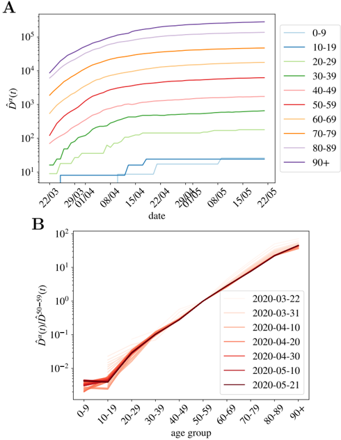
## [Chart Type]: Dual-Panel Line Charts - Age-Stratified Epidemiological Data
### Overview
The image contains two line charts, labeled **A** and **B**, presenting epidemiological data stratified by age group over time in early 2020. The data appears to model or track a disease outbreak, likely COVID-19 given the dates. Both charts use logarithmic scales on their y-axes. The overall presentation is technical, typical of a scientific publication.
### Components/Axes
**Chart A (Top Panel):**
* **Title/Label:** "A" (top-left corner).
* **Y-axis:** Labeled "$\hat{D}^r(t)$". This is a logarithmic scale ranging from $10^1$ to $10^5$. The notation suggests a modeled or estimated count (e.g., cumulative cases or deaths) over time (`t`).
* **X-axis:** Labeled "date". It displays dates from late March to late May 2020. Specific markers are: 22/03, 29/03, 01/04, 08/04, 15/04, 22/04, 29/04, 06/05, 08/05, 15/05, 22/05. The date format is DD/MM.
* **Legend:** Positioned on the right side. It lists 10 age groups, each associated with a distinct colored line:
* 0-9 (light blue)
* 10-19 (medium blue)
* 20-29 (dark blue)
* 30-39 (green)
* 40-49 (light green)
* 50-59 (red)
* 60-69 (orange)
* 70-79 (dark orange)
* 80-89 (light purple)
* 90+ (dark purple)
**Chart B (Bottom Panel):**
* **Title/Label:** "B" (top-left corner).
* **Y-axis:** Labeled "$\hat{D}^r(t)/\hat{D}^{50-59}(t)$". This is a logarithmic scale ranging from $10^{-2}$ to $10^2$. This represents a ratio: the value for a given age group divided by the value for the 50-59 age group at the same time `t`.
* **X-axis:** Labeled "age group". It lists the same 10 age groups as Chart A's legend, in order: 0-9, 10-19, 20-29, 30-39, 40-49, 50-59, 60-69, 70-79, 80-89, 90+.
* **Legend:** Positioned on the right side. It lists 7 specific dates in 2020, each associated with a line of varying shade of red/brown:
* 2020-03-22 (lightest)
* 2020-03-31
* 2020-04-10
* 2020-04-20
* 2020-04-30
* 2020-05-10
* 2020-05-21 (darkest)
### Detailed Analysis
**Chart A Analysis:**
* **Trend Verification:** All lines show an upward, roughly sigmoidal (S-shaped) trend over time, indicating cumulative growth. The slope is steepest in early April and begins to plateau by late May. The lines are strictly ordered by age: the 90+ group is always highest, and the 0-9 group is always lowest.
* **Data Points (Approximate):**
* **90+ (dark purple):** Starts near $10^4$ on 22/03. Rises steeply, crossing $10^5$ around late April, and ends near $3 \times 10^5$ by 22/05.
* **80-89 (light purple):** Follows a similar shape but lower. Starts ~$5 \times 10^3$, ends ~$10^5$.
* **70-79 (dark orange):** Starts ~$2 \times 10^3$, ends ~$5 \times 10^4$.
* **60-69 (orange):** Starts ~$10^3$, ends ~$2 \times 10^4$.
* **50-59 (red):** Starts ~$5 \times 10^2$, ends ~$8 \times 10^3$.
* **40-49 (light green):** Starts ~$2 \times 10^2$, ends ~$3 \times 10^3$.
* **30-39 (green):** Starts ~$10^2$, ends ~$10^3$.
* **20-29 (dark blue):** Starts ~$30$, ends ~$200$.
* **10-19 (medium blue):** Starts ~$10$, ends ~$30$.
* **0-9 (light blue):** Starts at or below $10$, shows a small step increase in mid-April, ends ~$20$.
**Chart B Analysis:**
* **Trend Verification:** All lines show a strong, consistent upward trend from left to right. This means the ratio $\hat{D}^r(t)/\hat{D}^{50-59}(t)$ increases with age group. The lines for later dates (darker colors) are generally higher than for earlier dates, especially for the oldest age groups.
* **Data Points (Approximate):**
* The ratio for the **50-59** group is, by definition, $10^0 = 1$ for all dates.
* For the **0-9** group, the ratio is very low, between $10^{-2}$ and $5 \times 10^{-2}$ (0.01 to 0.05).
* The ratio increases exponentially with age. For the **90+** group:
* On 2020-03-22 (lightest line), the ratio is ~$10^1$ (10).
* On 2020-05-21 (darkest line), the ratio is ~$5 \times 10^1$ (50).
* The lines converge near the 50-59 anchor point and diverge significantly at the age extremes.
### Key Observations
1. **Strong Age Gradient:** There is a dramatic, orders-of-magnitude difference in the modeled outcome ($\hat{D}^r(t)$) between the youngest and oldest age groups in Chart A.
2. **Temporal Progression:** The outbreak, as measured by this metric, grew rapidly through April and began to decelerate in May 2020 across all age groups.
3. **Increasing Relative Risk:** Chart B shows that not only is the absolute count higher for older groups (Chart A), but their *relative risk* compared to the 50-59 baseline also increases over time. The oldest groups become disproportionately more affected as the epidemic progresses.
4. **Low Impact on Youngest:** The 0-9 and 10-19 age groups show minimal growth in absolute terms (Chart A) and a very low, stable relative risk (Chart B).
### Interpretation
The data strongly suggests that age is the primary determinant of the severity of the modeled outcome (likely severe cases or deaths) in this epidemic wave. The exponential increase in both absolute counts (Chart A) and relative risk (Chart B) with age highlights a profound vulnerability in the elderly population.
The temporal trends in Chart B are particularly insightful. The fact that the relative risk for the 80+ groups increases from ~10x to ~50x the risk of the 50-59 group over just two months indicates that the epidemic's impact became increasingly concentrated among the oldest individuals as it unfolded. This could be due to factors like differential exposure, progression of the disease within individuals over time, or the saturation of cases in younger, less vulnerable groups.
The charts effectively separate two key narratives: the overall growth of the epidemic (Chart A) and the evolving, age-dependent structure of risk within it (Chart B). The use of logarithmic scales is essential to visualize the vast disparities across age groups.