## Bar Charts: Difference Distribution at Varying T Values
### Overview
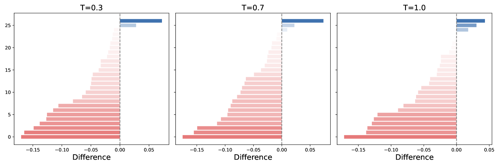
The image presents three bar charts arranged horizontally, each displaying the distribution of "Difference" values for different values of "T" (0.3, 0.7, and 1.0). The y-axis represents an unspecified count or frequency, ranging from 0 to 25. The x-axis represents the "Difference," ranging from approximately -0.15 to 0.05. The bars are colored in a gradient from red to white to blue, indicating the magnitude and sign of the difference.
### Components/Axes
* **Titles:** Each chart has a title indicating the value of "T": "T=0.3" (left), "T=0.7" (center), and "T=1.0" (right).
* **X-Axis:** Labeled "Difference," with tick marks at -0.15, -0.10, -0.05, 0.00, and 0.05.
* **Y-Axis:** Ranges from 0 to 25, with tick marks at 0, 5, 10, 15, 20, and 25.
* **Bars:** Each bar represents a specific "Difference" value. The bars are arranged vertically, with the lowest bars being red and the highest bars being blue.
* **Vertical Dashed Line:** A vertical dashed line is present at x=0.00 on each chart.
### Detailed Analysis
**Chart 1: T=0.3**
* The bars are arranged in ascending order of "Difference" value from bottom to top.
* The bars at the bottom are red, indicating negative "Difference" values.
* The bars transition to white and then to blue as the "Difference" values increase.
* The red bars extend to approximately -0.15 on the x-axis.
* The blue bars extend to approximately 0.05 on the x-axis.
* The y-axis values for the red bars are approximately between 0 and 5.
* The y-axis values for the blue bars are approximately between 25 and 26.
**Chart 2: T=0.7**
* The bars are arranged in ascending order of "Difference" value from bottom to top.
* The bars at the bottom are red, indicating negative "Difference" values.
* The bars transition to white and then to blue as the "Difference" values increase.
* The red bars extend to approximately -0.15 on the x-axis.
* The blue bars extend to approximately 0.05 on the x-axis.
* The y-axis values for the red bars are approximately between 0 and 5.
* The y-axis values for the blue bars are approximately between 24 and 26.
**Chart 3: T=1.0**
* The bars are arranged in ascending order of "Difference" value from bottom to top.
* The bars at the bottom are red, indicating negative "Difference" values.
* The bars transition to white and then to blue as the "Difference" values increase.
* The red bars extend to approximately -0.15 on the x-axis.
* The blue bars extend to approximately 0.05 on the x-axis.
* The y-axis values for the red bars are approximately between 0 and 5.
* The y-axis values for the blue bars are approximately between 23 and 25.
### Key Observations
* The distribution of "Difference" values is similar across all three charts, with a concentration of negative values and a few positive values.
* As "T" increases from 0.3 to 1.0, the height of the blue bars decreases slightly, suggesting a decrease in the frequency or count of positive "Difference" values.
* The red bars remain relatively consistent in height across all three charts, indicating a stable frequency or count of negative "Difference" values.
### Interpretation
The charts illustrate how the distribution of "Difference" values changes as the parameter "T" varies. The consistent presence of negative "Difference" values suggests a bias or tendency towards negative differences. The slight decrease in the frequency of positive "Difference" values as "T" increases may indicate a relationship between "T" and the occurrence of positive differences. The nature of the "Difference" and "T" variables is not specified, so further context is needed to fully understand the implications of these observations. The data suggests that as T increases, the positive differences become less frequent, while the negative differences remain relatively stable.