## Horizontal Diverging Bar Charts: Temperature-Parameterized Difference Distributions
### Overview
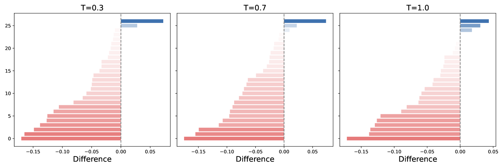
The image displays three horizontally oriented diverging bar charts arranged side-by-side. Each chart visualizes the distribution of a "Difference" metric across 26 indexed items (0-25) for a specific temperature parameter value (T). The charts share identical axes and a consistent color scheme, allowing for direct comparison of how the parameter T influences the distribution of differences.
### Components/Axes
* **Chart Titles:** Each subplot is titled with its temperature parameter: `T=0.3` (left), `T=0.7` (center), `T=1.0` (right).
* **X-Axis:** Labeled `Difference`. The scale runs from approximately -0.17 to +0.07. Major tick marks are at -0.15, -0.10, -0.05, 0.00, and 0.05. A vertical dashed gray line marks the zero point.
* **Y-Axis:** Represents an index or category, numbered from 0 at the bottom to 25 at the top. Ticks are at intervals of 5 (0, 5, 10, 15, 20, 25). The axis label is not explicitly stated.
* **Data Encoding:** Horizontal bars represent the magnitude and direction of the "Difference" for each index.
* **Color:** A diverging color map is used. Bars with negative differences are shades of red, with darker red indicating a larger magnitude (more negative). Bars with positive differences are shades of blue, with darker blue indicating a larger magnitude (more positive). Bars near zero are very light, almost white.
* **Position:** The length of each bar extends from the zero line to the value on the x-axis. Bars extend left for negative values and right for positive values.
### Detailed Analysis
**Chart 1: T=0.3 (Left Panel)**
* **Trend:** A strong, monotonic negative skew. The magnitude of negative difference is largest at the bottom (index 0) and decreases steadily as the index increases.
* **Data Points (Approximate):**
* Index 0: ~ -0.16 (darkest red)
* Index 5: ~ -0.12
* Index 10: ~ -0.08
* Index 15: ~ -0.04
* Index 20: ~ -0.01 (very light red)
* Index 21-23: Values very close to zero (lightest shades).
* Index 24: Small positive difference, ~ +0.02 (light blue).
* Index 25: Largest positive difference, ~ +0.06 (dark blue).
**Chart 2: T=0.7 (Center Panel)**
* **Trend:** Similar negative skew, but the distribution is more compressed towards zero for mid-range indices compared to T=0.3. The transition from negative to positive occurs at a higher index.
* **Data Points (Approximate):**
* Index 0: ~ -0.17 (slightly more negative than T=0.3).
* Index 5: ~ -0.13
* Index 10: ~ -0.09
* Index 15: ~ -0.05
* Index 20: ~ -0.02
* Index 21-24: Values very close to zero, with indices 23-24 showing faint positive (light blue) bars.
* Index 25: Largest positive difference, ~ +0.06 (similar magnitude to T=0.3).
**Chart 3: T=1.0 (Right Panel)**
* **Trend:** The negative skew is the most pronounced at the bottom and the most compressed near zero for the upper indices. The positive region is the smallest.
* **Data Points (Approximate):**
* Index 0: ~ -0.17 (similar to T=0.7).
* Index 5: ~ -0.14
* Index 10: ~ -0.10
* Index 15: ~ -0.06
* Index 20: ~ -0.03
* Index 21-24: Values extremely close to zero, with only indices 24-25 showing clear positive bars.
* Index 25: Largest positive difference, ~ +0.05 (slightly smaller than at lower T).
### Key Observations
1. **Consistent Negative Dominance:** Across all temperature settings, the vast majority of indices (0-20/21) exhibit negative differences. Positive differences are confined to the top 1-5 indices.
2. **Monotonic Gradient:** There is a clear, smooth gradient from large negative differences at low indices to near-zero or positive differences at high indices within each chart.
3. **Temperature Effect:** Increasing the parameter T from 0.3 to 1.0 appears to:
* Slightly increase the magnitude of the most negative differences (at index 0).
* Compress the distribution, causing the transition from negative to positive to occur at a higher index.
* Slightly reduce the magnitude of the largest positive difference (at index 25) at T=1.0.
4. **Color-Value Correlation:** The color gradient perfectly aligns with the bar length and direction, providing a redundant and clear visual encoding of the data magnitude.
### Interpretation
This visualization likely represents the output of a model or analysis where a temperature parameter (T) controls some aspect of smoothing, regularization, or probability scaling. The "Difference" could be a change in a metric (e.g., log-probability, error, activation) between two conditions or models.
The data suggests that the system being measured has an inherent ordering (the y-axis index) where lower-indexed items consistently show a decrease (negative difference) and higher-indexed items show a small increase (positive difference). The temperature parameter T modulates this effect: **higher T amplifies the negative differences for low indices and suppresses the positive differences for high indices, effectively "sharpening" the contrast between the two ends of the index spectrum.** This is a common behavior in softmax-based functions or attention mechanisms where temperature controls the peakedness of a distribution. The charts effectively demonstrate the sensitivity of the system's output distribution to this single hyperparameter.